FINNY AI
Redesigning finny AI prospect profile
My Role
Design Engineer — HTML, CSS, Javascript, Visual Research, Iterations, Visual Design
Timeline & Status
2 days 🧋
Overview
The project aimed to reimagine how the Finny AI prospect profile would look, by aiming to enhance the visual appeal, streamline information categorization, and improve navigation for better user experience.
My role as web designer involved leading the design strategy, ensuring the profile was both aesthetically pleasing and easy to understand and that the site was responsive enough on both web and mobile
Context
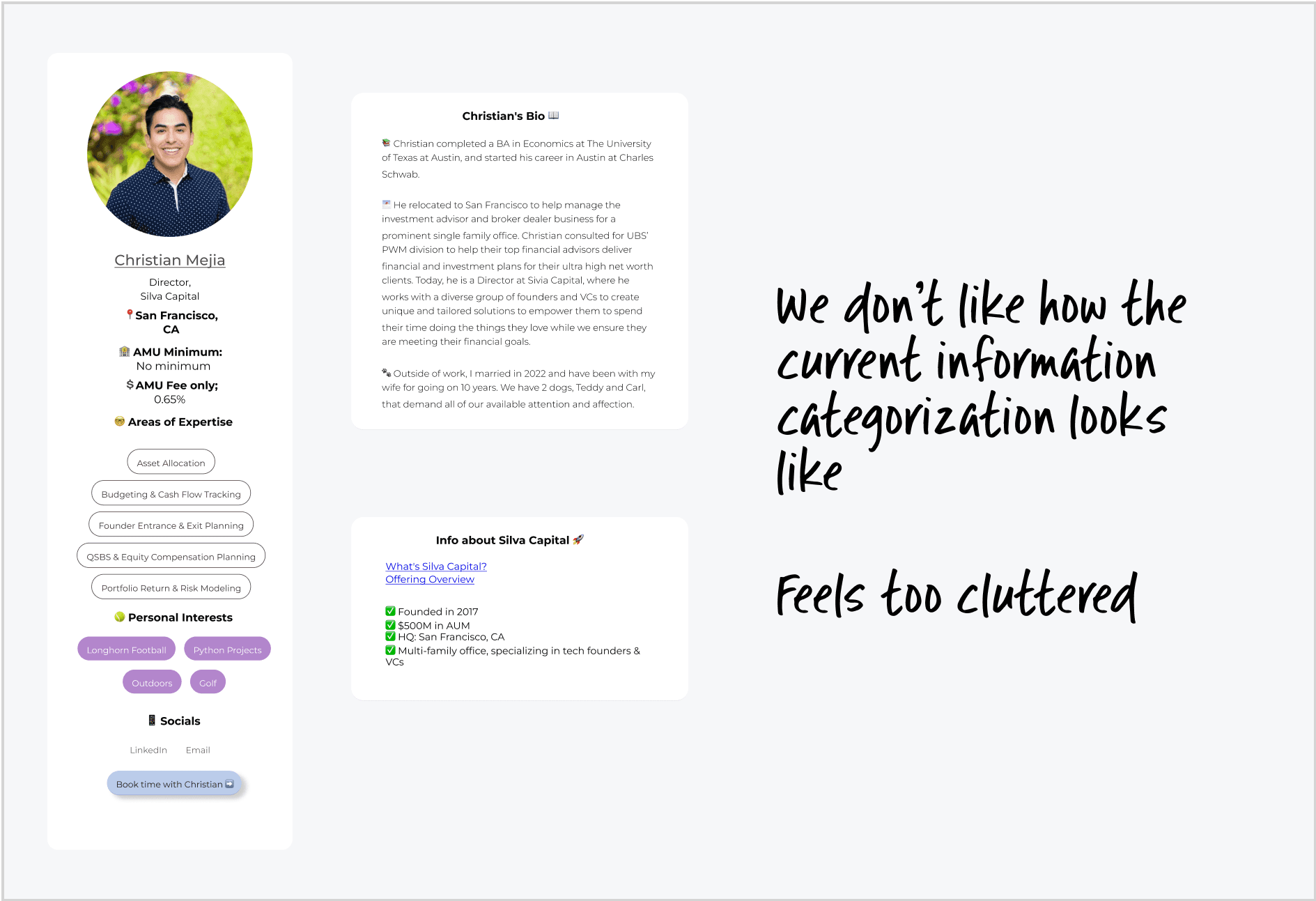
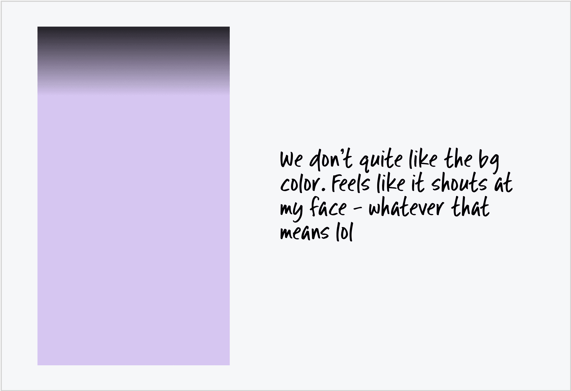
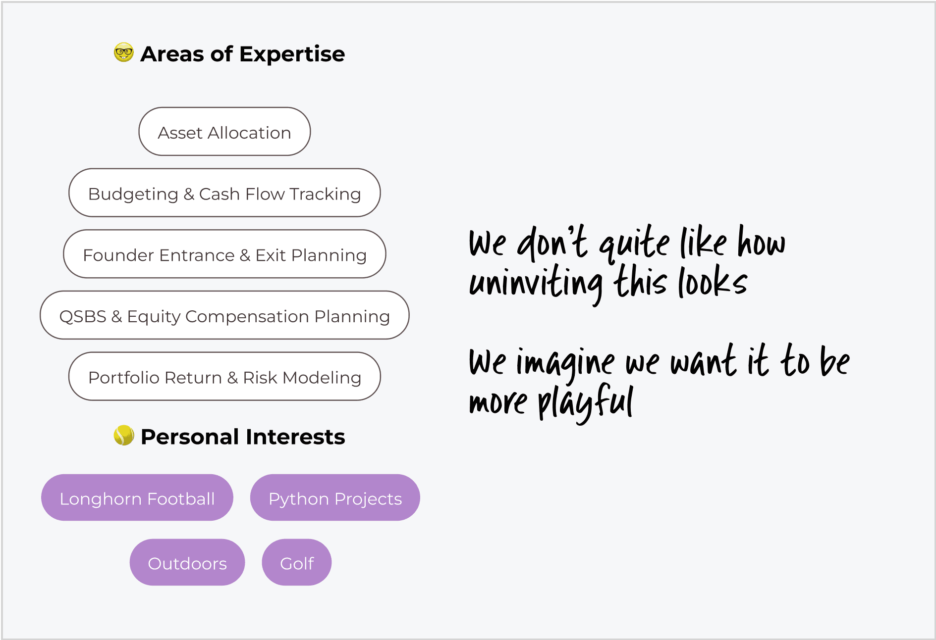
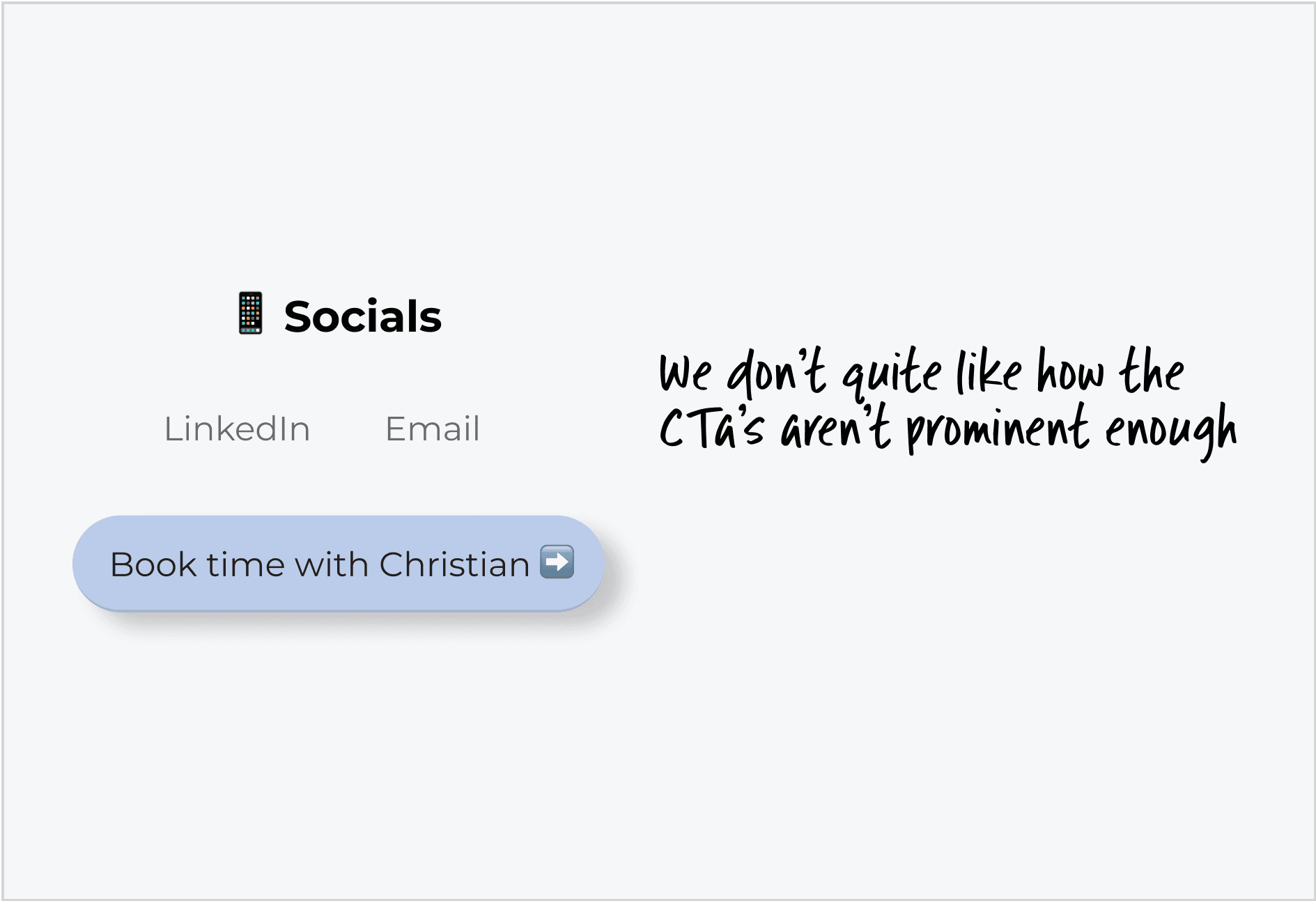
We don't quite like it
The Finny AI team recognized that their prospect profile page felt cluttered and visually unappealing. It turned out that this was a template page the CEO had been experimenting with on Webflow, which probably explains why it didn't quite hit the mark.
The design wasn’t visually appealing and didn’t respond well on different devices, which really took away from the overall user experience.
What don't we quite like about it?
These points highlight some of the main issues the team had with the current profile page—some of which were worded verbatim 😂.
Quick Itertation
Finding what works
I had a call with the team on Monday night due to the time difference, and I needed to deliver the redesign by Wednesday. That meant I had just Tuesday to come up with a solid design—no pressure, right?
I had to move quickly but stay efficient, zeroing in on a creative direction right away while making quick iterative decisions on placements, layouts, and other design details.
#Iteration1
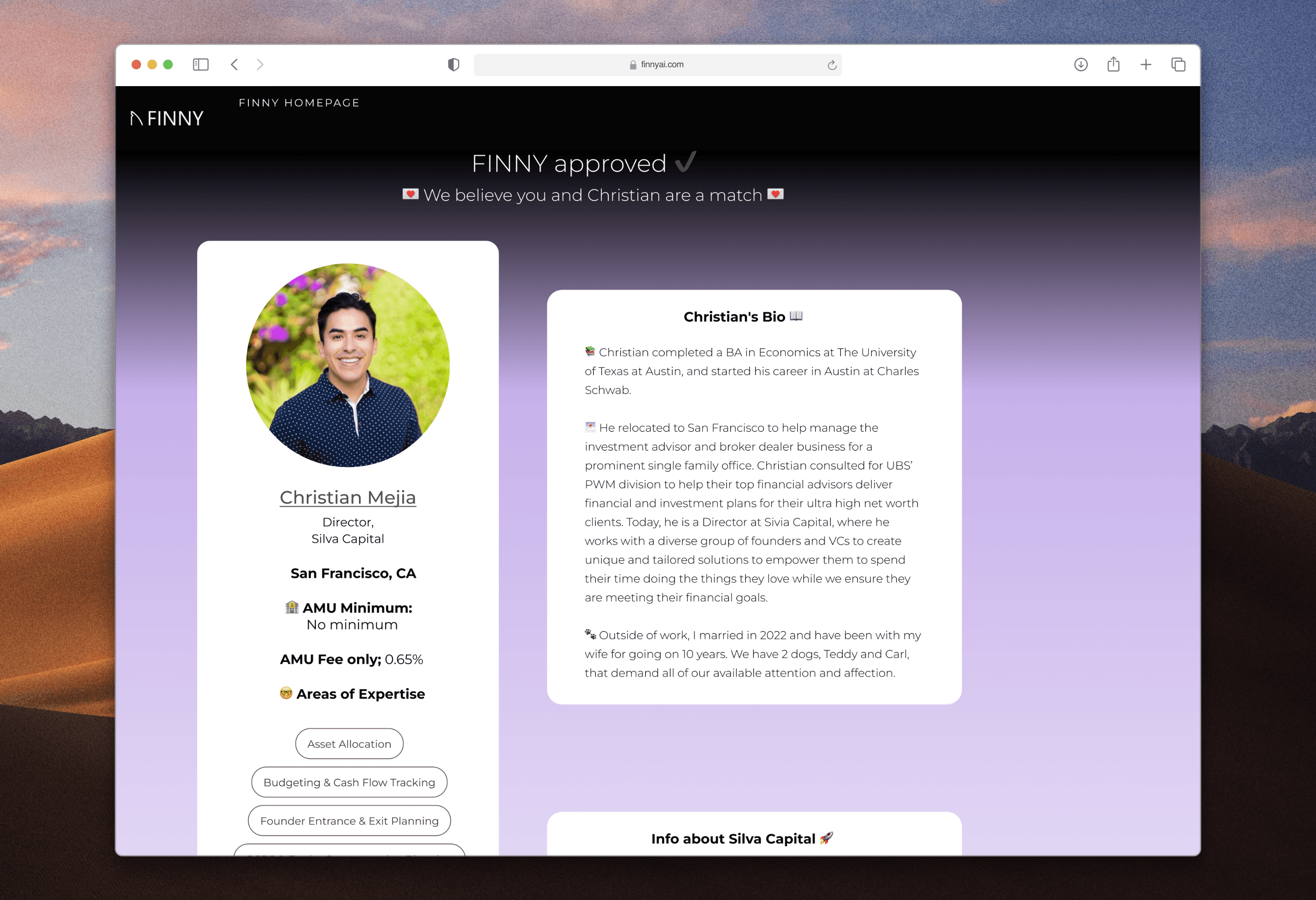
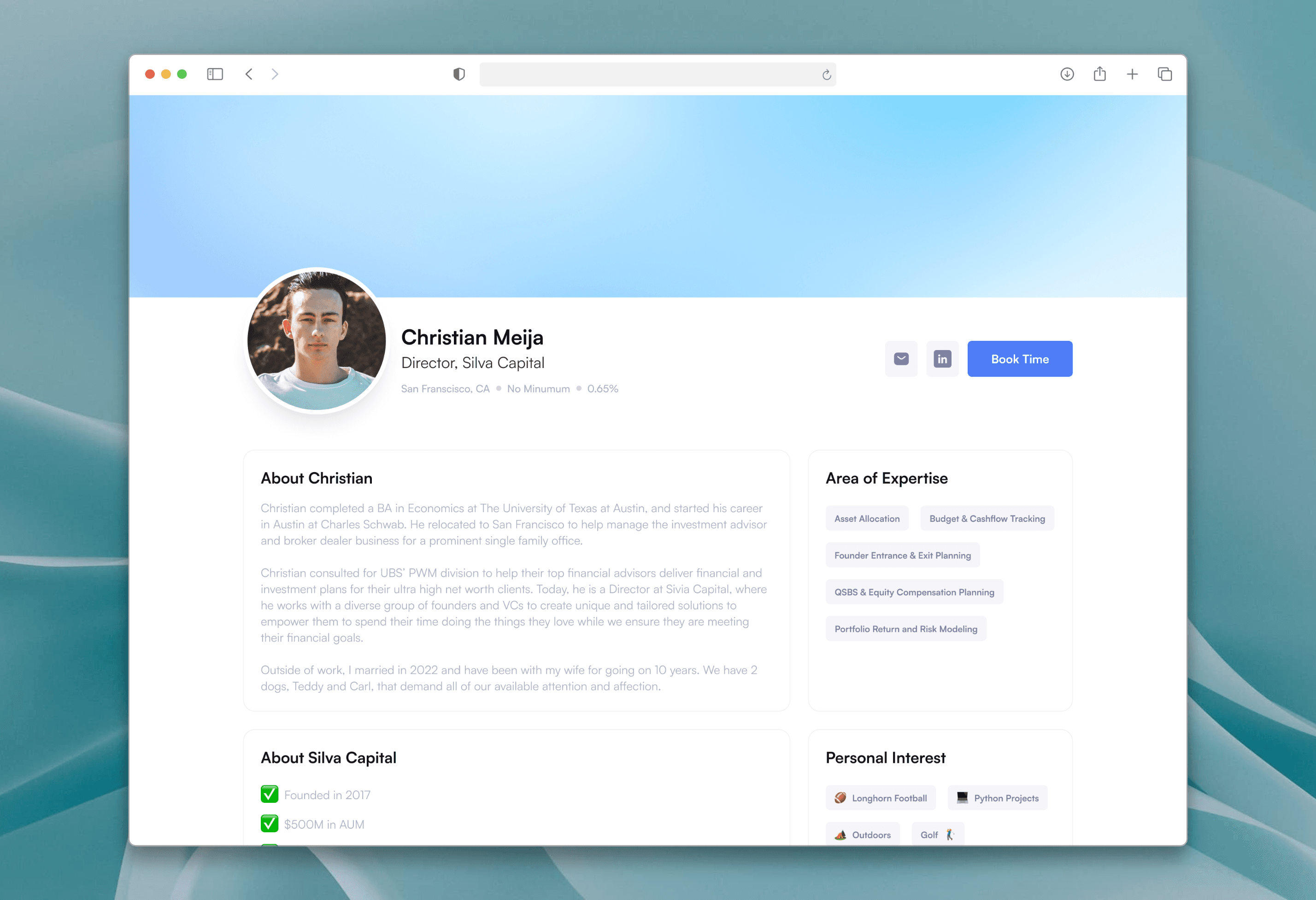
This was the earliest iteration of the design. At this stage, I was figuring out what worked and what didn’t, focusing mainly on layout. I aimed to find the best way to categorize information and make it look clean and organized.
#Iteration2
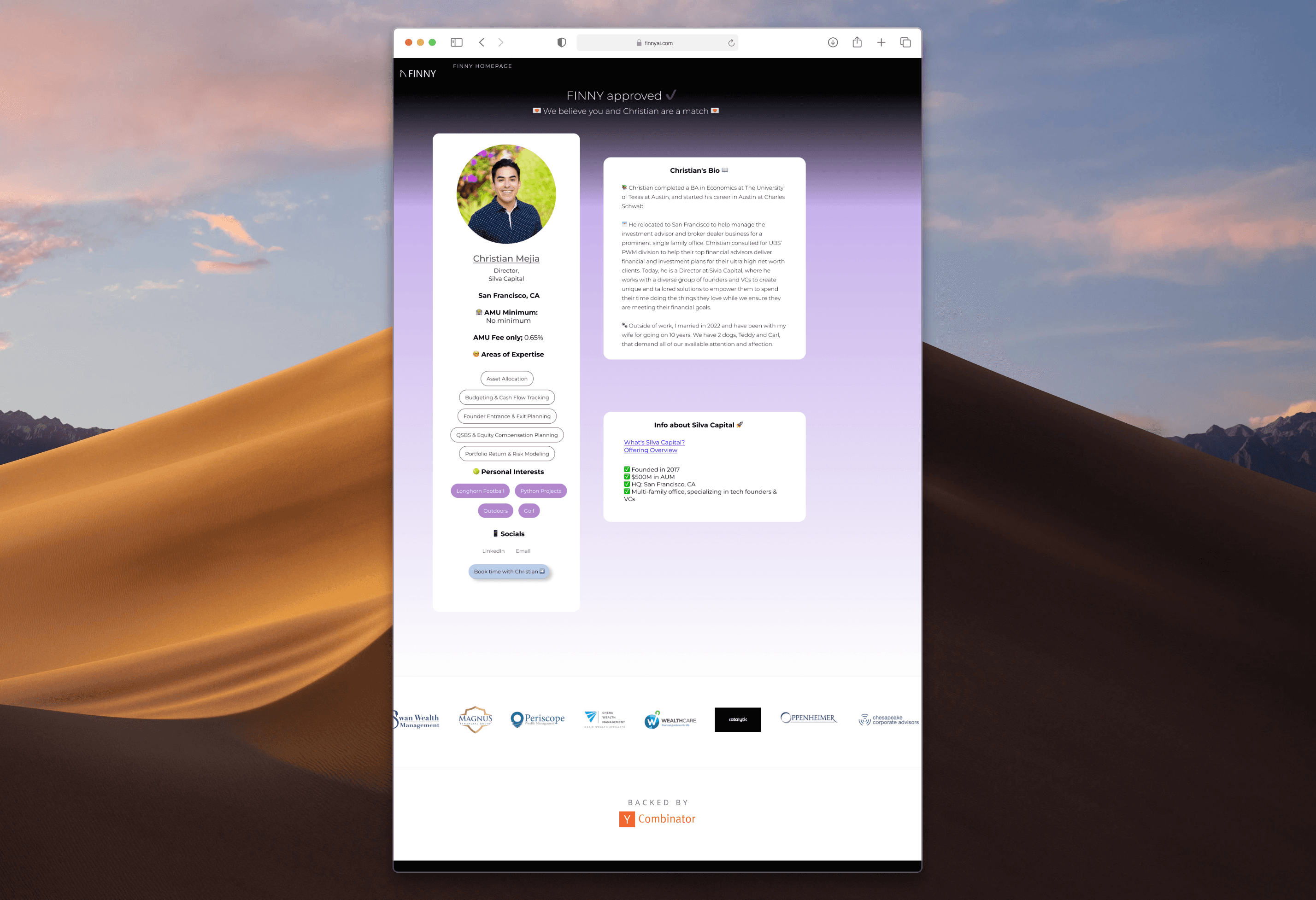
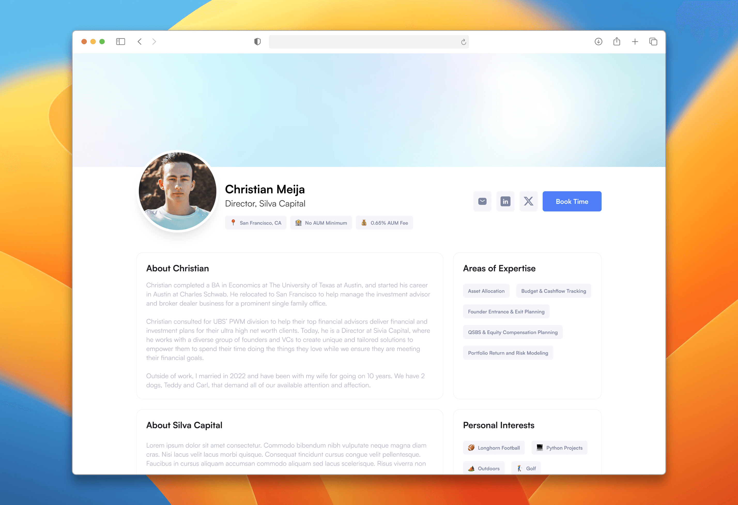
In the second iteration, I kept the box format from the previous design since it offered better information categorization. I experimented with the visual layout and even tried adding emojis to see if I could introduce a playful vibe.
Visuals
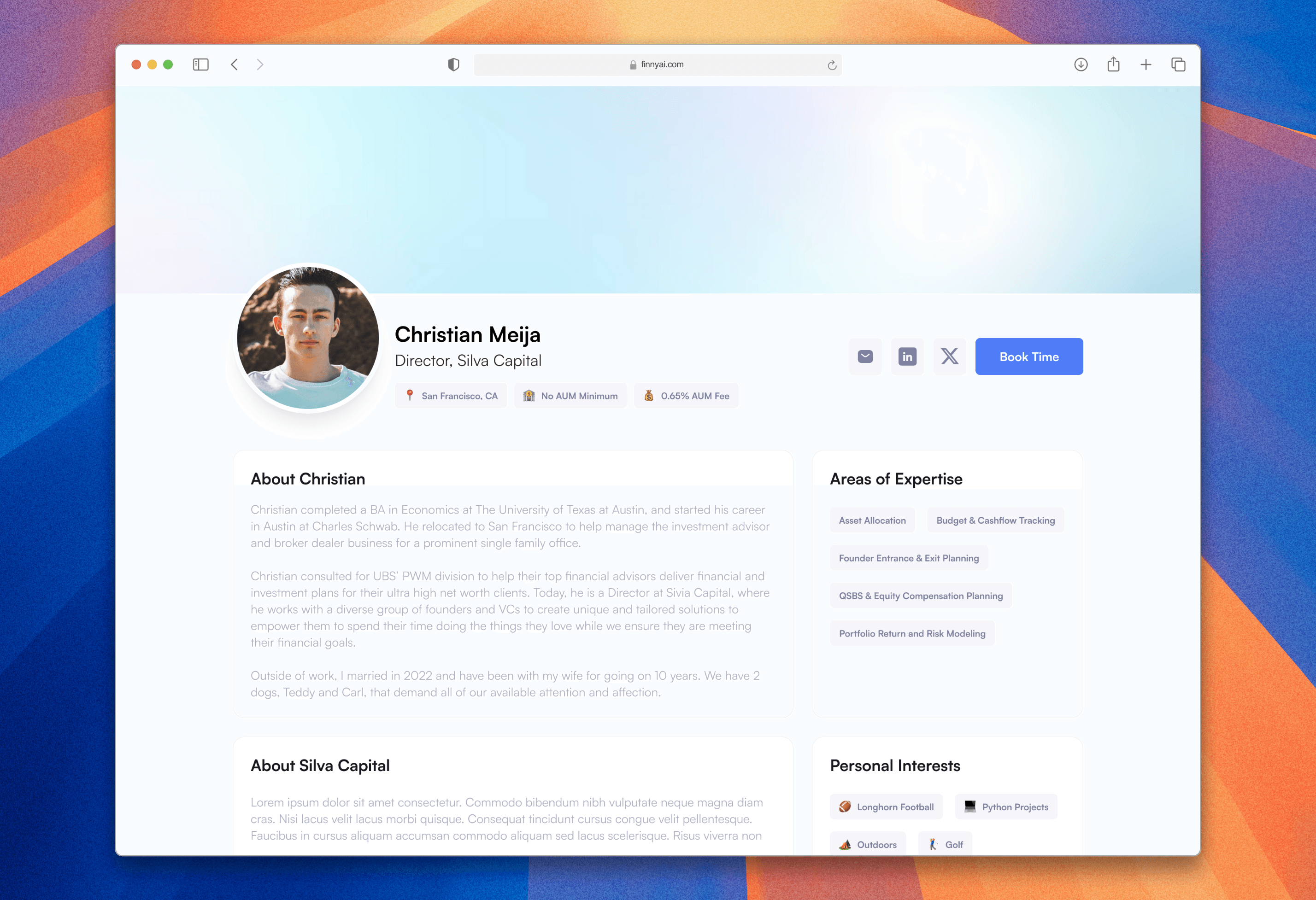
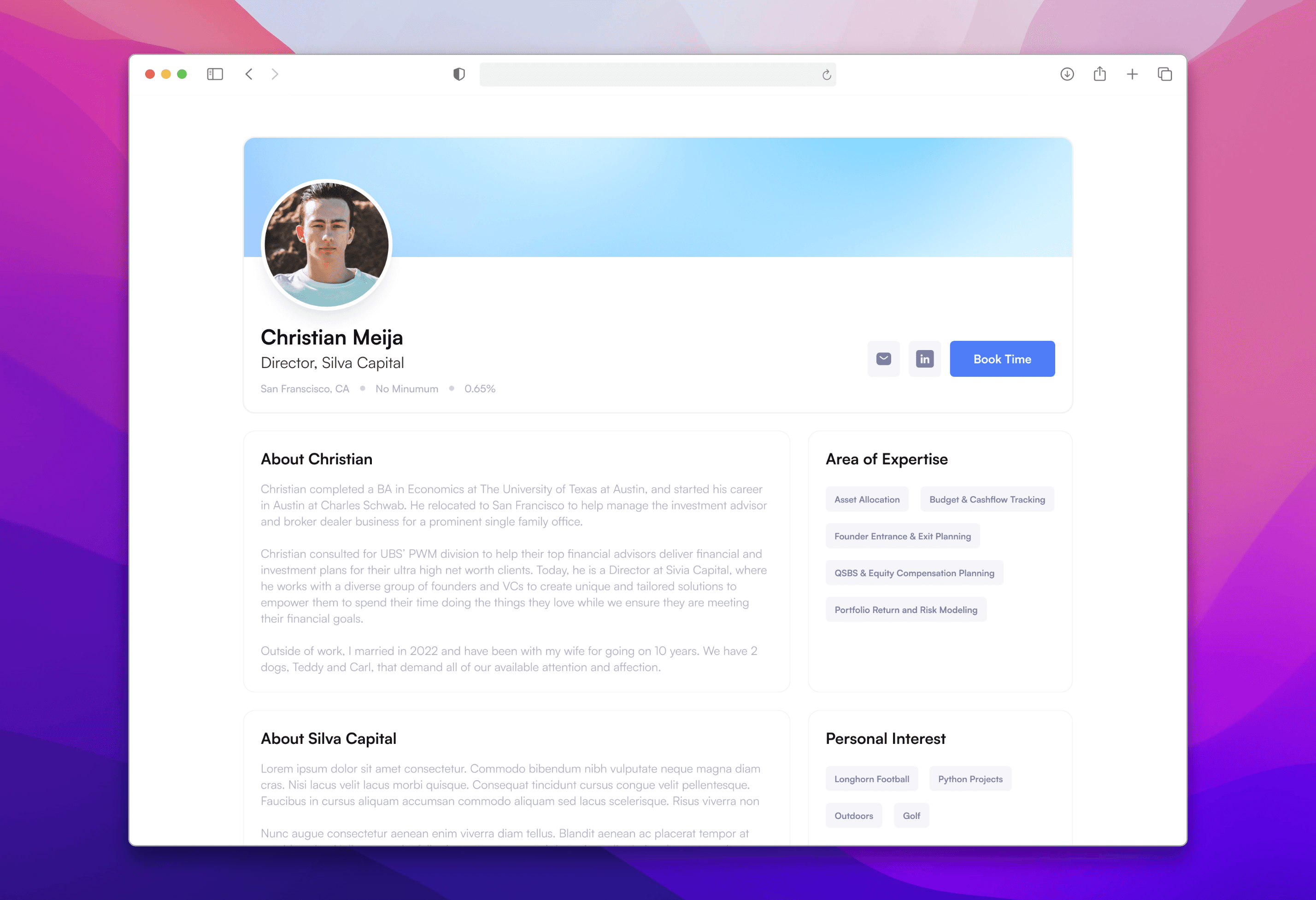
We've got something better
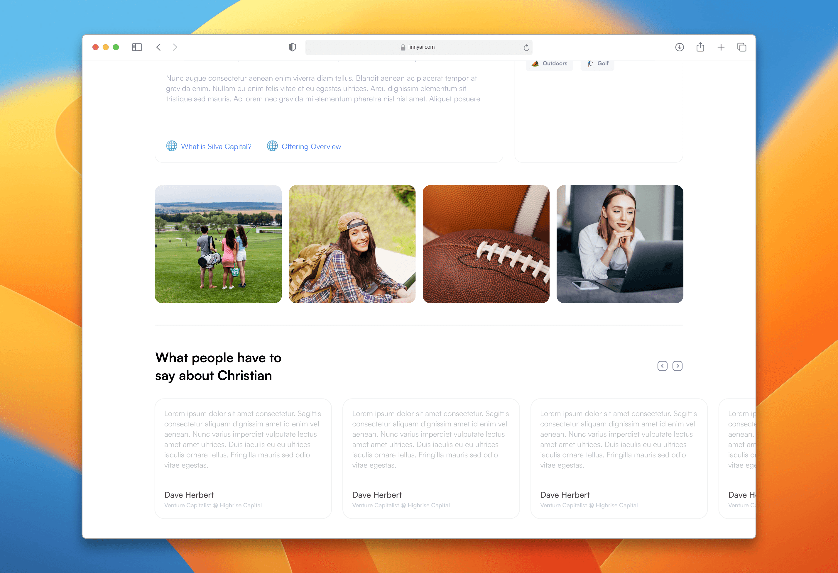
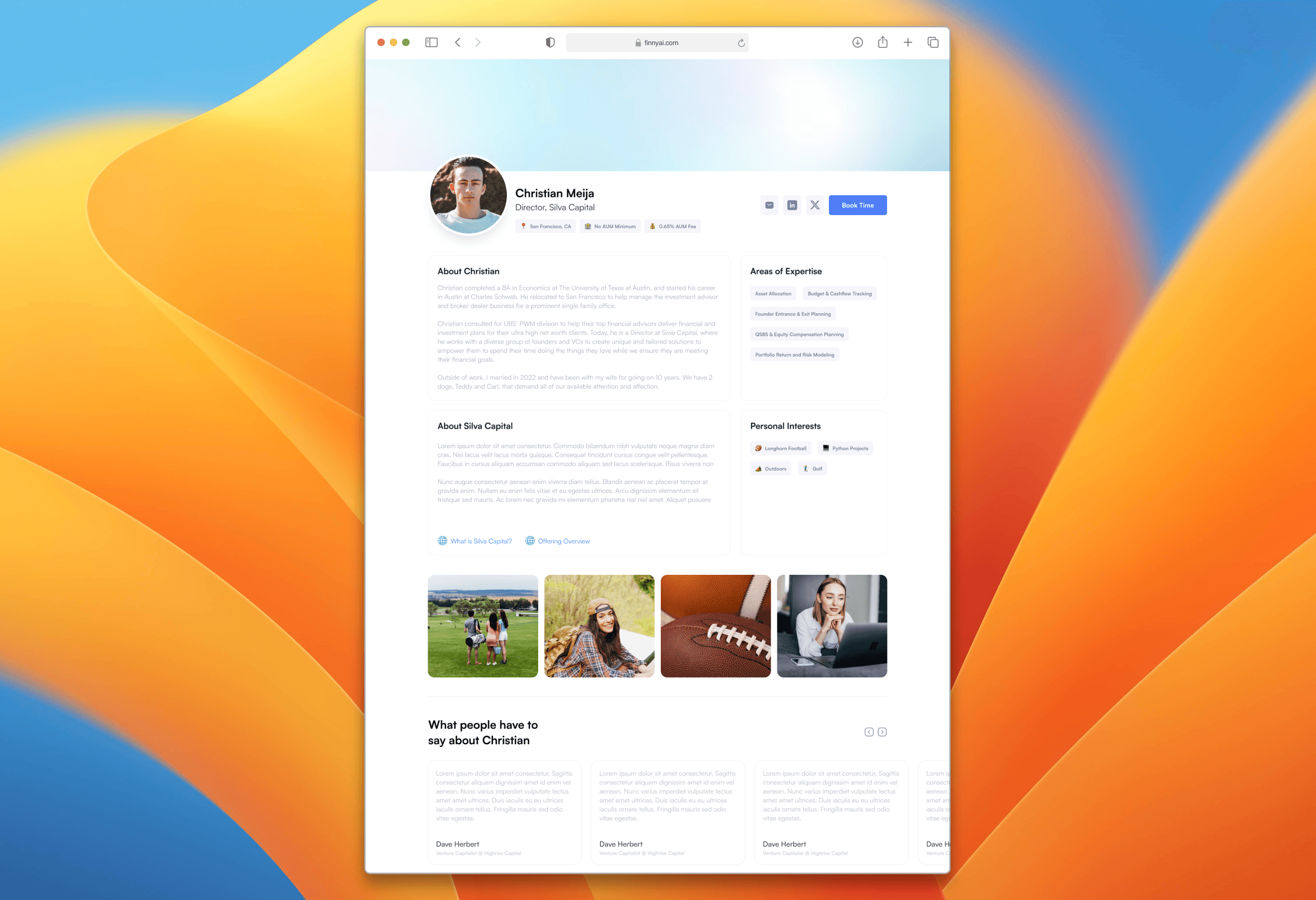
This shows the final design I went with, after incorporating feedback from the Finny team and following my own intuition.
Project Takeways
Working under tight deadlines requires a balance of speed and strategic thinking. Rapid iteration and quick decision-making are crucial for delivering high-quality designs efficiently.
Incorporating team feedback early on helps refine and improve the design. Collaboration and open communication are key to aligning the design with user needs and expectations.
Experimenting with different elements, like visual layouts and playful touches such as emojis, can enhance the design and make it more engaging. Being open to creative experimentation can lead to innovative solutions.
