KOOHA
Kooha App - User Panel
My Role
Product Designer — Feature Scoping, Visual Design, Prototyping
Team
Deborah, Mobile Dev
Semilore, Backend Engineer
Timeline & Status
6months x 🧋🧋
Overview
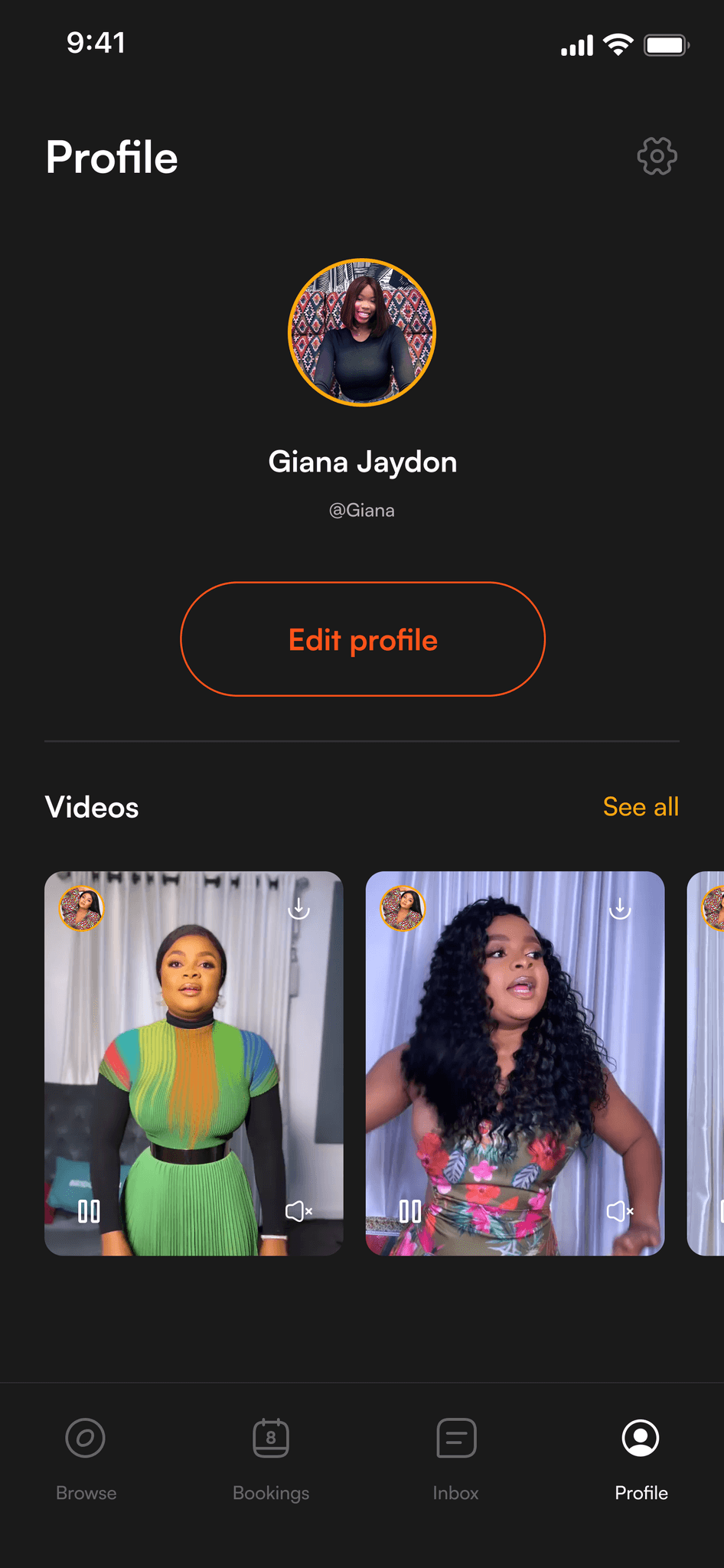
Kooha is a platform where users can request personalized video messages from their favorite celebrities. With a diverse marketplace, users can choose celebrities, specify message details, and receive custom videos for various occasions.
Context
For Context
In 2023, I joined Kooha to help build a platform where fans can get personalized videos from their favorite stars. The previous designer had already laid down a solid foundation with research and user flows, so I hopped straight into the wireframes and visuals.
My focus was on translating all that research into designs that were fun and easy to use. With fresh ideas and great teamwork, we fine-tuned the app’s features to create a smooth, engaging experience for our users.
audience
Who are we building for
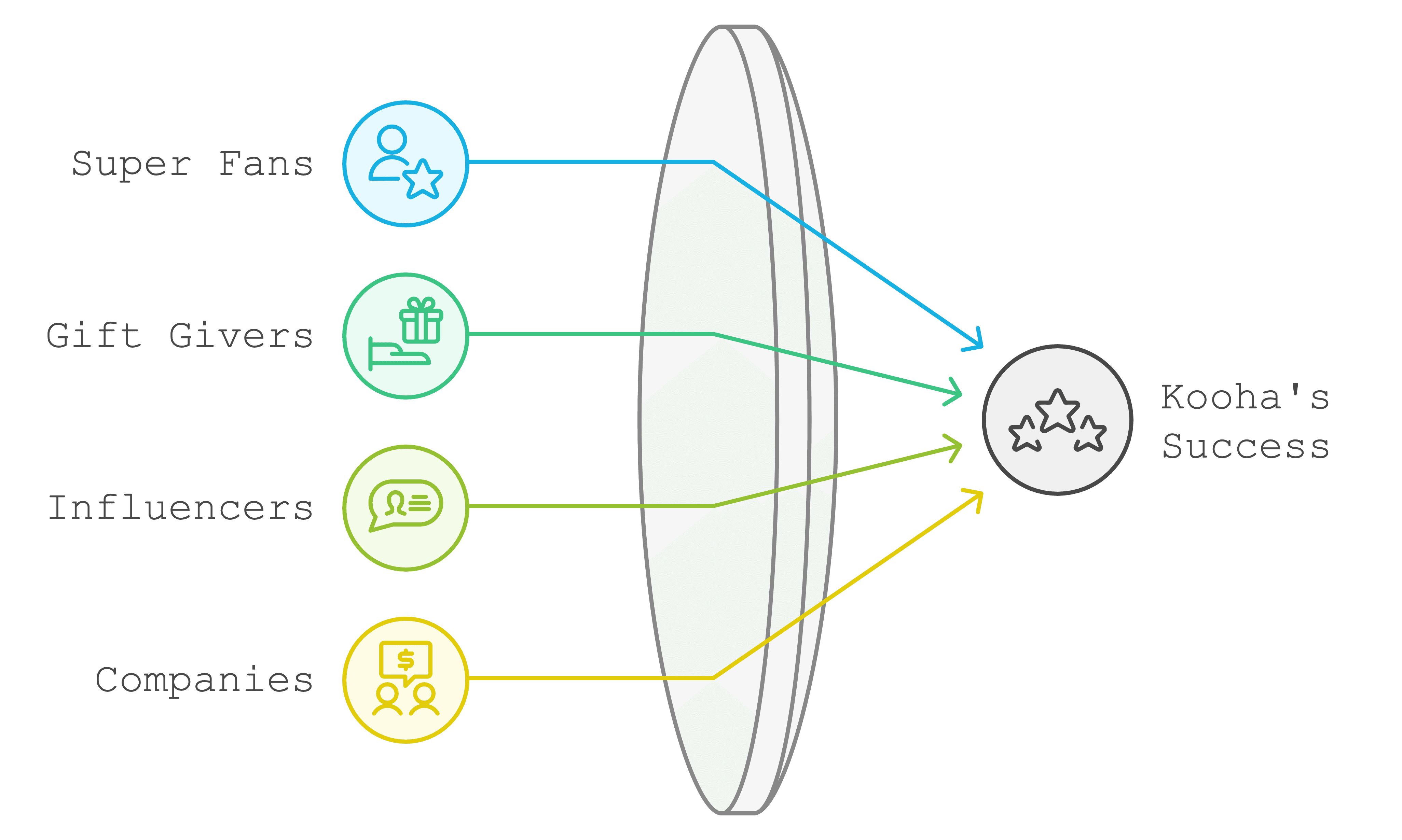
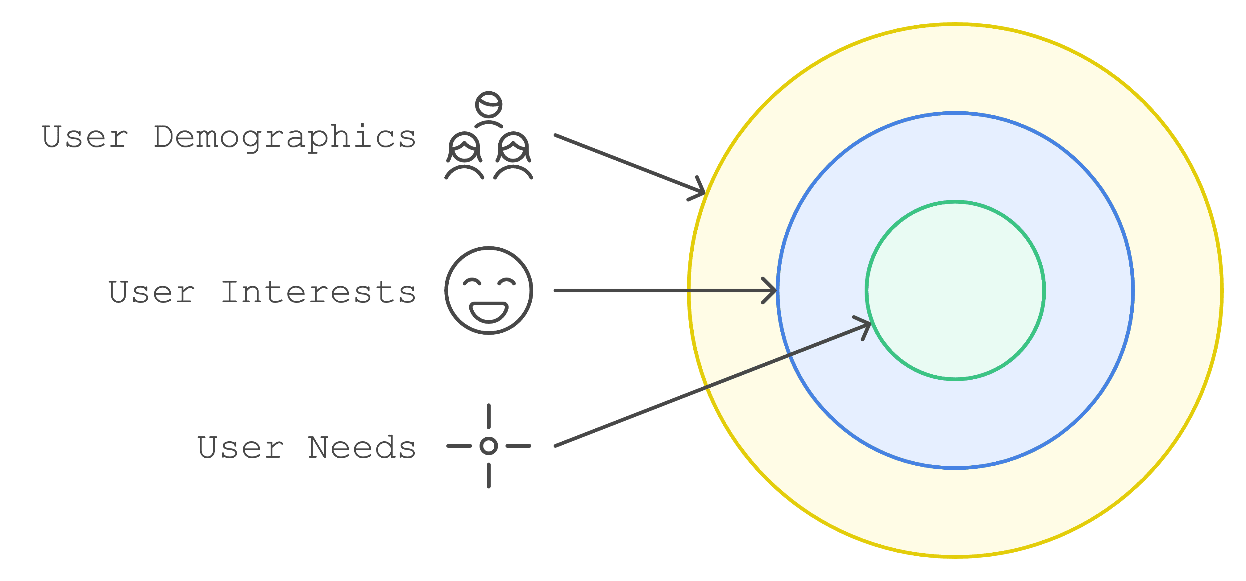
To truly understand who we’re building Kooha for, I sat down with the product manager to dive into our target audience, and we identified a few key categories of fans who would be excited to use a platform that brings them closer to their favorite stars.
Each of these personas represents a unique segment of our audience, showcasing their interests, goals, and what they’re looking for in an experience.
This personas represents the lowest common denominator. If we can build an experience that can get this people into control, we can get almost anyone in control.
audience
Understanding our users better
To really get into the minds of our users, I worked with our team to set up interviews with 12 potential Kooha users. We wanted to hear real stories and experiences, so we created casual but focused conversations with people who might use our platform.
Our interviewees were a diverse bunch - from young students in Lagos to established professionals in Abuja, ranging from 18 to 45 years old. Most of them were active social media users who followed their favorite celebrities closely, and they had the means to spend on entertainment and digital services.
During these chats, we focused on understanding three main things:
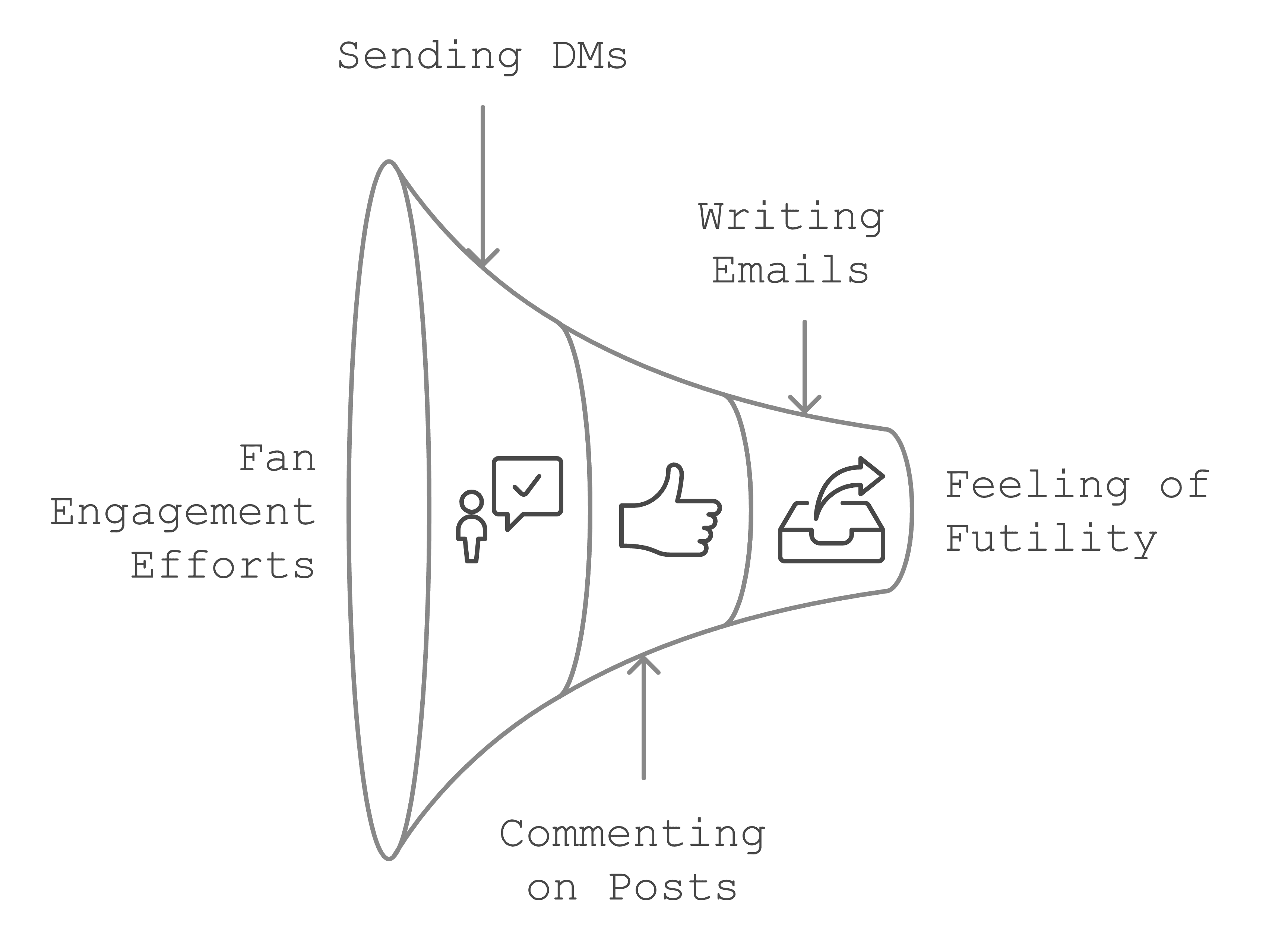
How they currently try to connect with their favorite celebrities (mostly through social media comments and DMs)
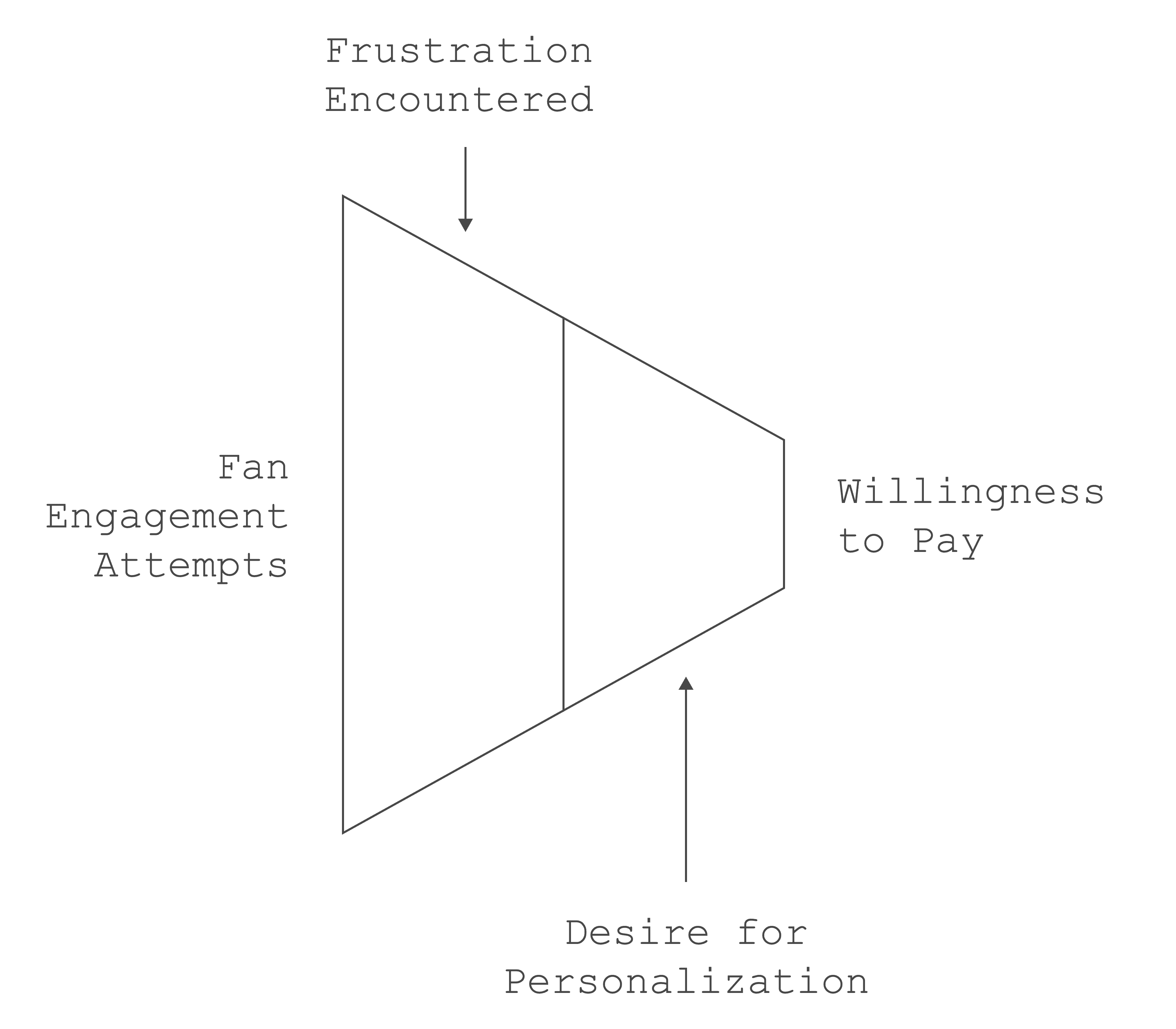
What frustrations they face when trying to reach these stars
What would actually convince them to pay for a personalized video message
These conversations were eye-opening. One interviewee shared, "I've been commenting on my favorite artist's posts for years, but I've never gotten a response." Another mentioned, "I'd love to get a birthday message from Johnny Drille for my sister, but I don't know how to make that happen."
audience
Making Sense of User Feedback
To make sense of all these conversations, I organized feedback into clear patterns using affinity mapping. Think of it like sorting through a big puzzle. we grouped similar comments and experiences together until we could see the bigger picture.
This helped us spot the most common pain points and ensure we were solving real problems that most users faced, not just individual complaints.
This structured approach to analyzing feedback helped us move forward with confidence, knowing we were tackling the right problems. Plus, having these clear patterns made it easier to prioritize which features to tackle first.
audience
What We Discovered
Our conversations with users revealed some clear challenges that needed solving. Each person we talked to brought unique perspectives, but certain pain points kept coming up again and again.
The biggest frustration? Actually reaching celebrities. Almost 8 out of 10 users we spoke with felt that their favorite stars were simply out of reach. "I've tried everything," one user told us. "I send DMs, comment on posts, even write emails - but it feels like shouting into the void." The traditional ways of connecting with celebrities just weren't working for most fans.
Trust was another big concern that surfaced in our talks. Many users (about 65%) were worried about getting scammed by fake celebrity accounts - a valid concern in today's digital world. "How do I know the video I'm getting is actually from the celebrity?" was a question we heard repeatedly. People wanted to be sure they were getting authentic content from their favorite stars.
When it came to payments, we hit upon another crucial insight. The vast majority of our potential users (82%) strongly preferred using local payment methods they were familiar with. "I don't feel comfortable using international payment platforms," was a common sentiment. Users wanted the convenience of paying through methods they already knew and trusted.
Solution
Getting the fixes in
After uncovering these challenges, it was clear we needed to focus on creating moments that would make users feel confident and comfortable throughout their journey. Each step of the booking process needed to address those concerns about accessibility, trust, and payment that our users shared with us.
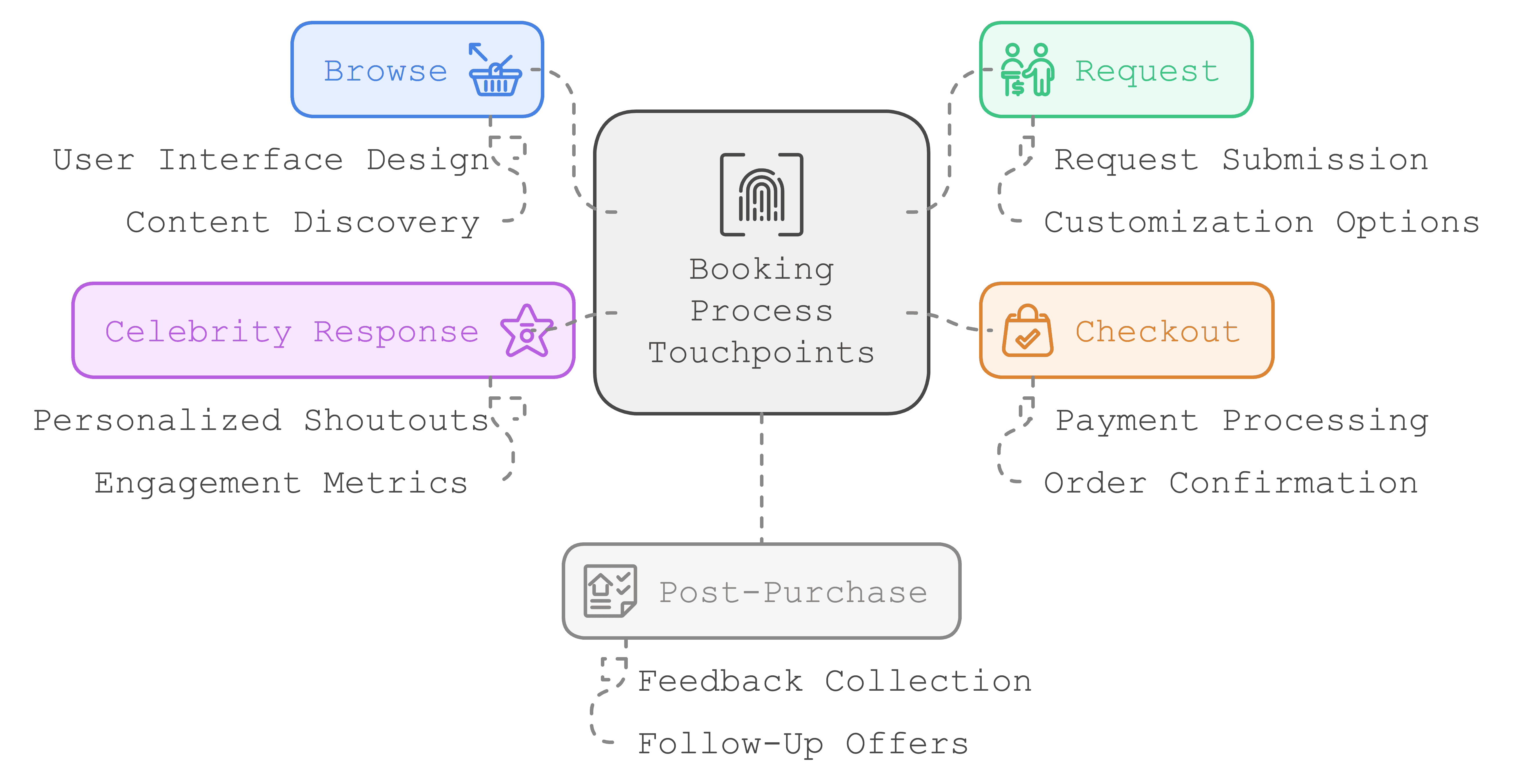
Looking at the entire user journey, we identified four key moments where we could make or break the user's experience:
When users are searching for their favorite celebrity
When they're crafting their personalized video request
During the payment process
When they finally receive and share their video
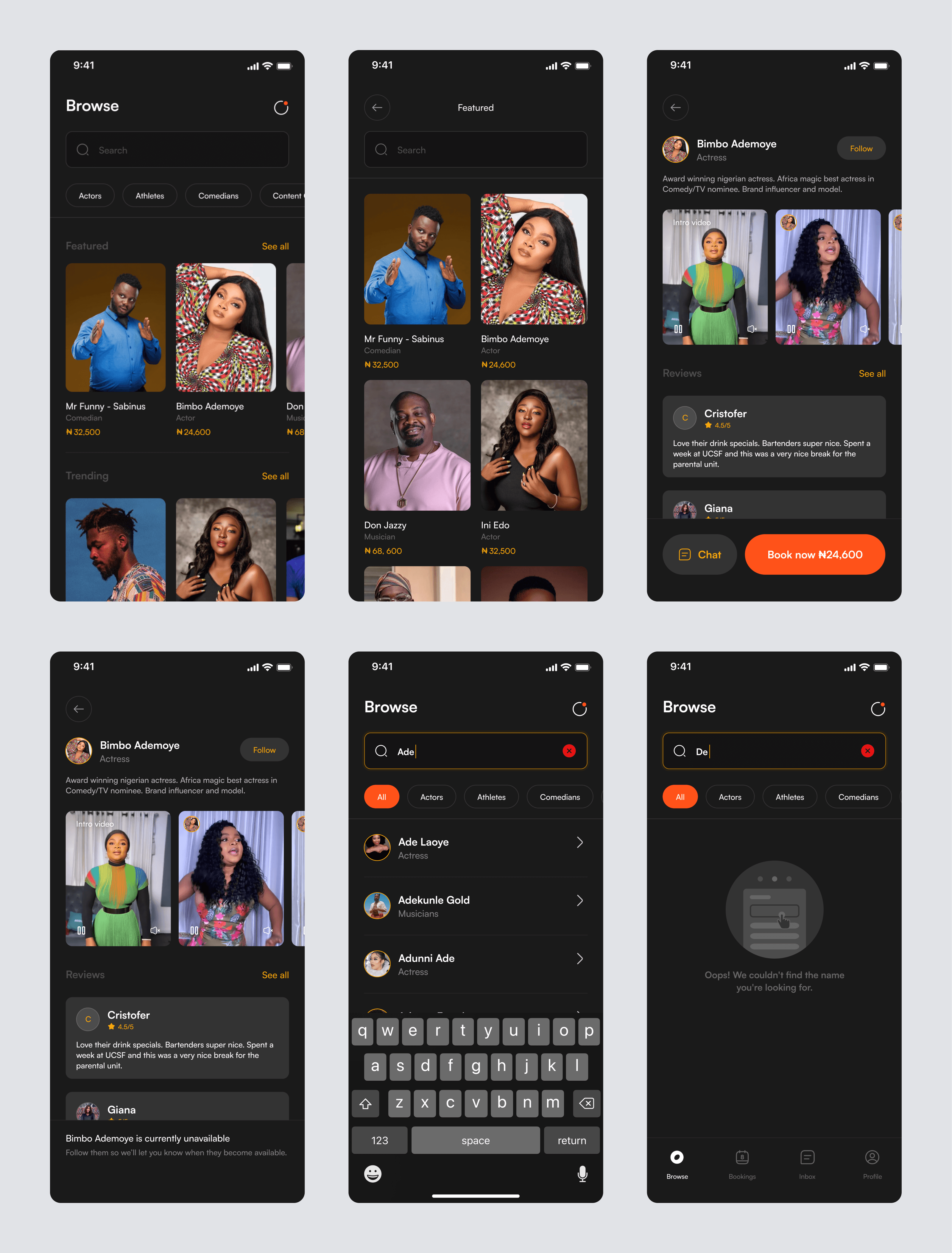
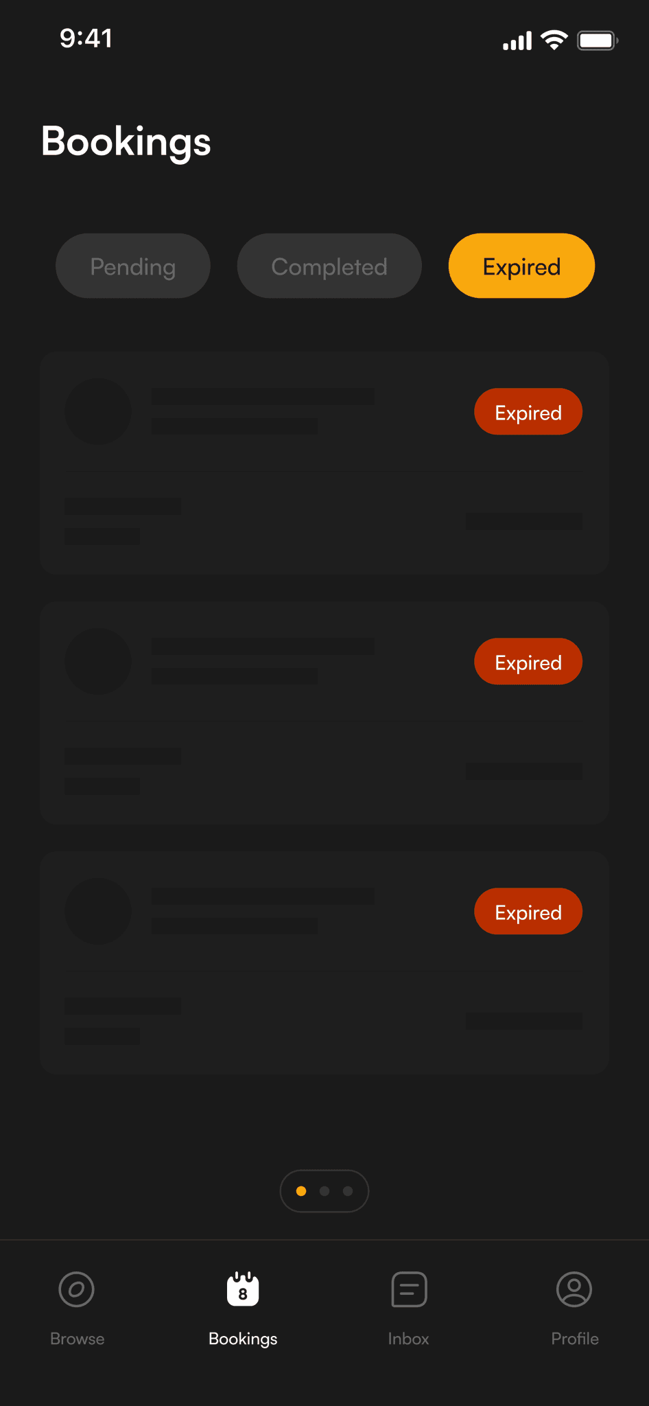
Browse (Searching for a celebrity)
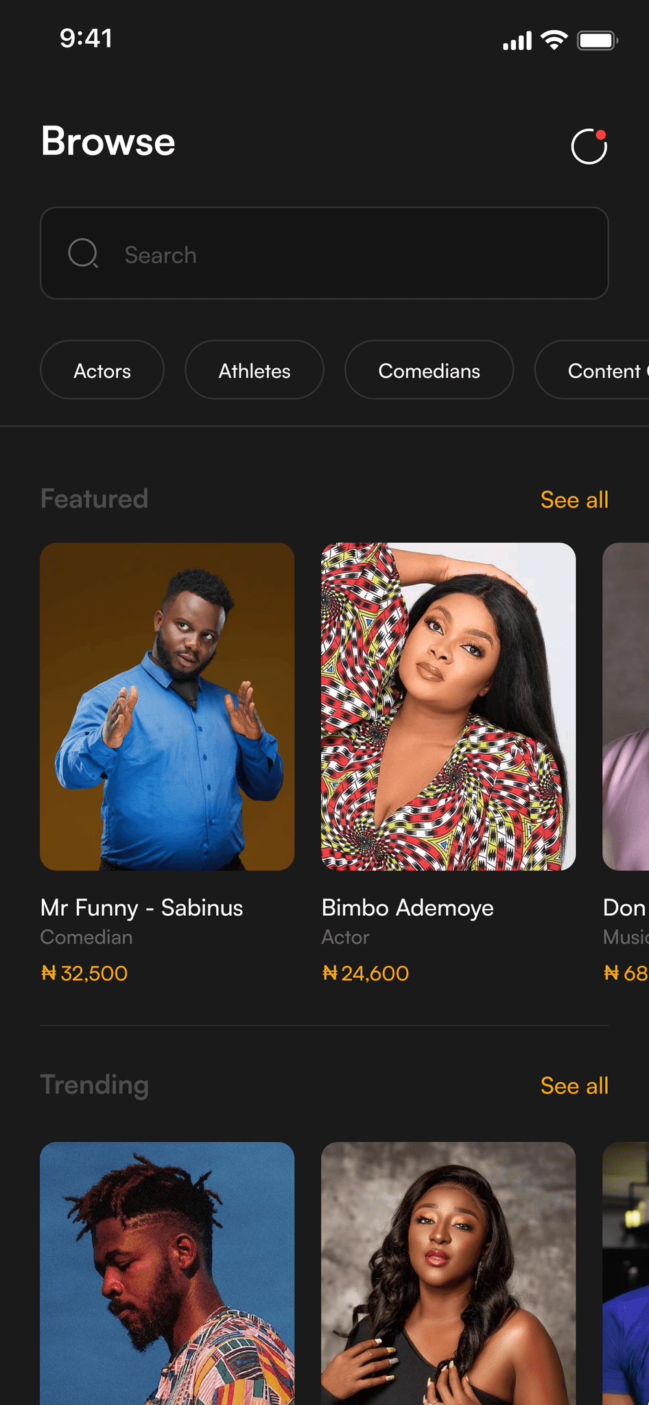
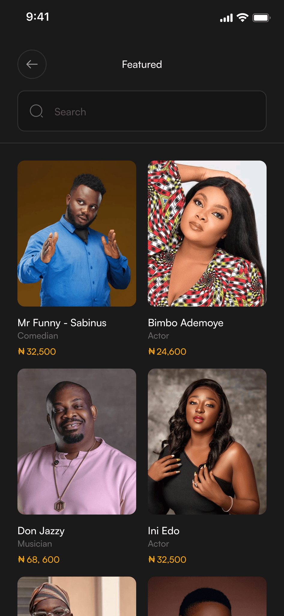
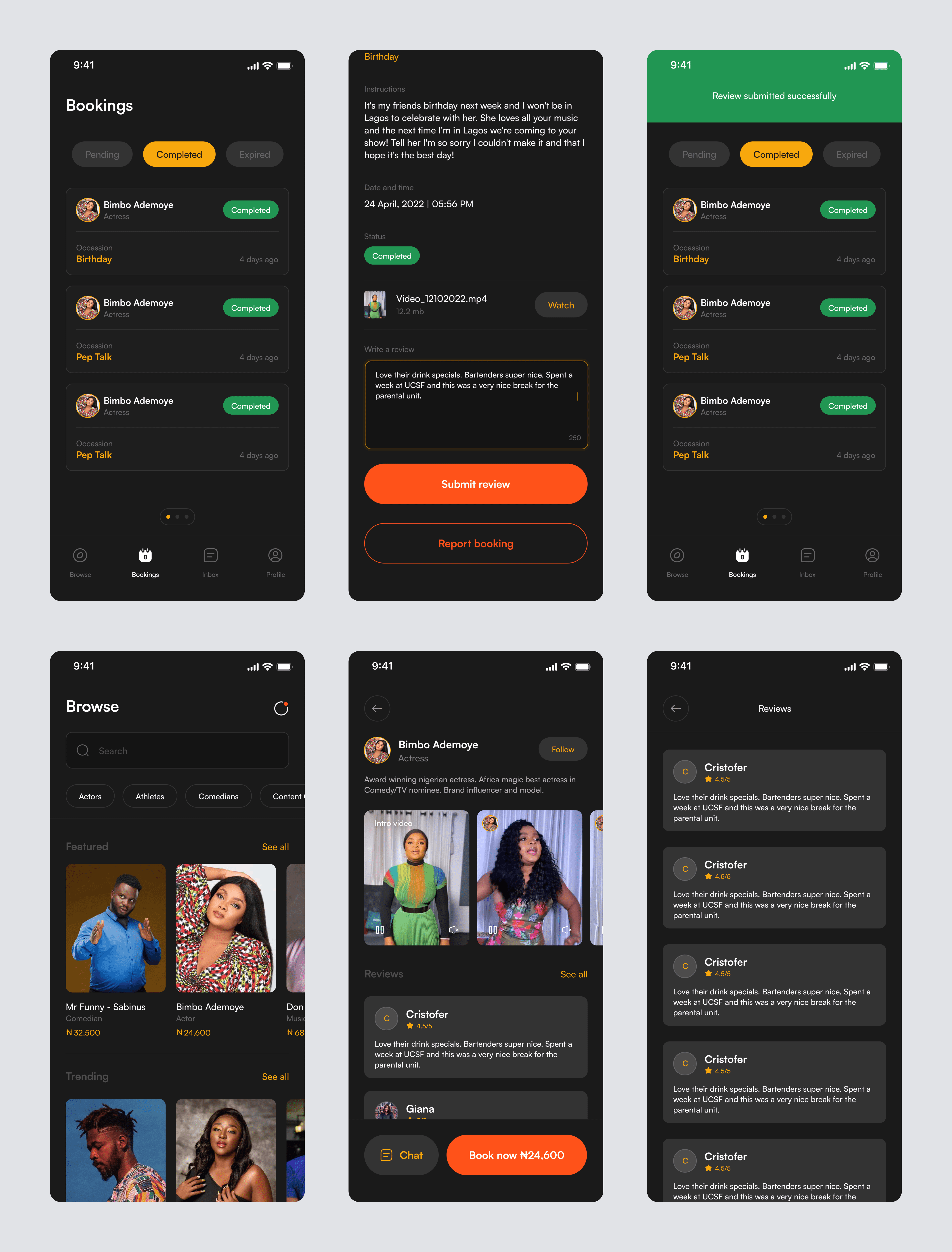
The first challenge was making celebrities easily discoverable. Our user research showed that fans were frustrated with how hard it was to reach their favorite stars, so we knew this first impression had to be perfect.
I designed the browse experience to feel like flipping through a curated magazine of stars. The search feature comes with smart suggestions that pop up as you type – kind of like having a friend who knows exactly which celebrity you're thinking of.
I also added filters for different categories (actors, athletes, musicians, and more) so users could easily explore and discover new personalities they might be interested in.
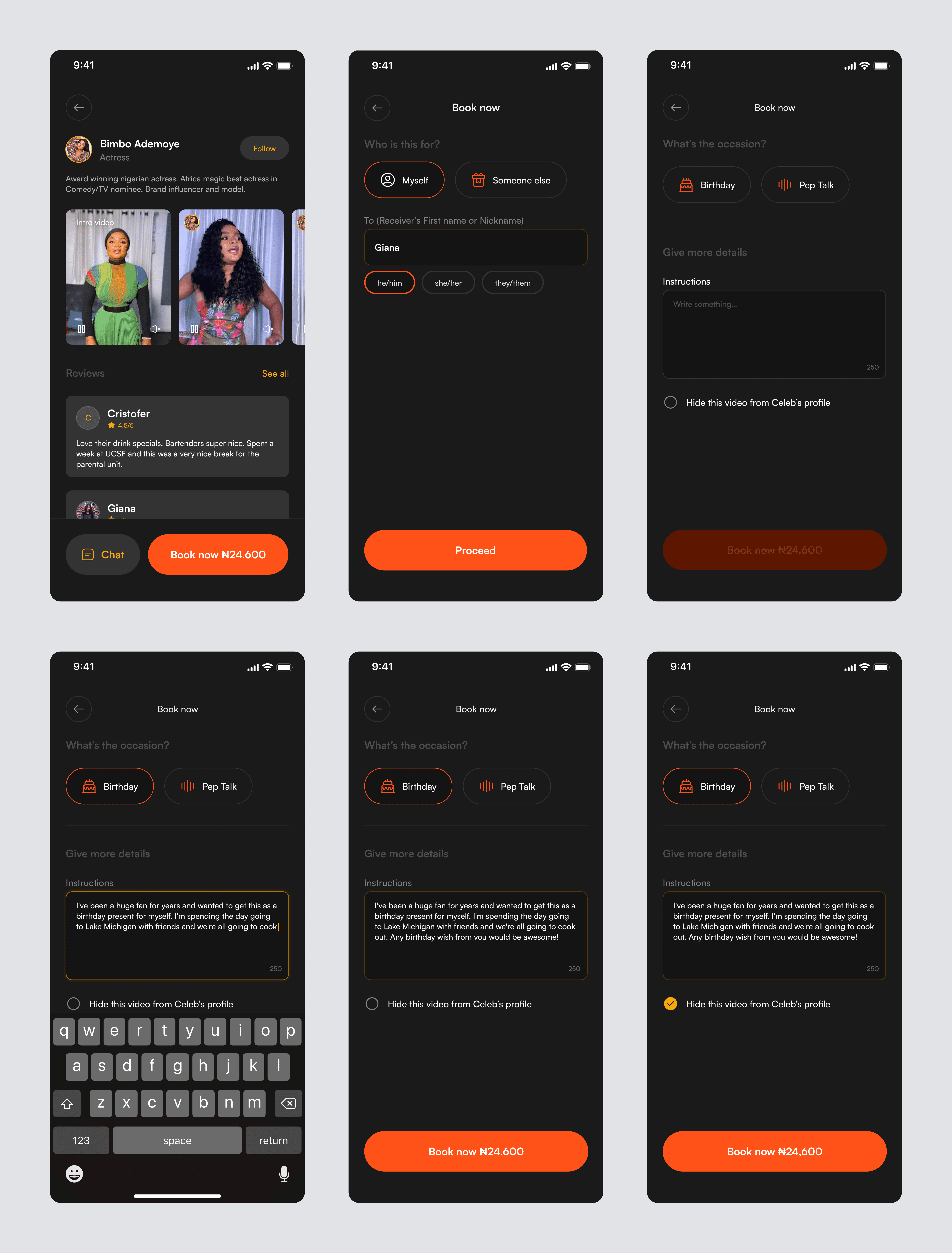
Request (Customizing the Video)
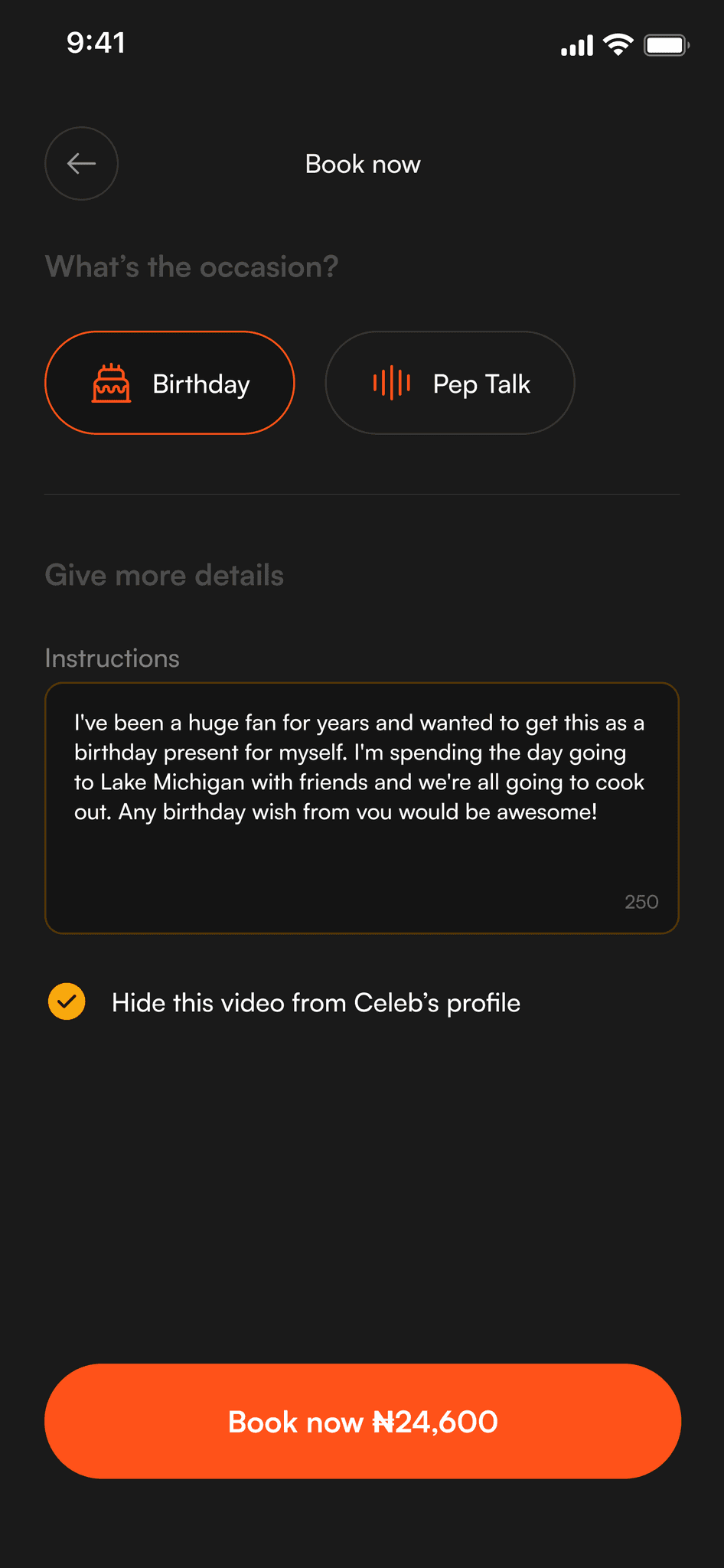
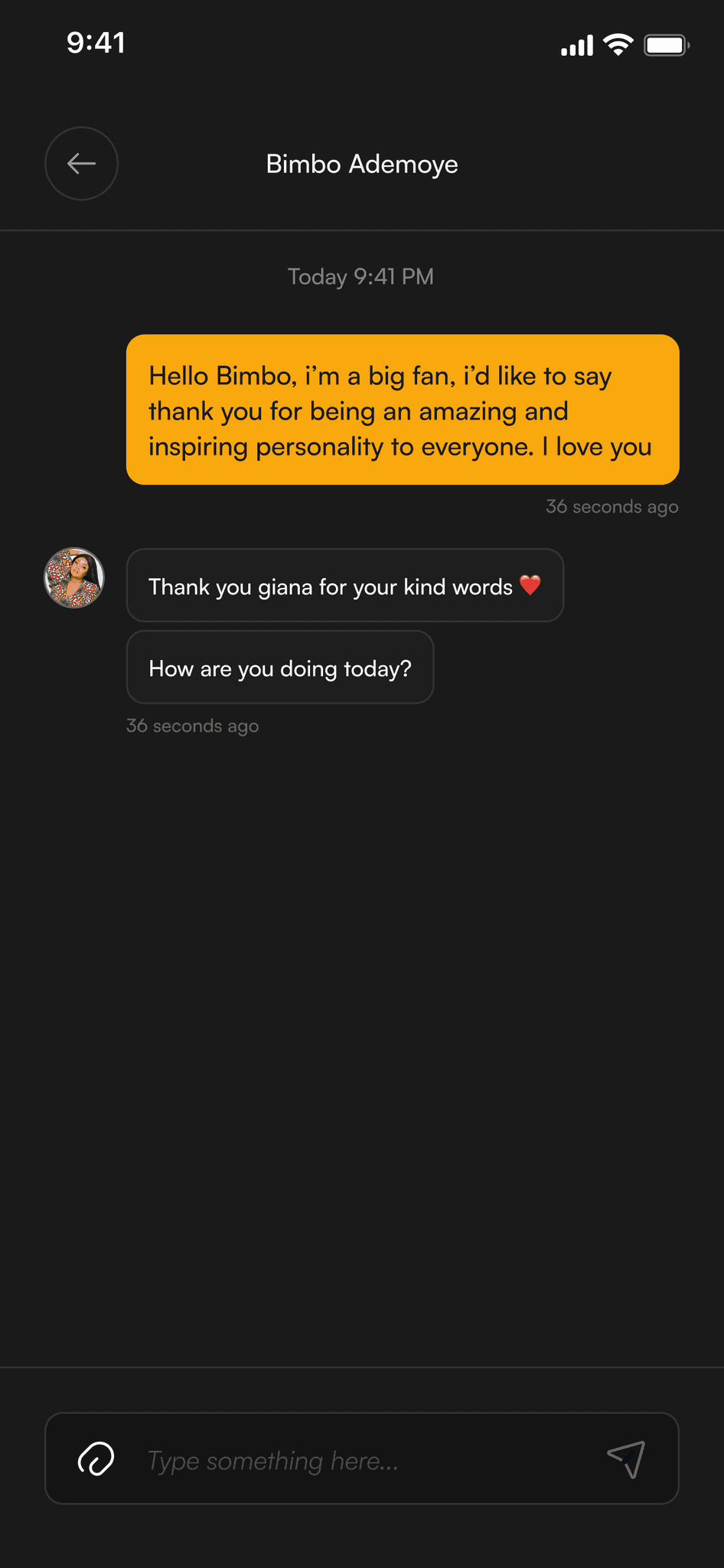
I wanted requesting a video to feel as easy as sending a message to a friend. From our user chats, we learned that people often felt overwhelmed by long forms or weren't sure how to make their request special.
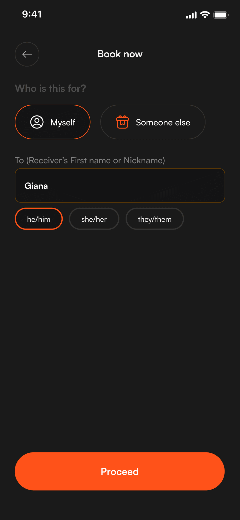
We kept the form simple but personal, breaking it down into clear steps like "What's the occasion?" and "Who's it for?" To help users along, we added example messages and helpful tips for each section.
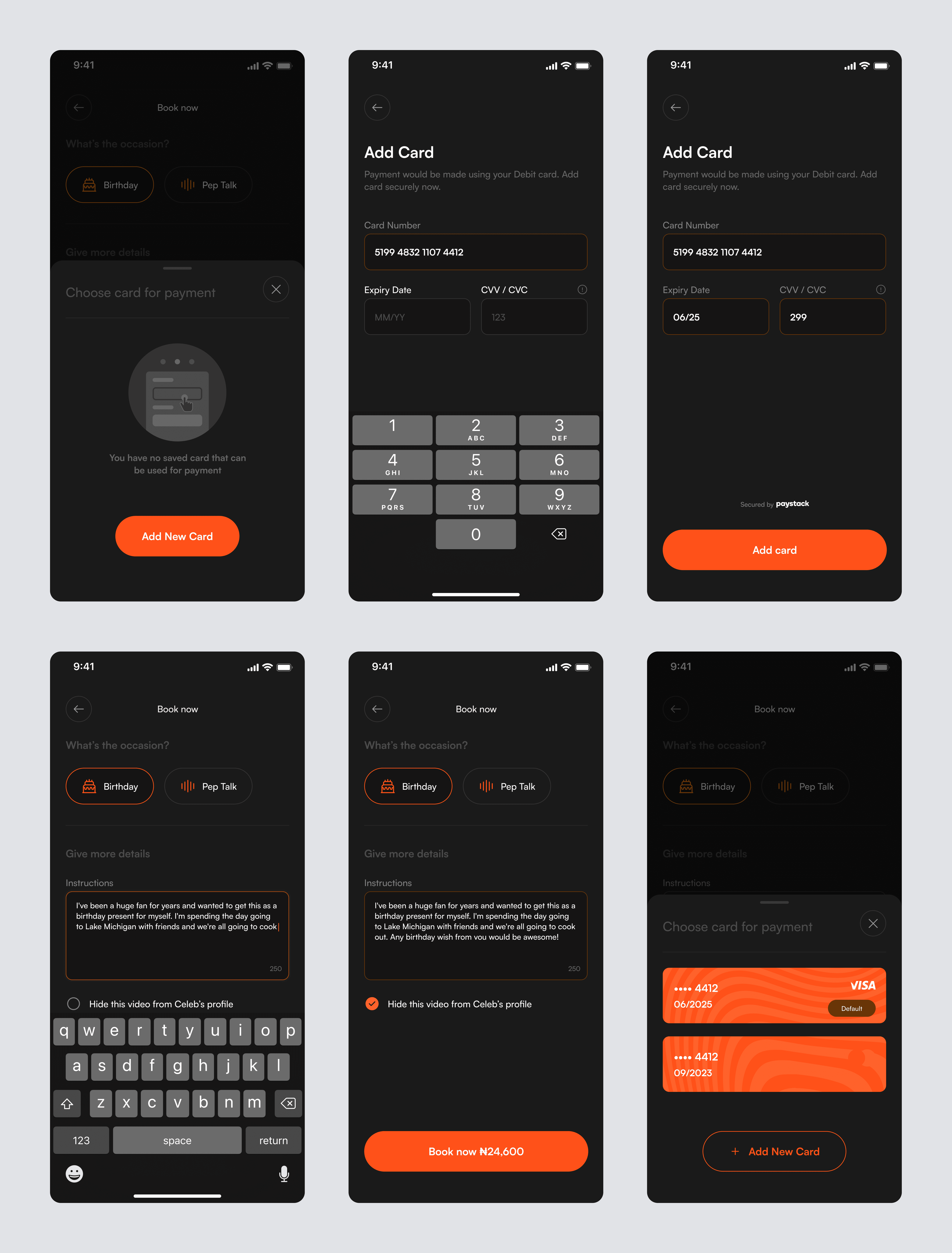
Checkout (Payment and Confirmation)
I wanted to make paying for videos as easy as buying from your favorite local store. Our research showed that users were hesitant about payment processes, particularly when it came to international platforms, so we focused on making it feel familiar and secure.
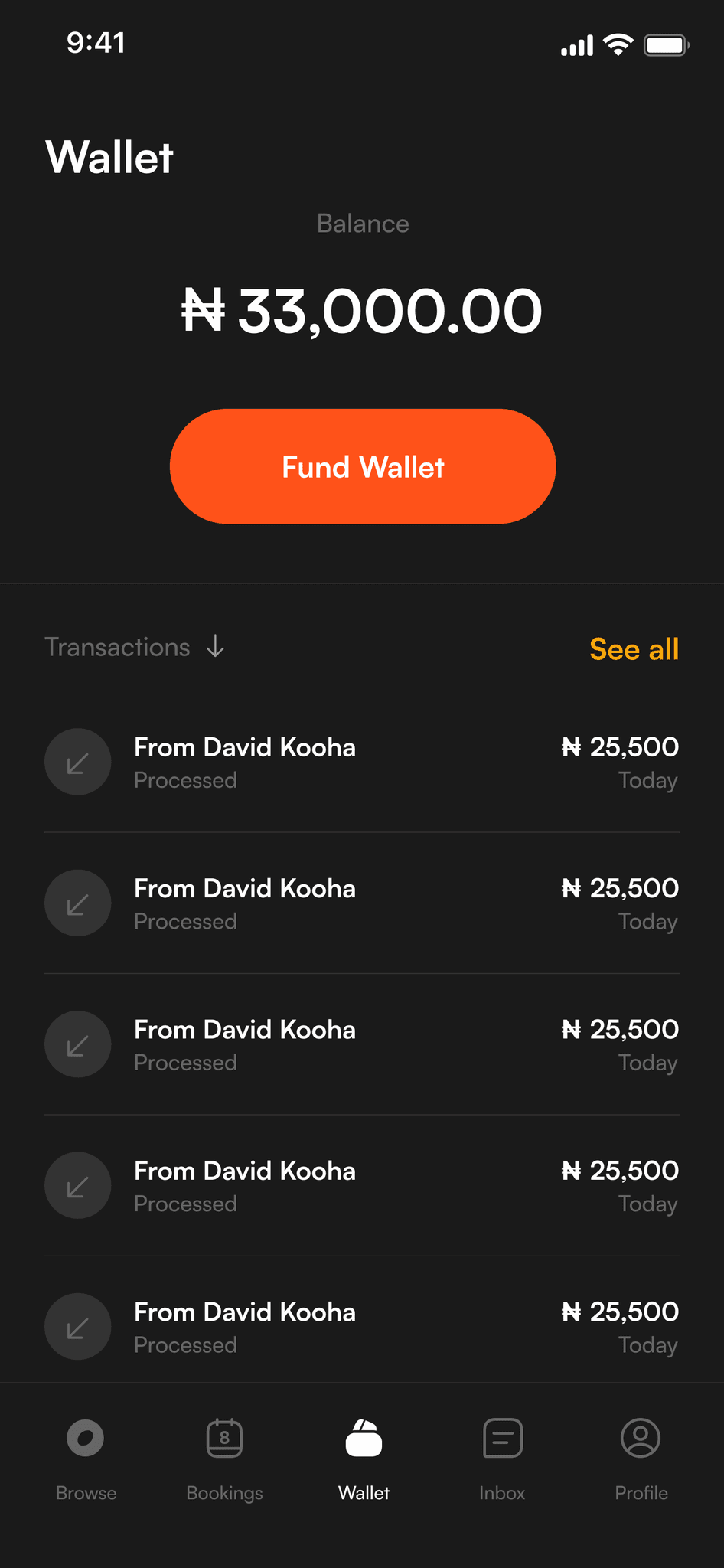
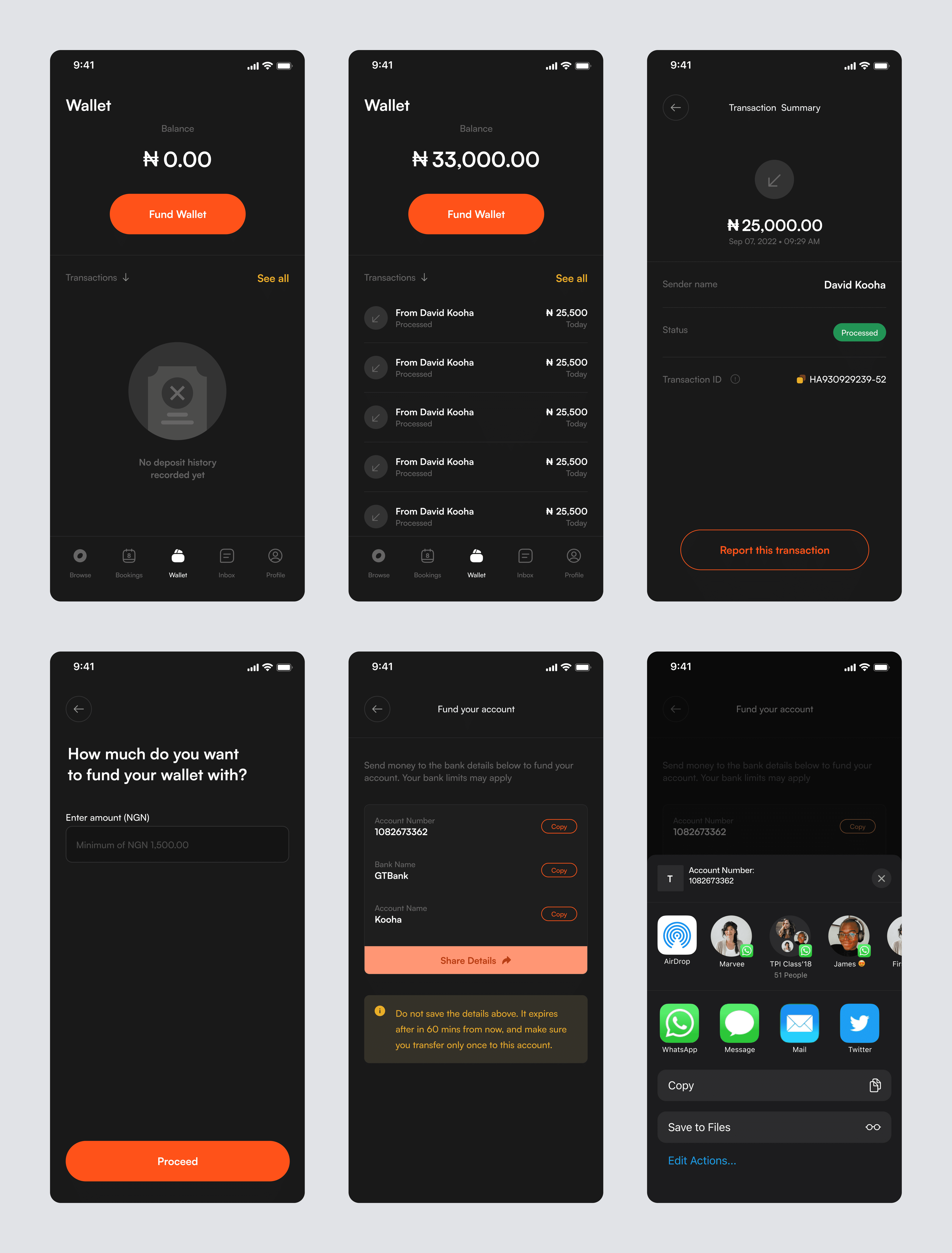
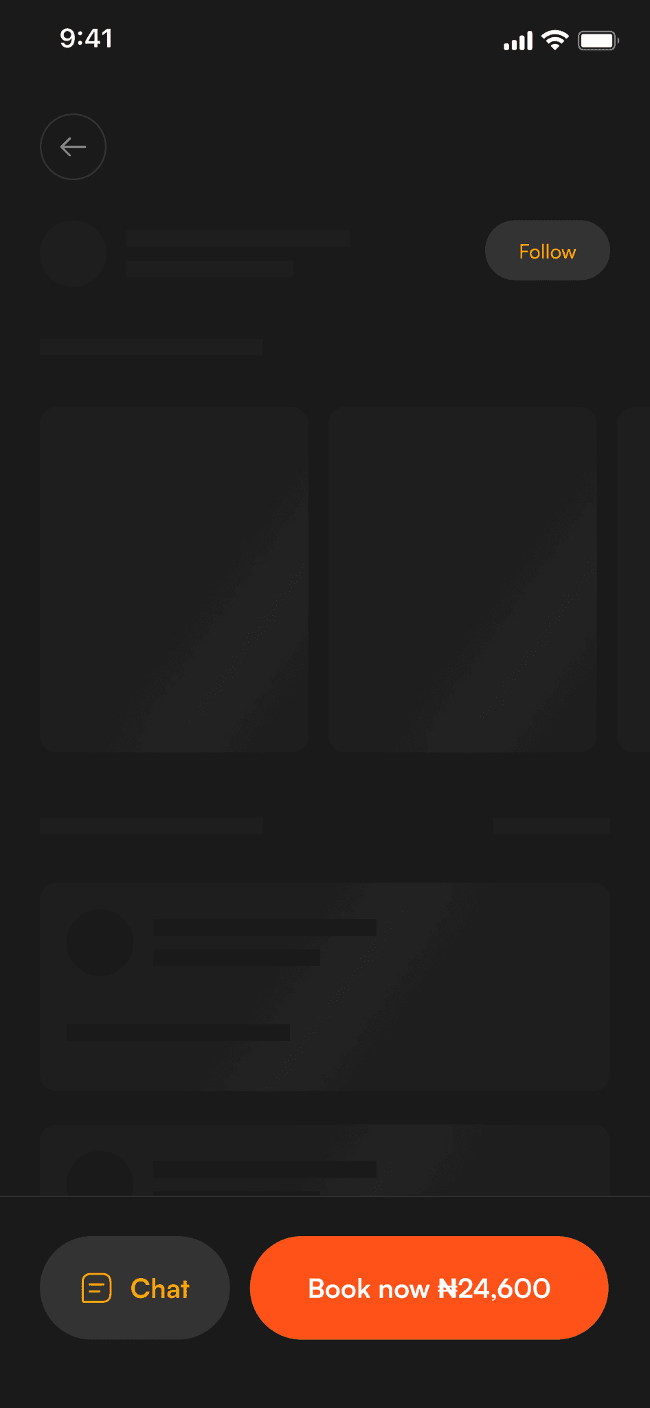
We kept the checkout flow clean and simple, cutting out any unnecessary steps. Users could pay directly with their cards, but we also added a wallet feature for added convenience. This meant users could store money in their wallet upfront and book videos whenever they wanted, without having to pull out their card each time. This simple change made the whole payment experience feel more local and trustworthy.
The wallet feature became our little game-changer. Users could add money to their account once and then book videos whenever inspiration struck, without the hassle of entering card details over and over. We kept the design clean and straightforward, making the whole payment process feel as natural as sending money to a friend. This meant users could focus on what really mattered – getting that perfect video from their favorite celebrity.
Celebrity Response (Delivery of the Video)
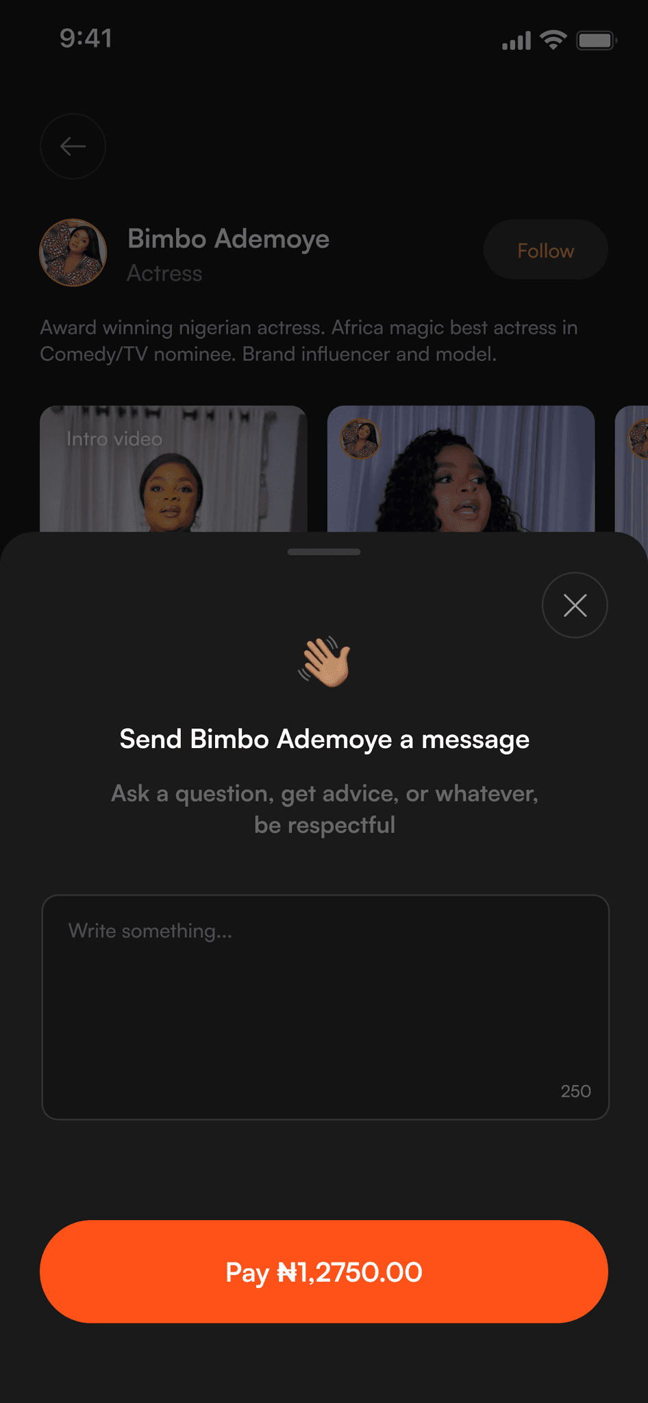
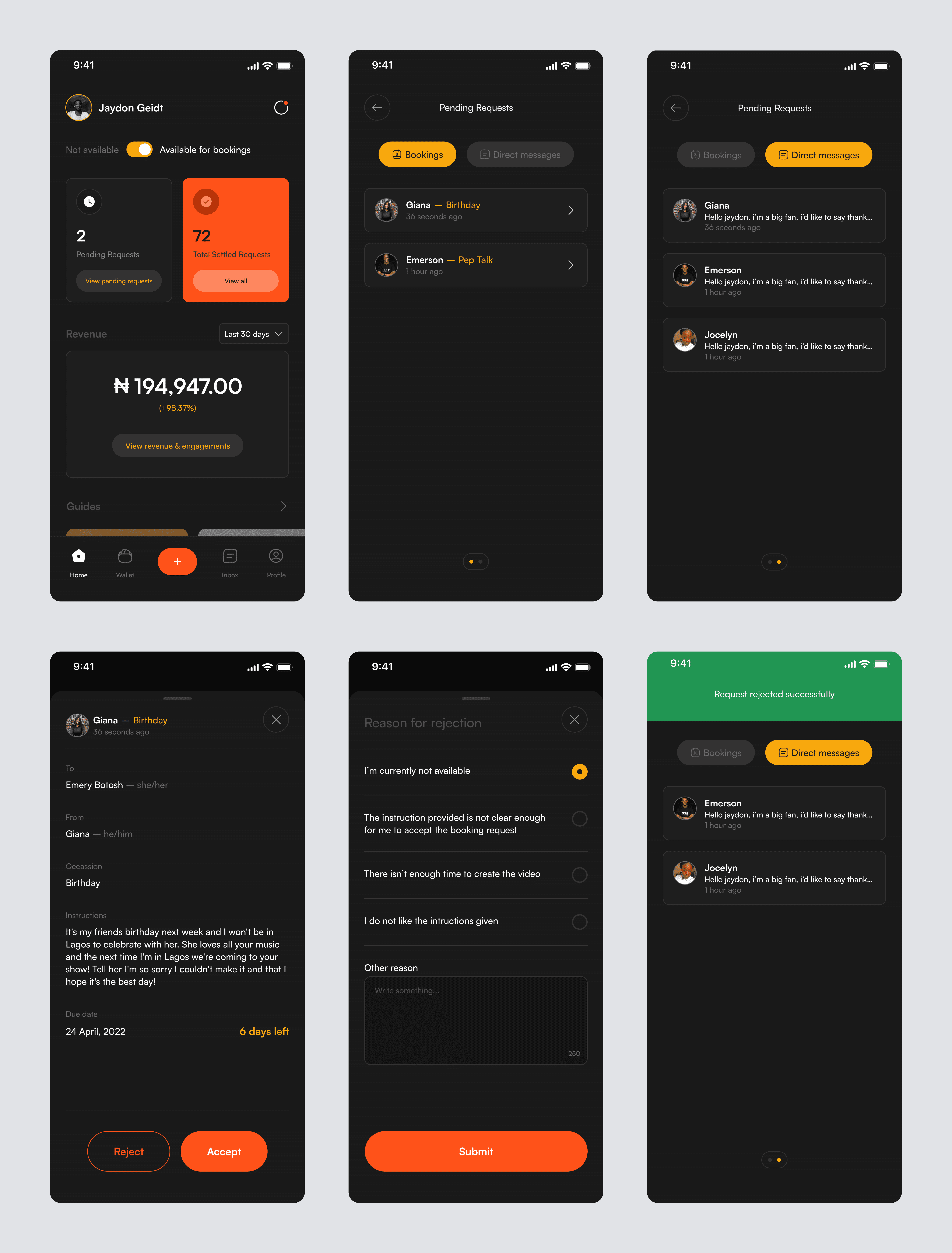
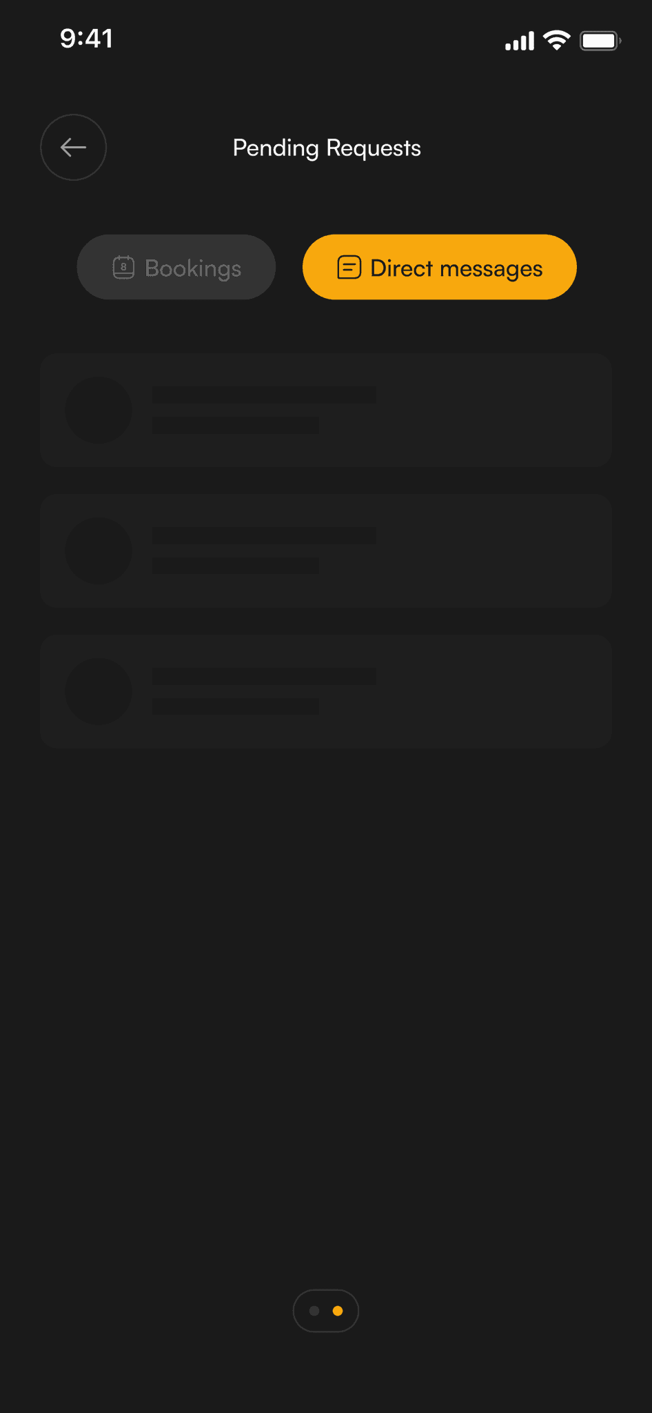
On the celebrity side, we needed to make the experience just as smooth. After all, if it's easy for celebrities to create videos, fans get their messages faster! I designed a simple dashboard where stars could view requests, manage their time, and upload videos without any technical headaches.
Think of it like a personal assistant that keeps everything organized – new requests, recording deadlines, and earnings all in one place. This way, celebrities could focus on what they do best: creating personal, heartfelt messages for their fans.
Post-Purchase (Feedback and Sharing)
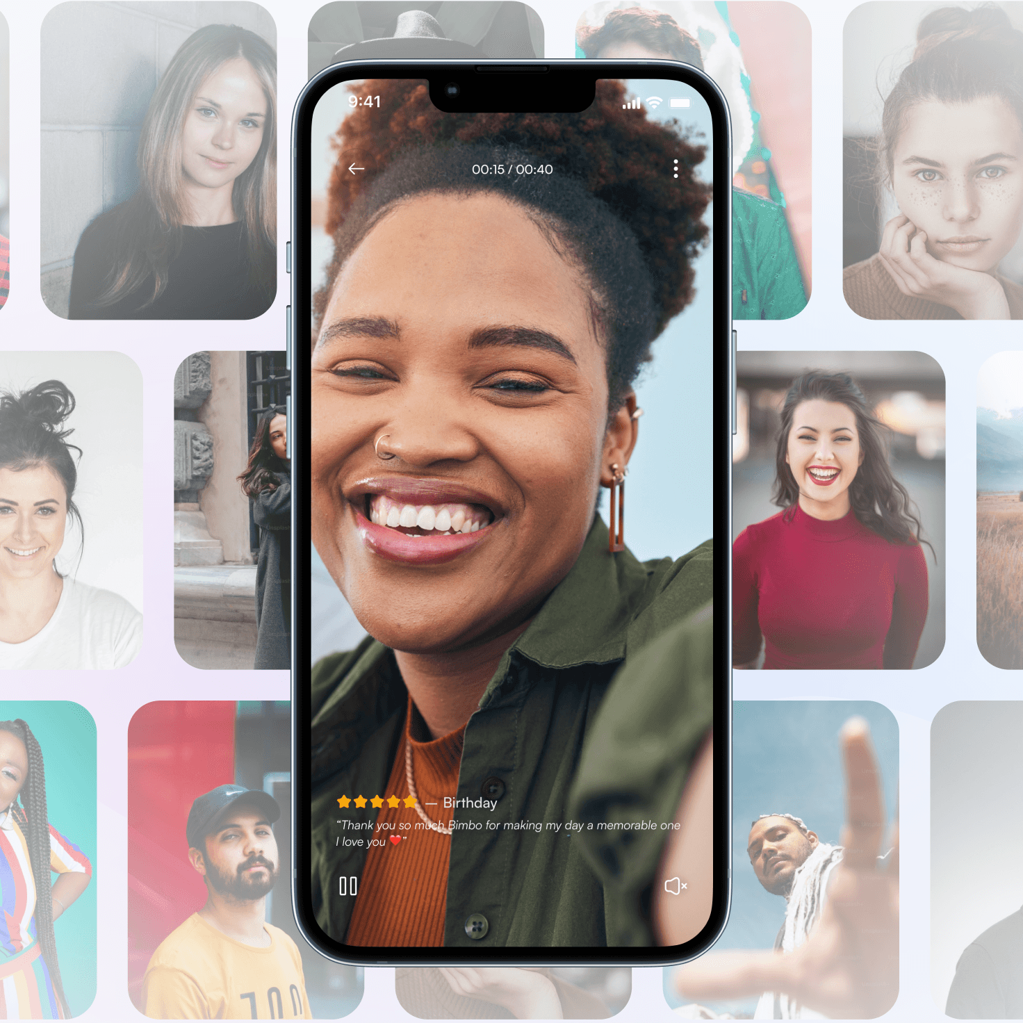
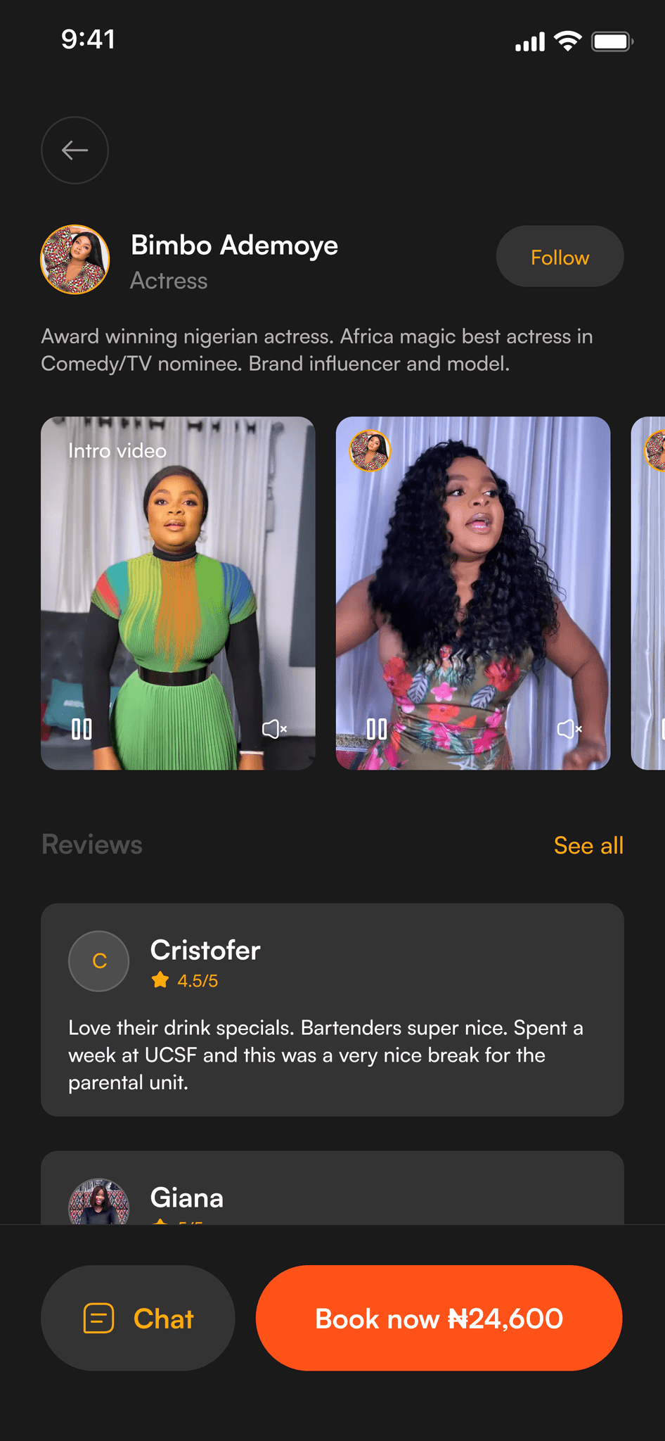
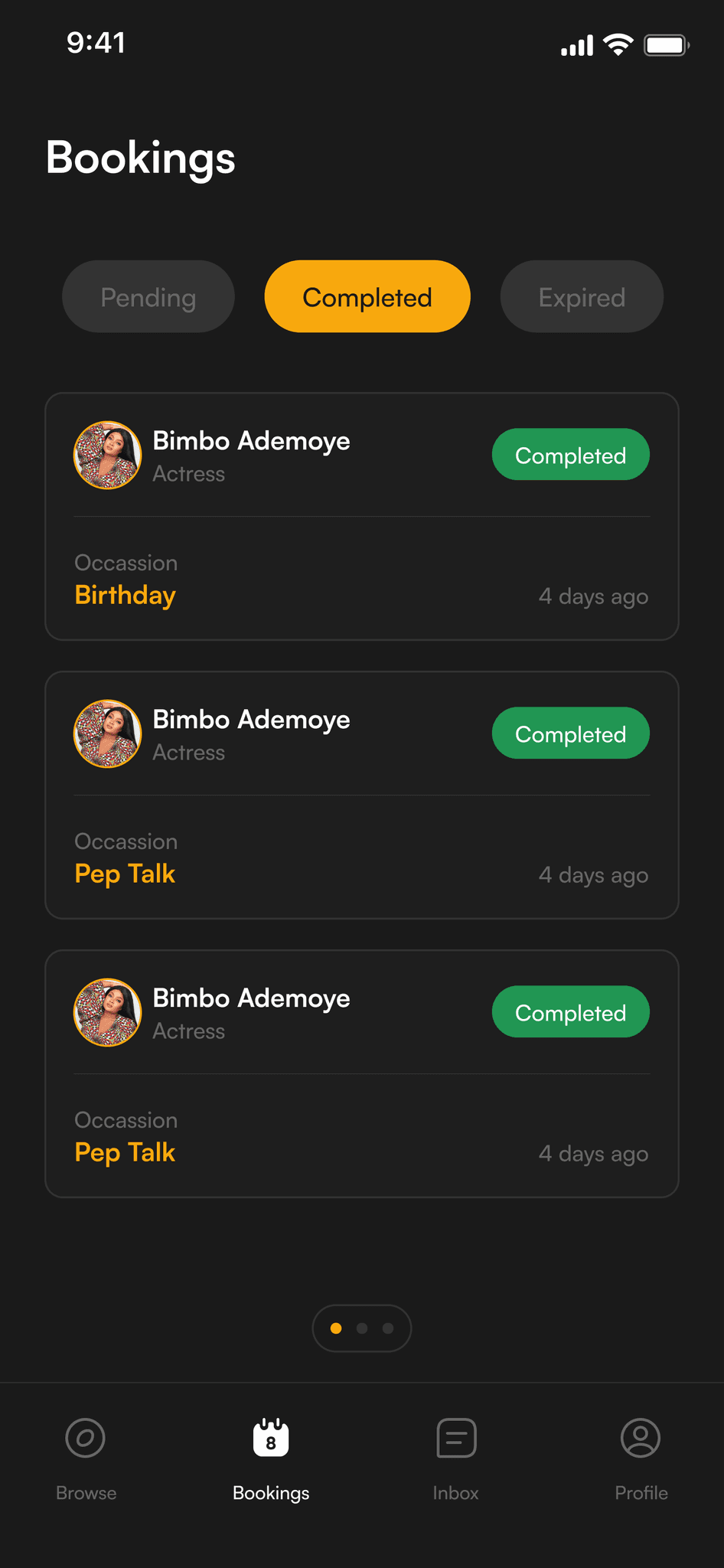
After users received their videos, it was important to capture their excitement and feedback. I designed a simple review system where fans could rate their experience and share what they loved about their personalized shoutout.
These reviews not only helped build trust for future users but also gave celebrities valuable feedback on their videos. Plus, with easy social sharing options, happy fans could show off their special moments to friends and family.
Visuals
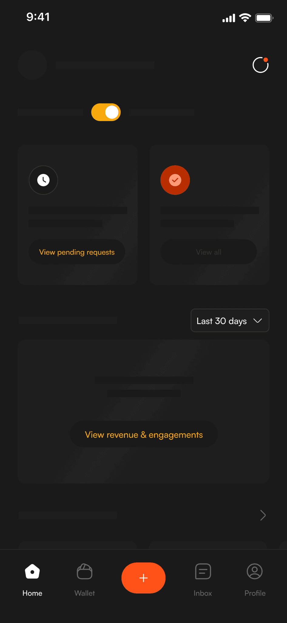
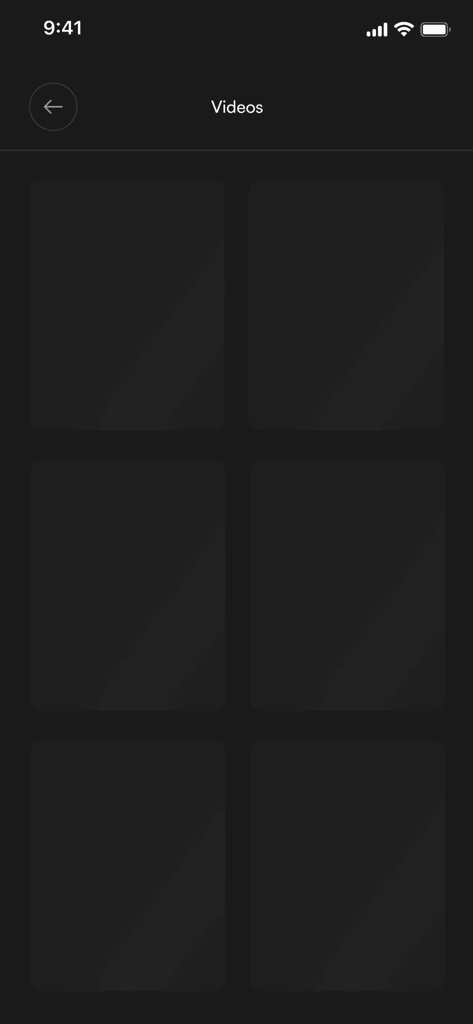
Optimizing Performance with Lazy Loading
One of the biggest challenges in building an app filled with videos and images is making sure everything runs smoothly. Nobody likes waiting for content to load! To tackle this, I implemented something called lazy loading across the app. Think of it like opening a book – instead of flipping all pages at once, you only see the pages as you turn them.
This meant that celebrity profiles, video previews, and other media would only load when users scrolled down to see them. It's a small but mighty change that made the app feel faster and more responsive, letting users browse through their favorite celebrities without any annoying loading delays.
Testing Our Assumptions
Before launching, we needed to make sure Kooha worked for everyone, not just tech-savvy users. We set up testing sessions with a diverse group of people – from university students to working professionals, ranging from 18 to 45 years old. Some were comfortable with apps, others not so much, but all of them were excited about connecting with celebrities.
We spent 45 minutes with each person, watching them explore the app and listening to their thoughts as they completed different tasks. We wanted to see if they could easily find celebrities they liked, successfully book a video, navigate the payment process, and share their experience afterward.
These sessions were like having a friend test-drive the app while thinking out loud. Their reactions, hesitations, and "aha!" moments helped us spot areas where we could make the experience even better.
Our Testing Approach
We ran testing sessions both in-person and virtually across different Nigerian cities – from Lagos to Abuja, and even Port Harcourt. This mix helped us understand how people from different parts of the country would use Kooha.
Some sessions were at coffee shops, others over video calls, but all focused on watching real people try to use our app.
Each person got real-world tasks to complete. Instead of just saying "test the app," we created scenarios they could relate to:
"Book a birthday video from Don Jazzy for your friend"
"Find a comedian who could send a congratulatory message"
"Add money to your wallet and request a video"
These real-life scenarios helped us see how people would actually use Kooha in their day-to-day lives. We watched how they navigated, where they hesitated, and what got them excited. One user even mentioned, "Oh, I could actually use this for my sister's wedding!" , exactly the kind of natural reaction we were looking for.
What We Learned From Testing
After each round of testing, we gathered as a team to review recordings and notes, looking for patterns in user behavior. We focused on both the quantitative data (success rates, time taken) and qualitative feedback (user reactions, comments). This helped us prioritize which improvements would make the biggest impact for our users.
Our testing sessions revealed some interesting insights about how people actually used the app:
Search & Discovery
90% of users successfully found celebrities they were looking for
Some users weren't quite sure about certain category names
We fixed this by adding smarter search suggestions and clearer category labels
Booking Process
85% of users could create video requests successfully
The long form was initially overwhelming for some
We solved this by breaking it into smaller, more conversational steps
Payment Flow
75% of users completed the payment process
Many users wanted simpler payment options
This led us to create the wallet feature with local payment methods
Results
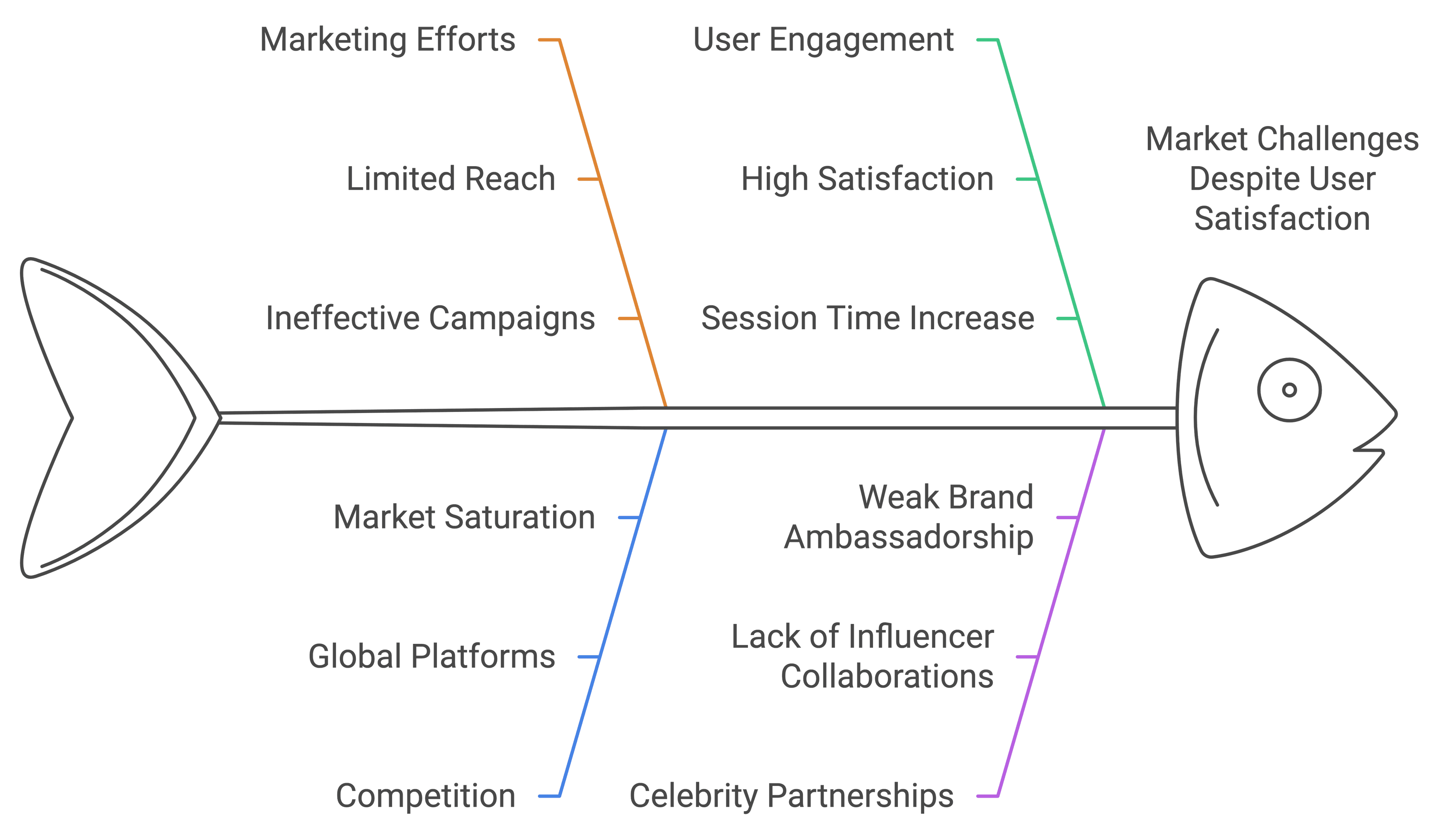
The testing and design work paid off in terms of user experience – we hit some impressive numbers that showed we were on the right track. Users were not just completing their tasks (90% success rate), they were actually enjoying using the app (85% satisfaction). People were spending more time exploring the platform too, with session times up by 40%.
But here's where things got interesting. Despite having a product that users loved, we faced some real challenges in the market. Our marketing efforts weren't reaching as many people as we'd hoped, and we were up against some pretty big global platforms. Plus, we needed to build stronger relationships with more celebrities to really make the platform valuable for users.
Learnings
This journey with Kooha taught us some valuable lessons. First and foremost, we learned that building a great product is only half the battle. Even though we created something users loved using, we needed a strong marketing strategy to match our product development efforts. It's like having an amazing restaurant – if people don't know about it, they can't enjoy the food!
We also gained deep insights about our local market. Things like understanding how Nigerians prefer to pay for services and what makes them trust a platform became crucial parts of our learning. These cultural nuances played a bigger role than we initially expected.
Perhaps most importantly, we learned the value of keeping our ears to the ground. Continuously listening to user feedback and monitoring how people used the app helped us spot problems early and make improvements quickly. It's an ongoing conversation with our users that never really ends.
