OASIS
My Role
Product Design Lead
Team
Utti, Mobile Dev
Hammed, Backend Engineer
Timeline & Status
4 months x 🧋🧋
Overview
Oasis is a side project built for the anime space. It is designed to be your one stop app for everything anime. Equipped with community platforms, anime recommendations, group discussions, posts. etc
I owned and led design strategy for the oasis app - playing a critical role in the ideation, sketch, wireframes, scoping and prototyping, while making sure the app is as intuitive as imagined.
Oasis app has recieved a couple of love from the anime community, as the team and i are currently in the beta testing phase of the product.
Context
The message was loud and clear
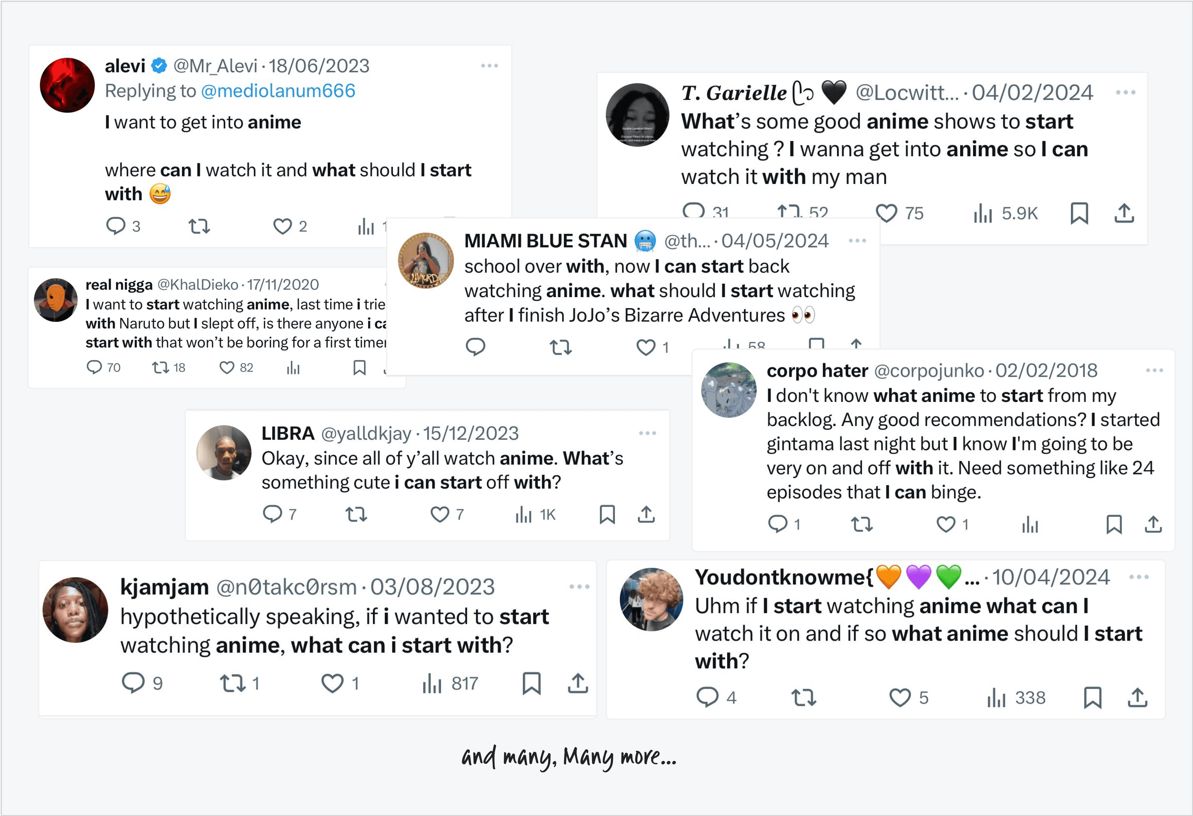
Lots of people asking for beginner anime recommendations, like "What anime should I watch as a newbie?" This shows there's a big need for guidance since the anime space can be overwhelming. Often, these requests got no replies, revealing a lack of community support for new anime fans. Surprisingly, even anime enthusiasts.
THE PROBLEM
How, What and Where
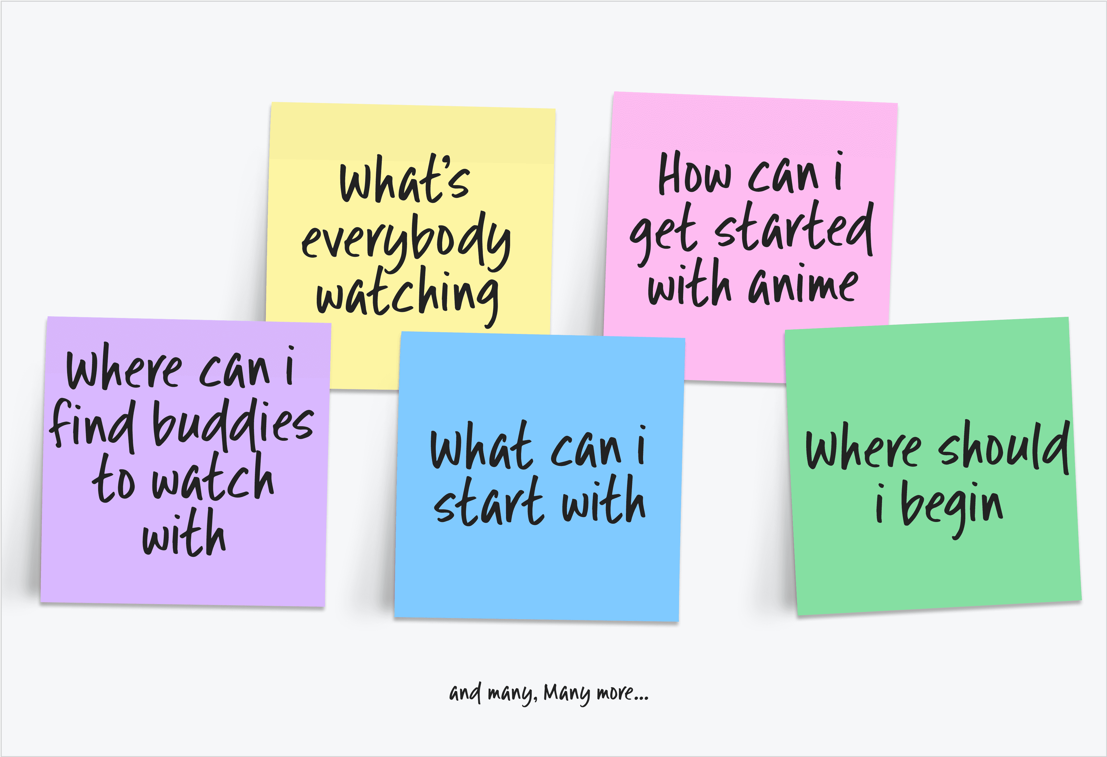
A major problem faced was conceptualizing an app that solves for how, what and where questions in a way that other platforms did not cater for
There are potentially a good amount of anime communities on discord and reddit, several twitter threads, facebook groups, etc already in their own way, catering to and for the anime community
But as an enthusiast myself, questions of how, what and where still remain unanswered. Meaning that, aforementioned platforms aren't doing something right, yet.
Information architecture
You gotta start from somewhere
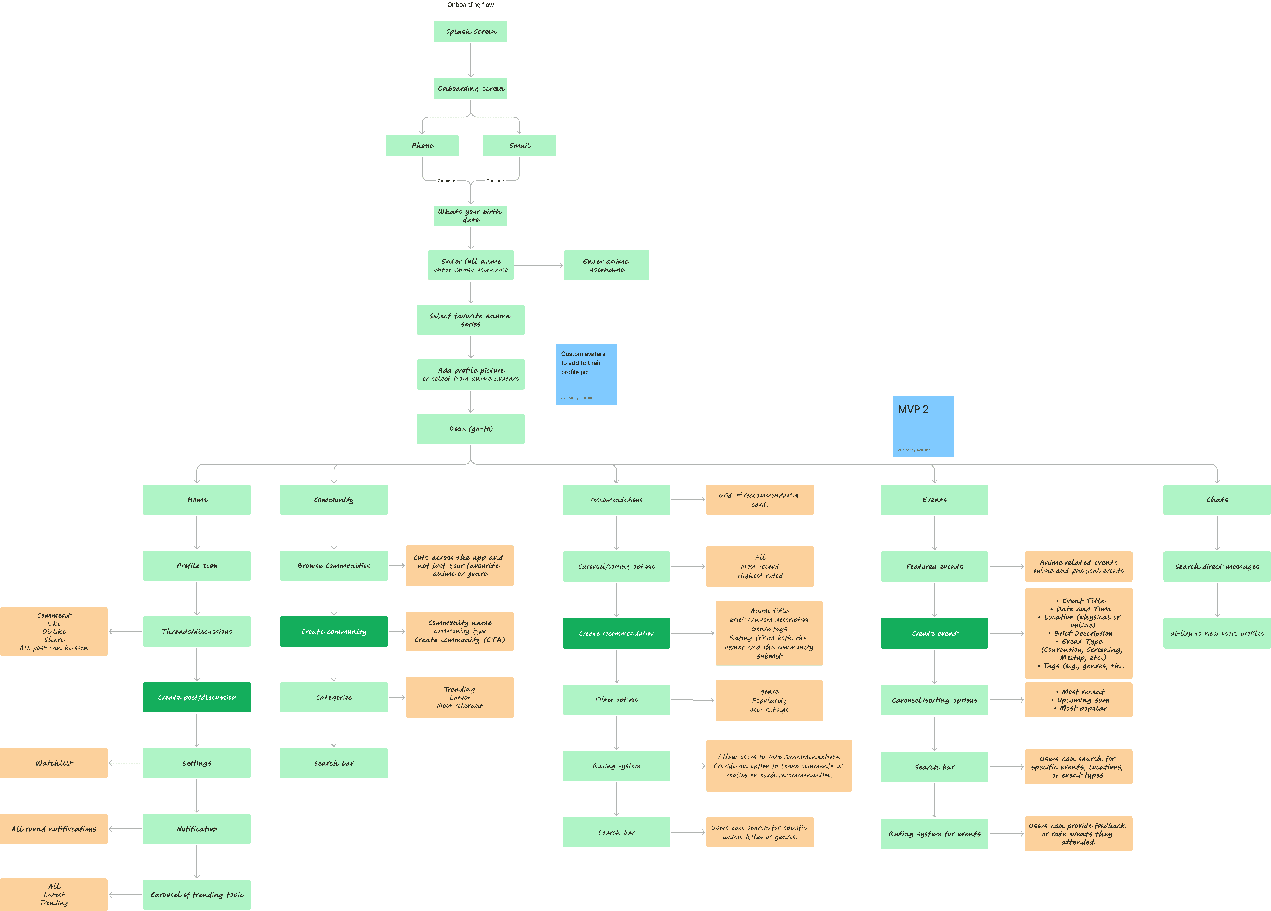
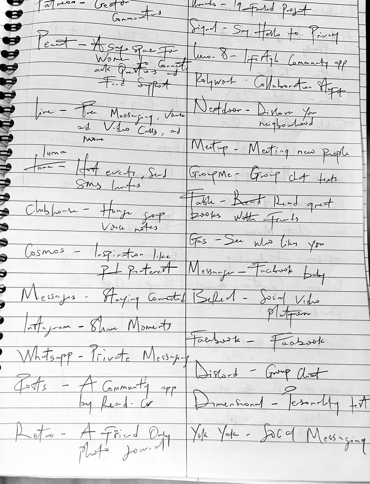
My version of starting from somewhere involved drafting out a rough out information architecture for the app for better clarity on how to approach the design
Wireframes
Finding structure amidst the chaos
To make sense of an otherwise slightly chaotic IA, I started by exploring ways to foster a percieved sense of progress.
One of the ways involved wireframes, as it provided a basic visual guide structure of the interface.
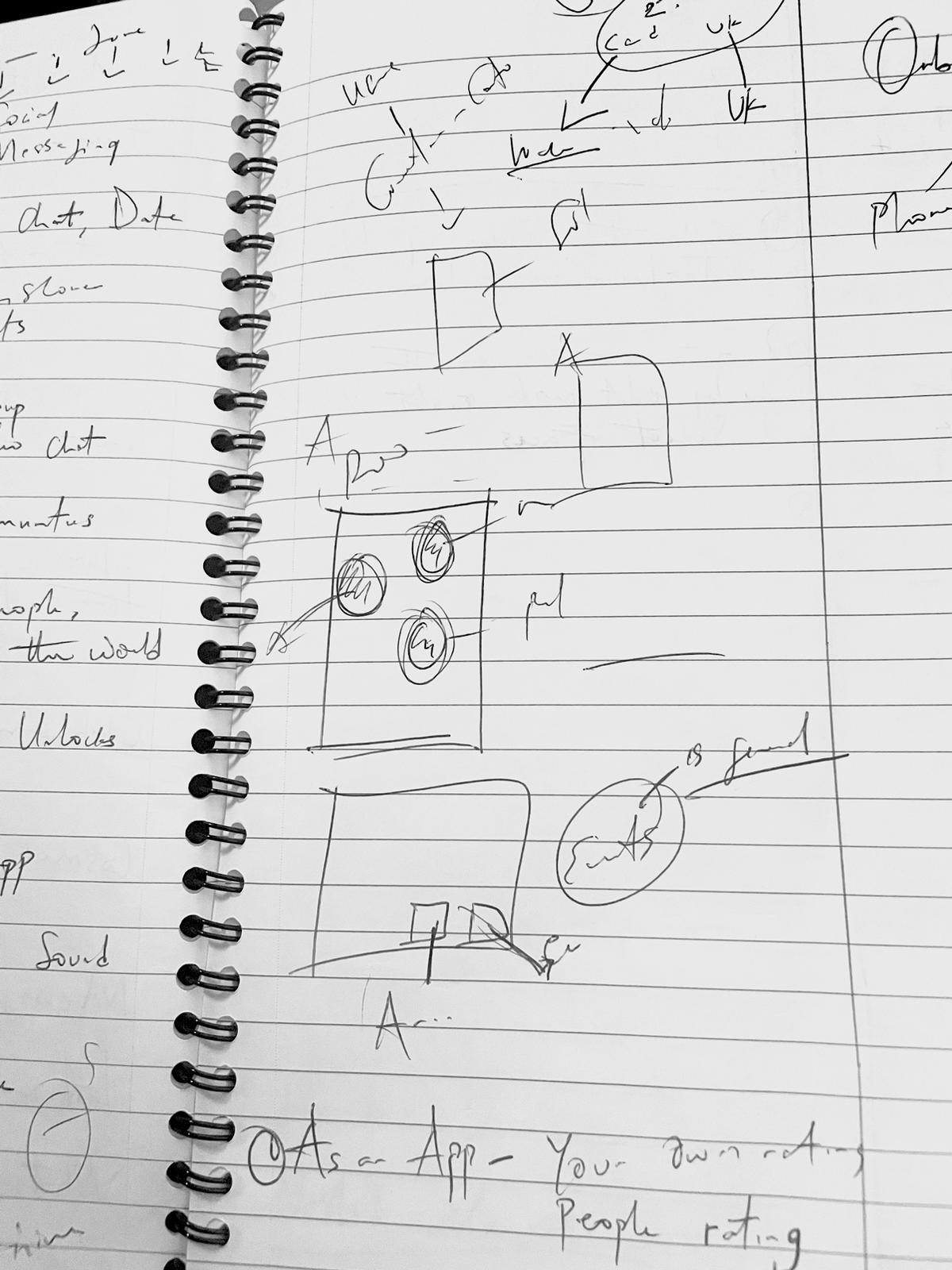
From way back
Sketching and ideation as far back as when they were still just doodles on paper.
Solution
Getting the fixes in
I approached the problem with the mindset of creating a one stop hub for everything anime. A platform sticky and anime focused enough to conveniently address the how, what and where questions.
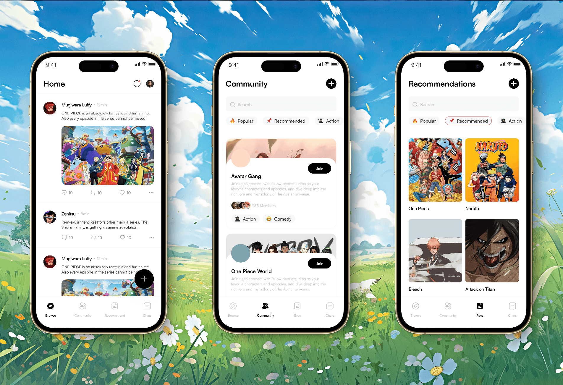
In designing for this, three main features served as MVPs: Posts, Community and Recommendation.
Answering "How"
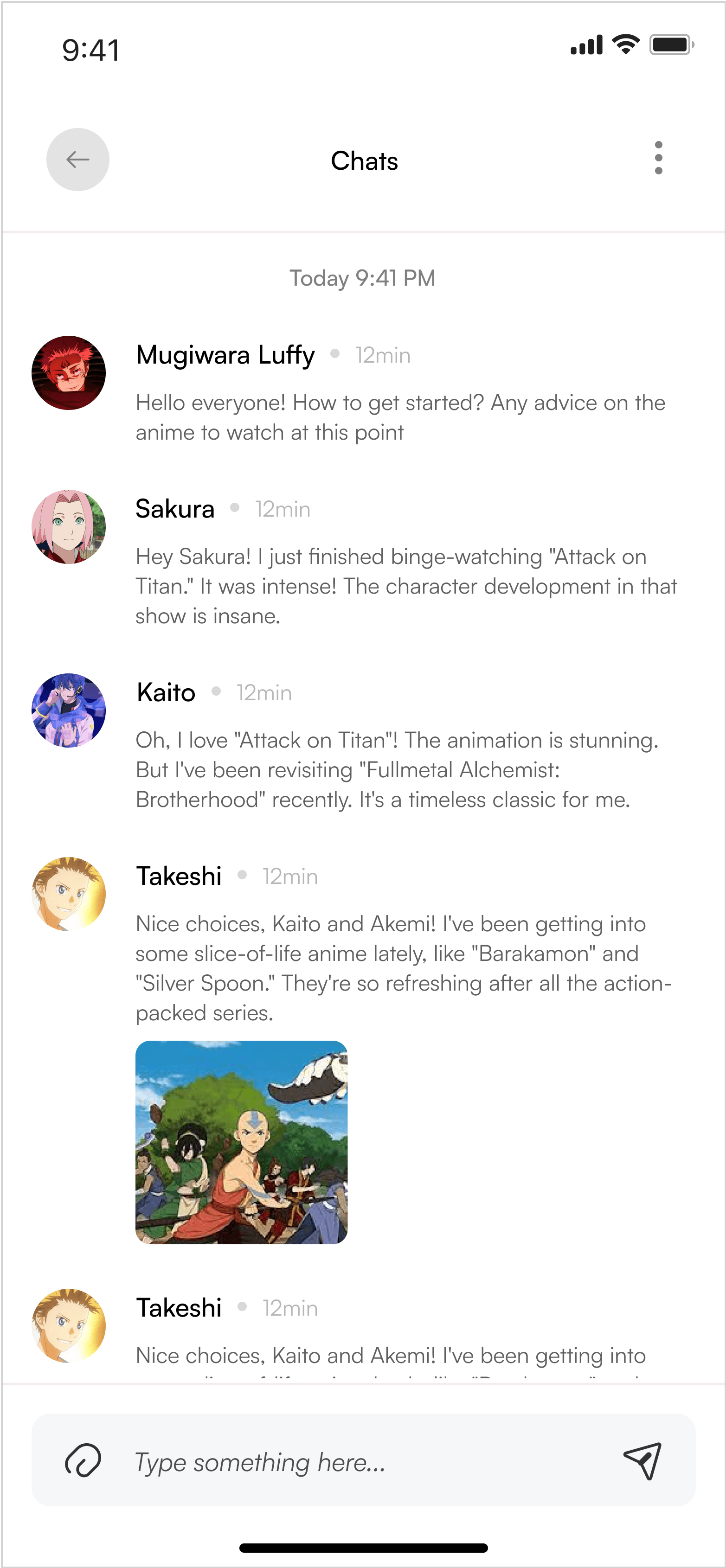
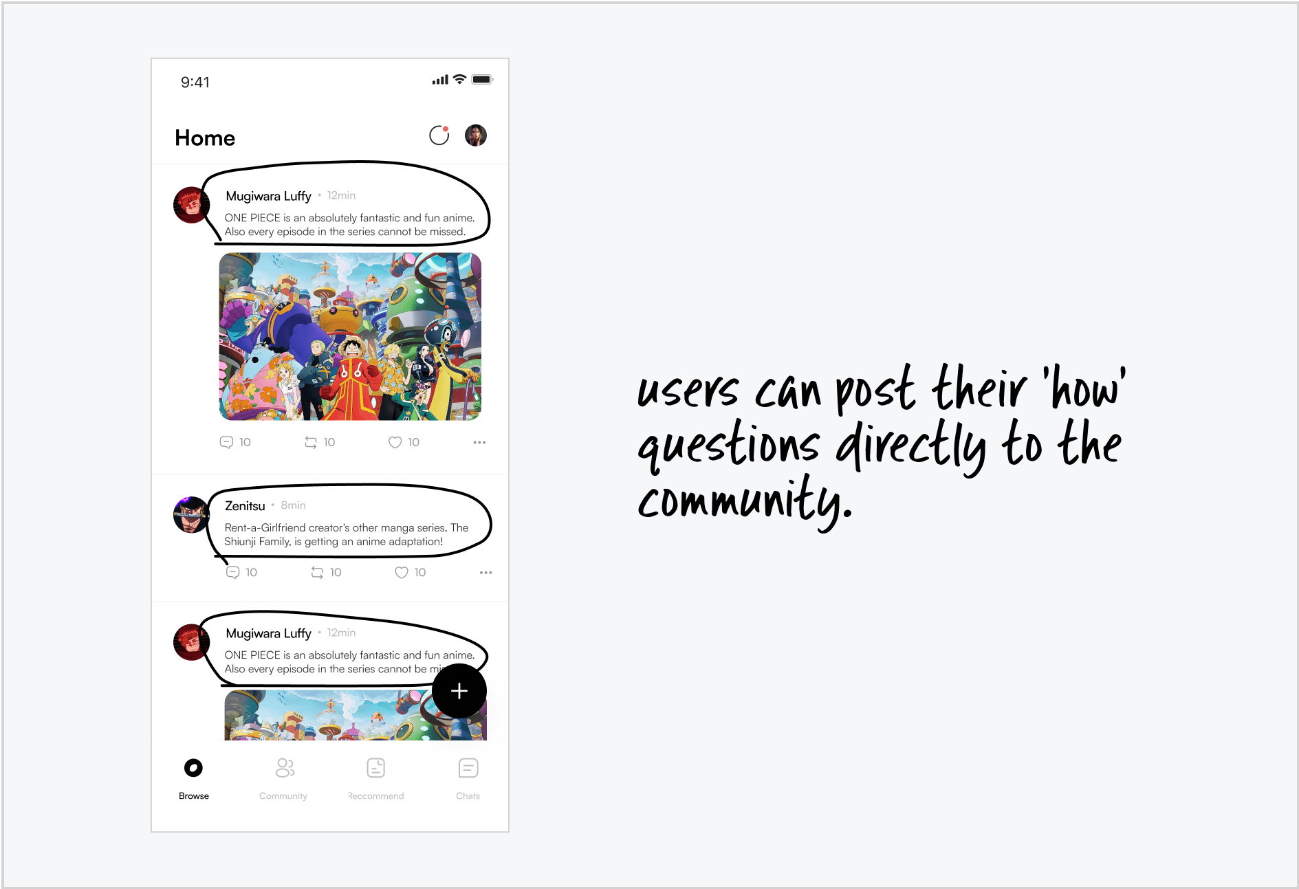
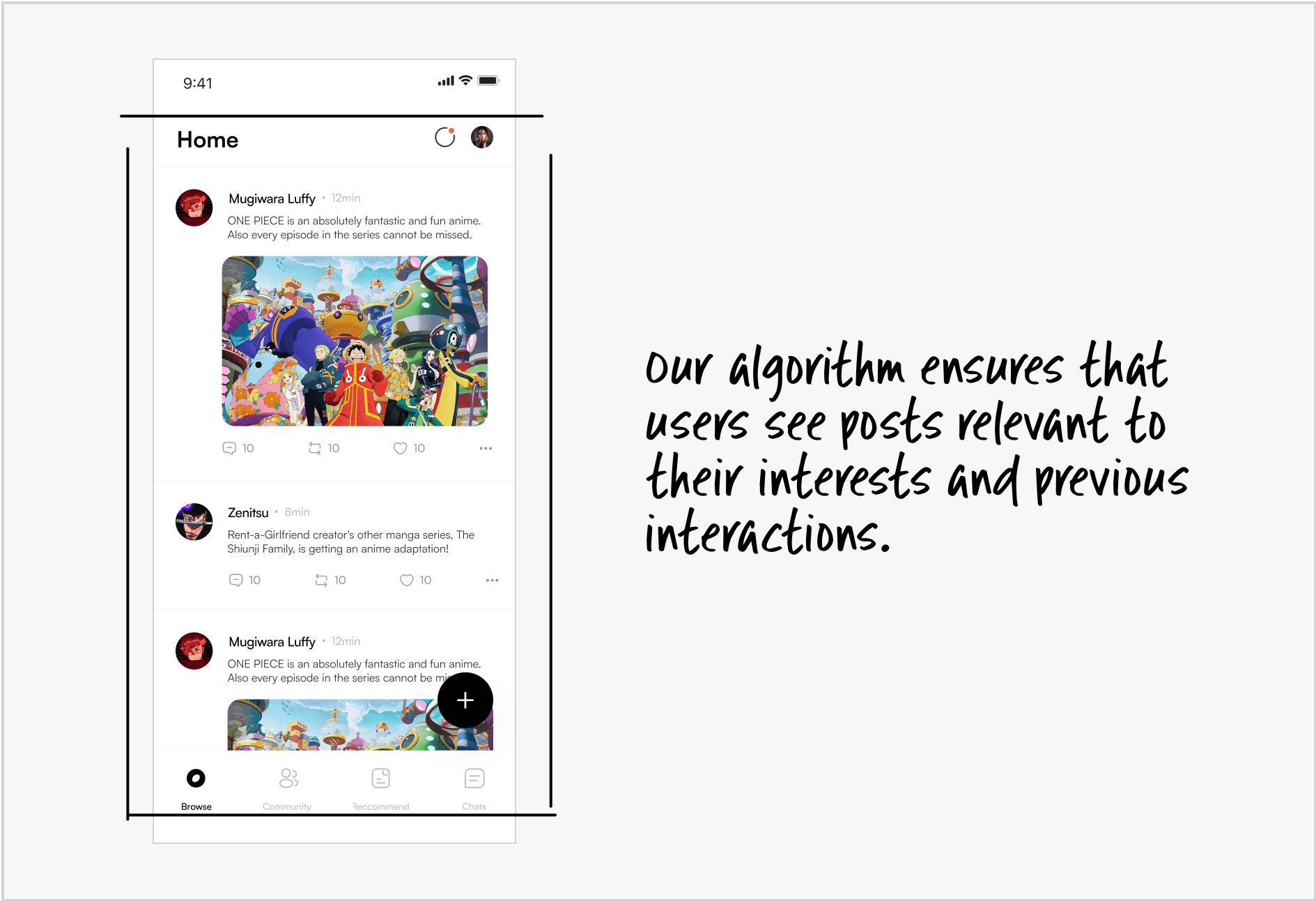
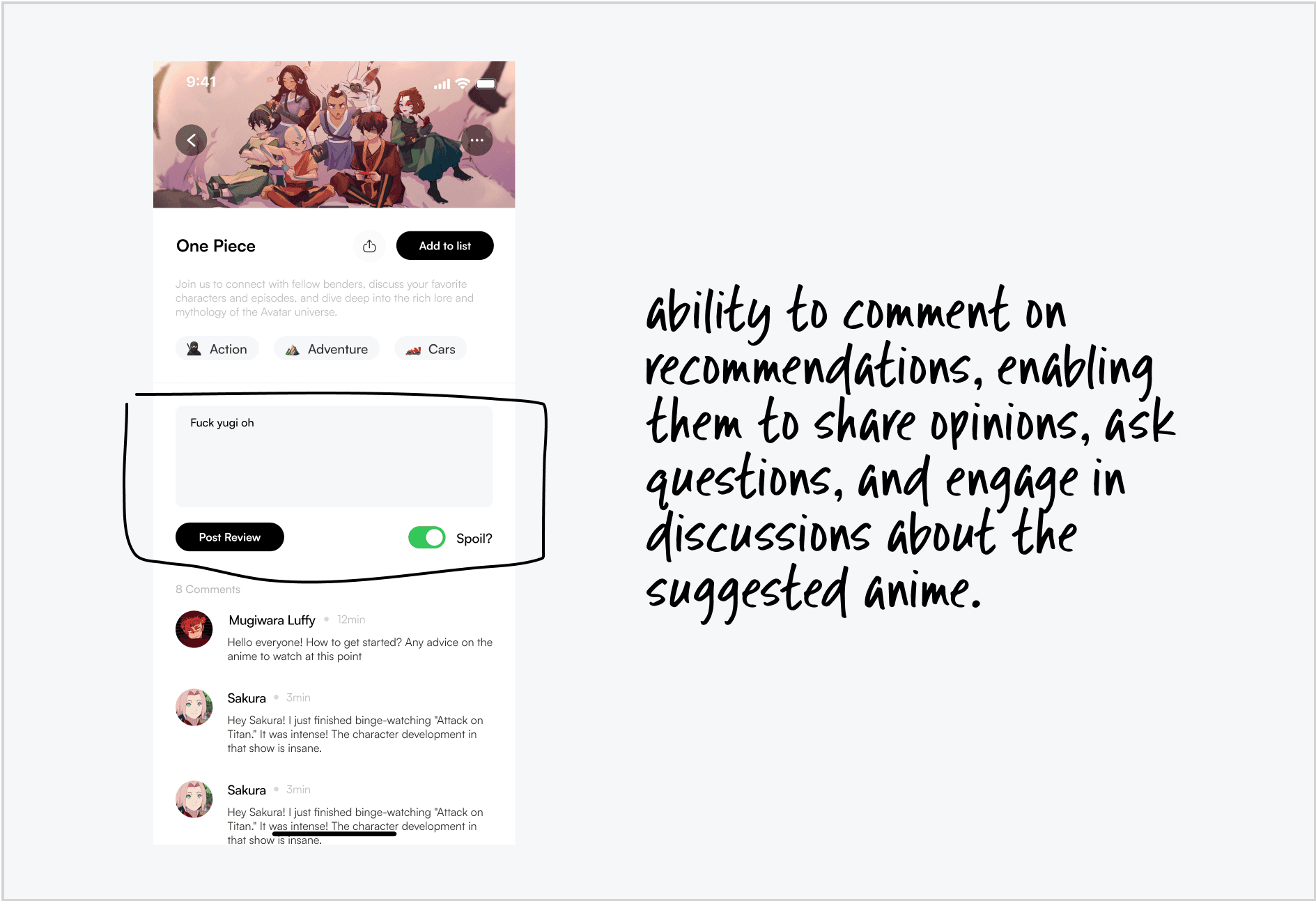
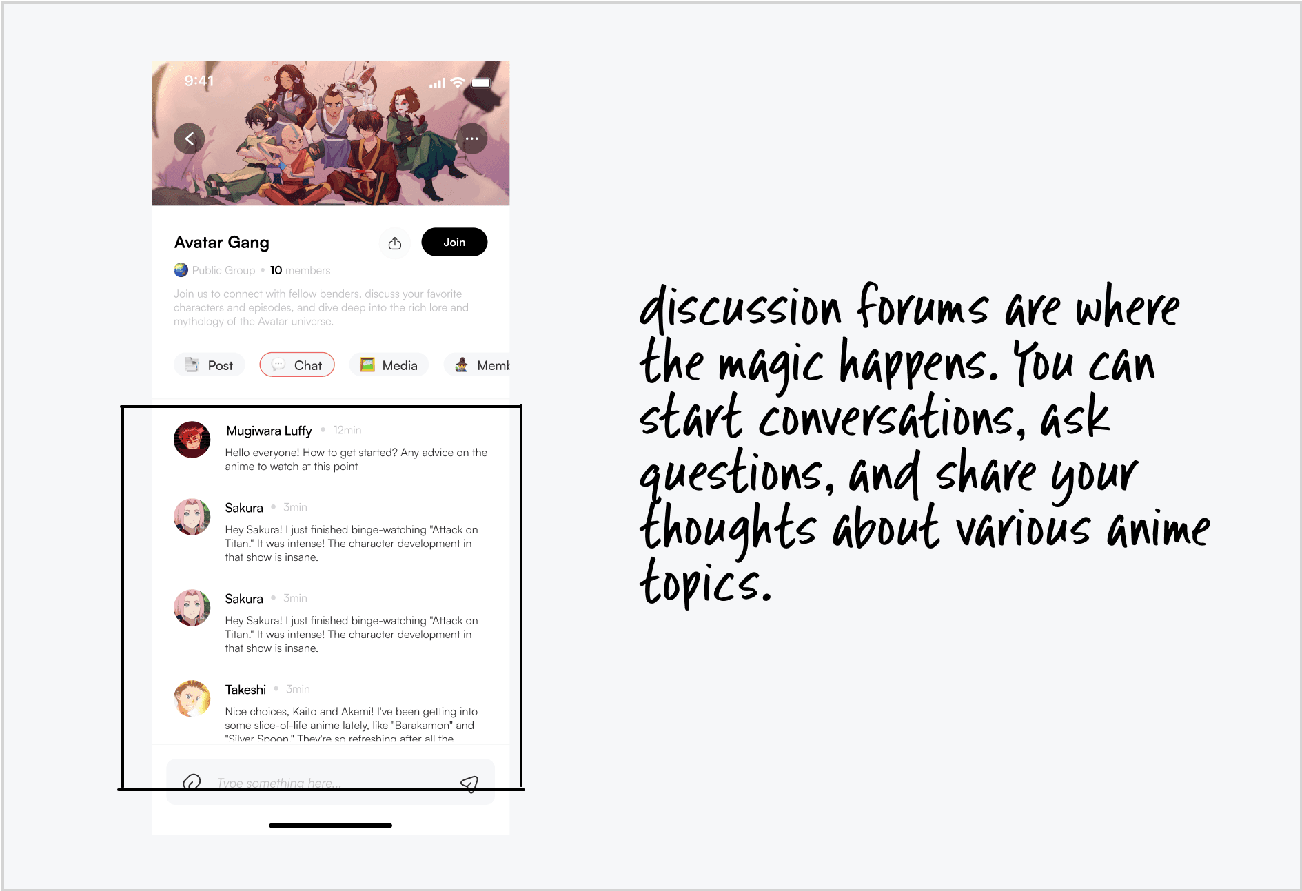
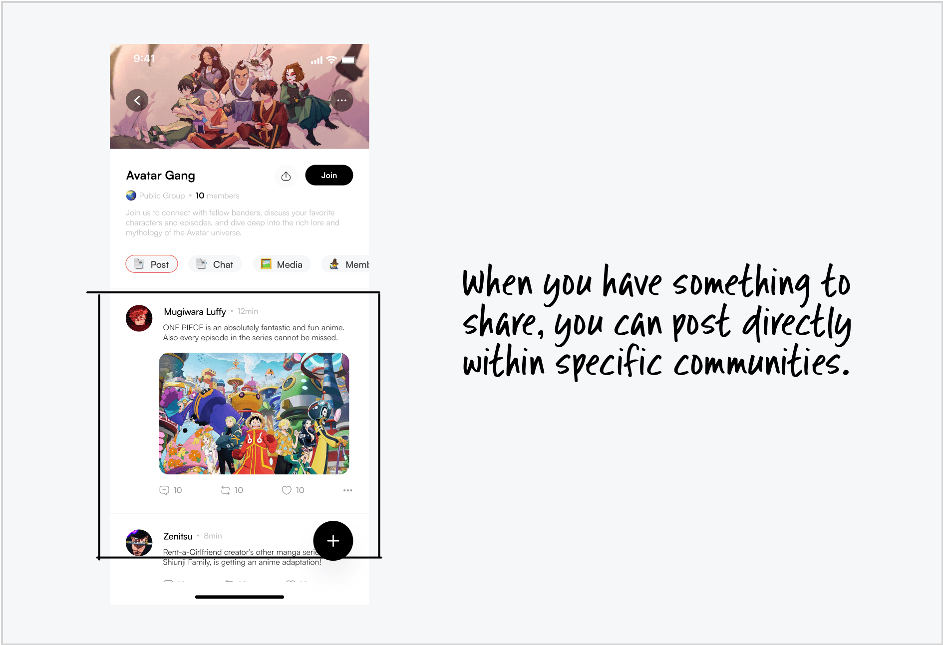
Many anime fans turn to social media and forums to ask their 'how' questions. Unfortunately, these platforms are not optimized for this type of inquiry. Questions often go unnoticed, buried under the flood of new posts, or receive incomplete responses.
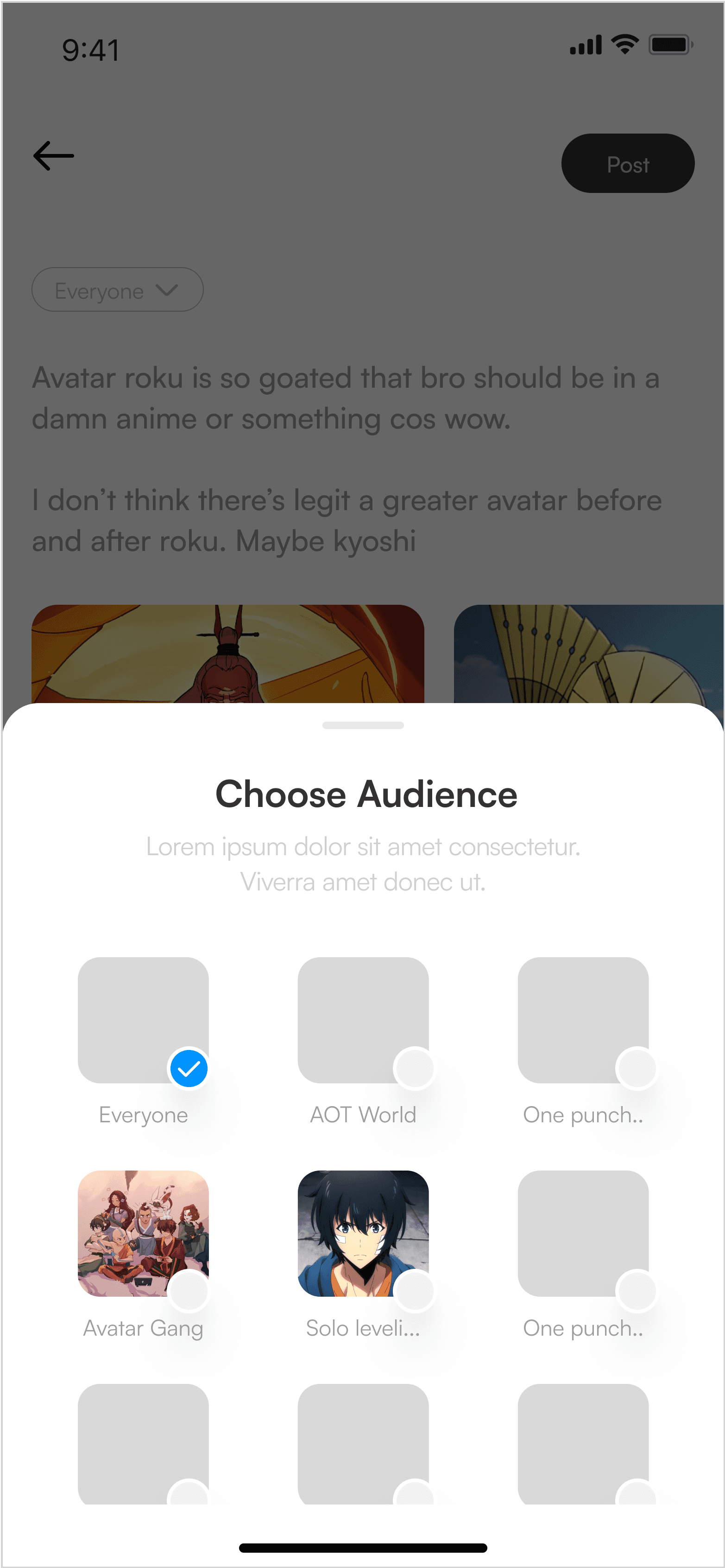
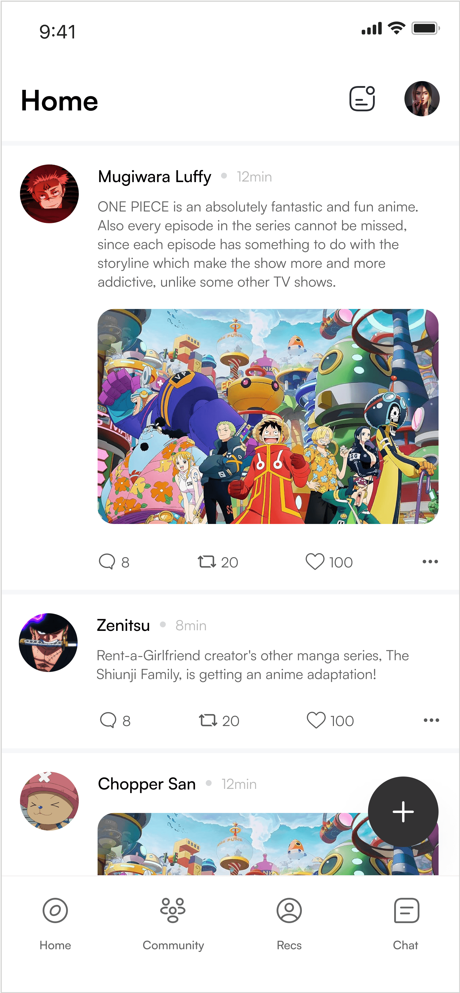
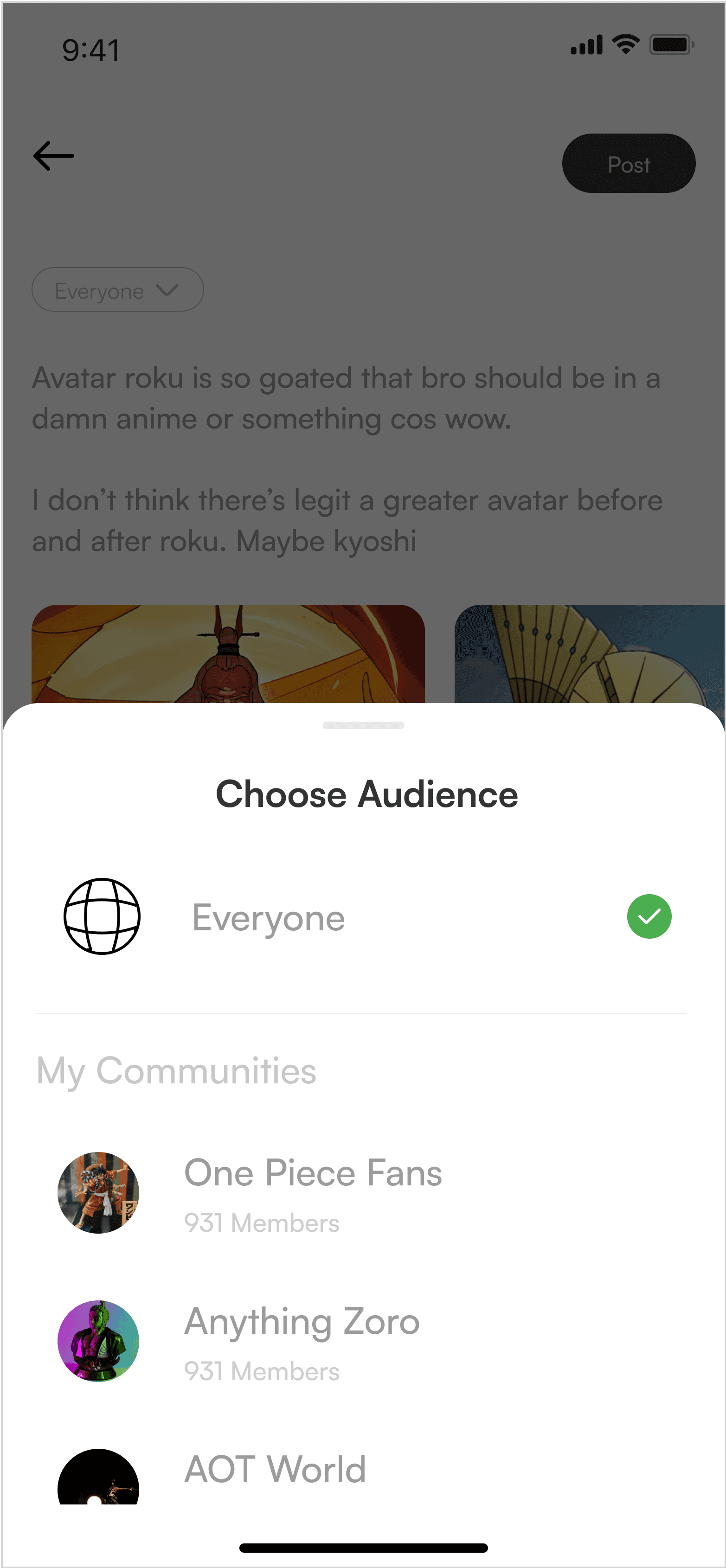
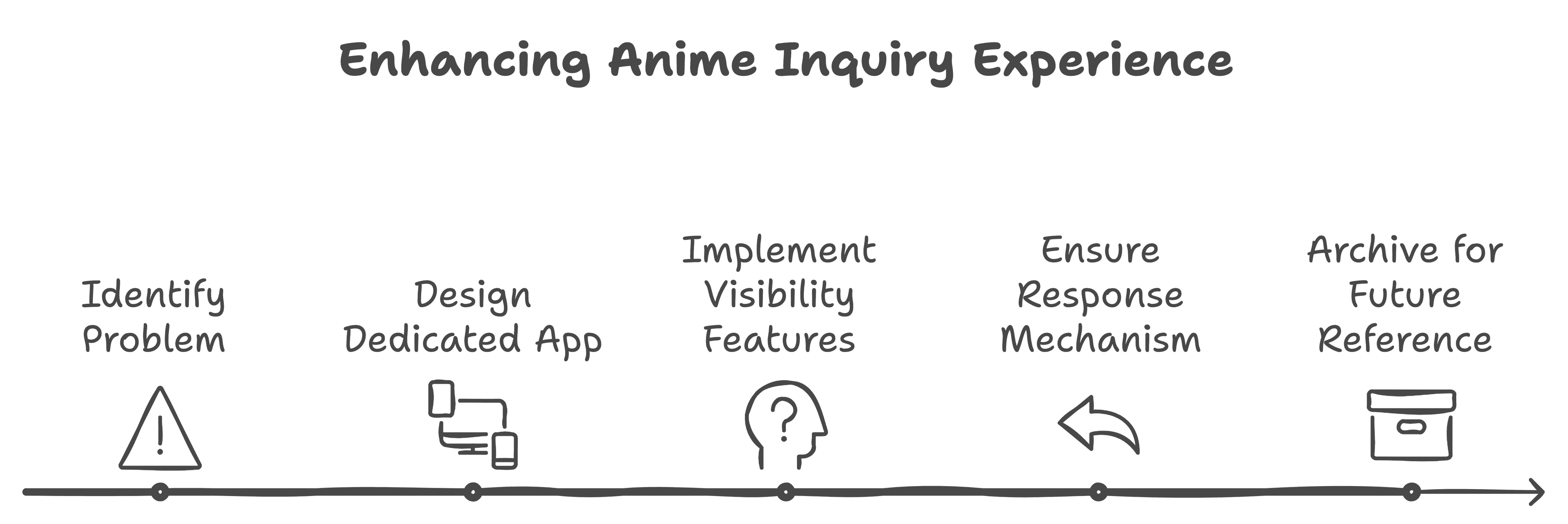
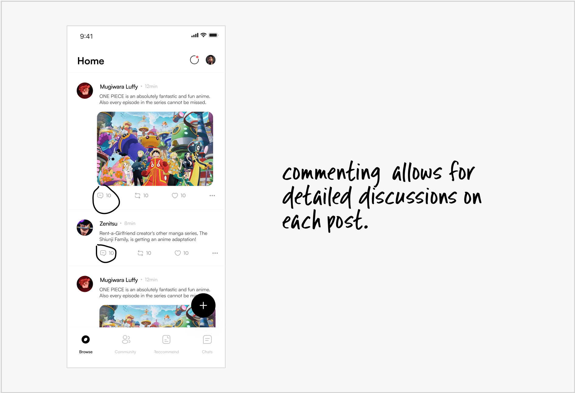
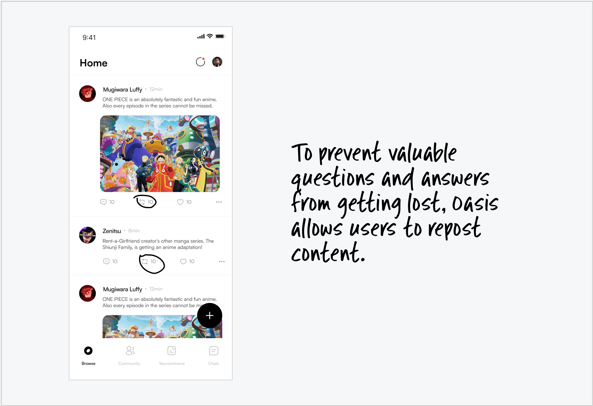
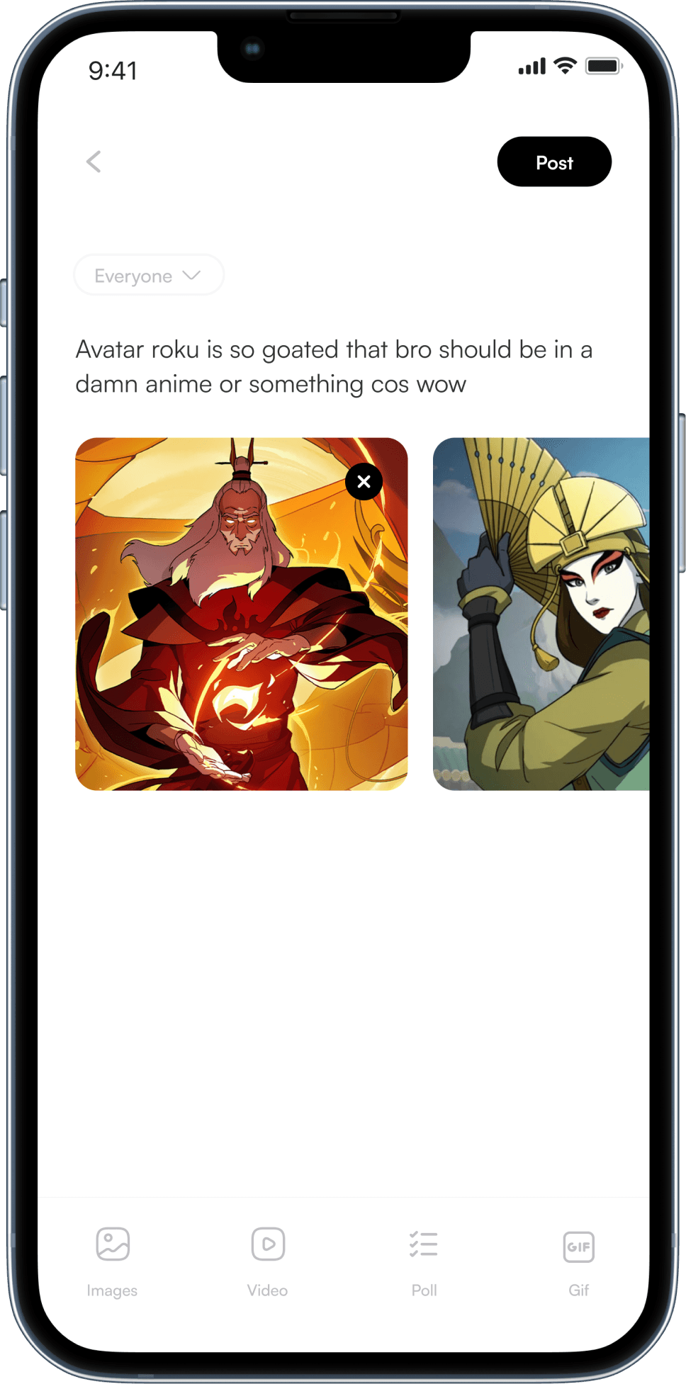
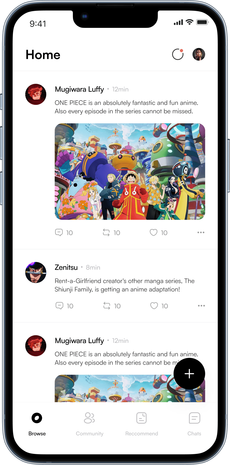
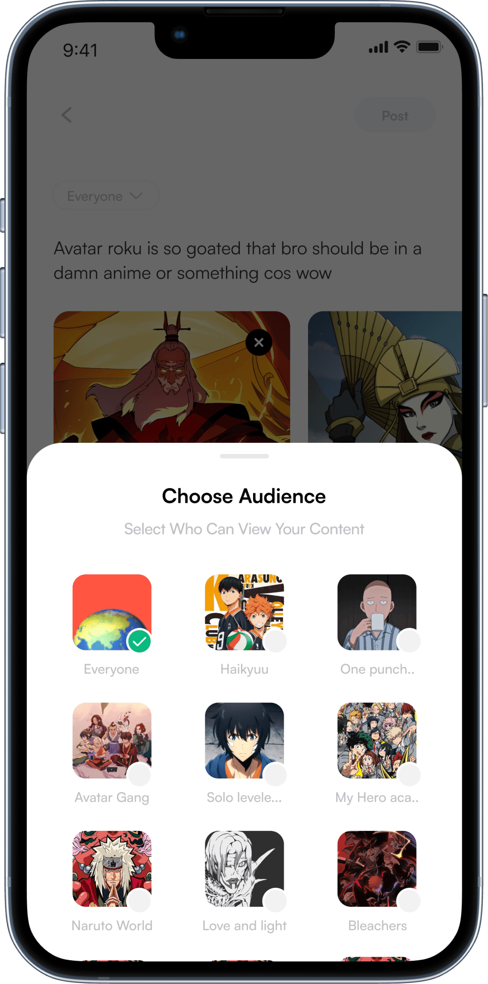
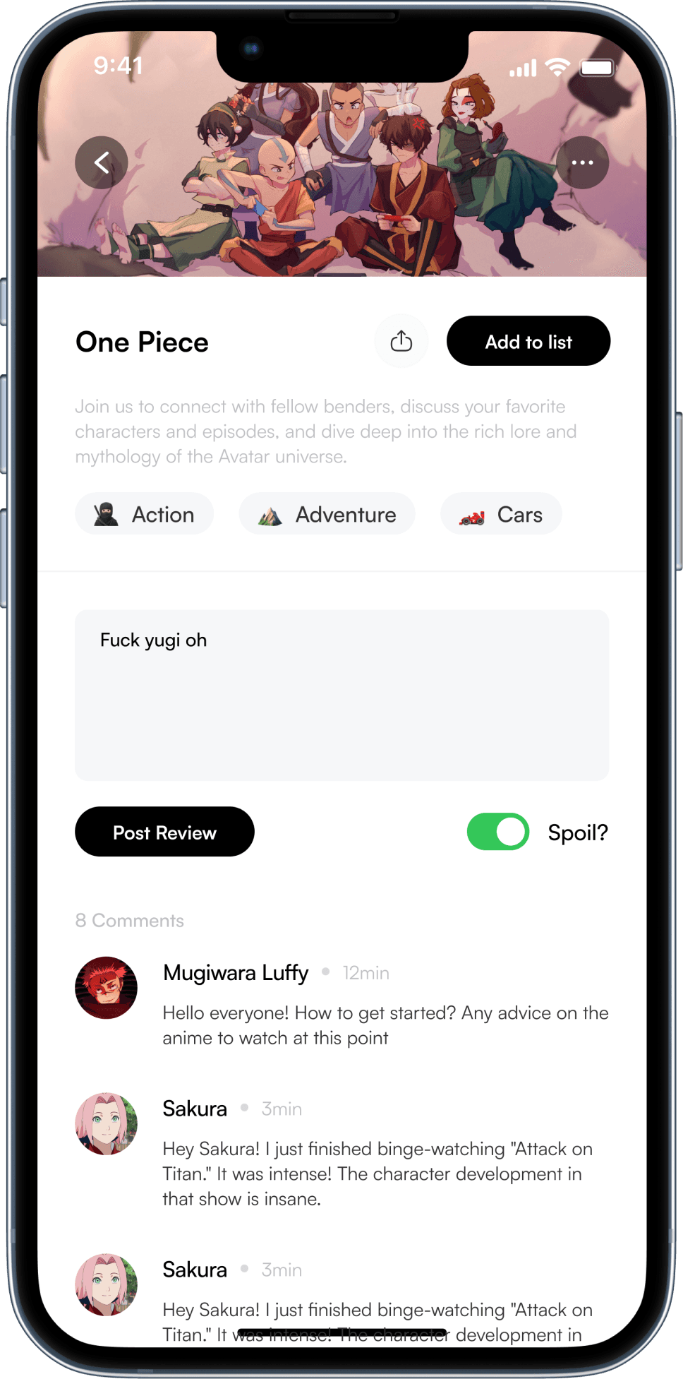
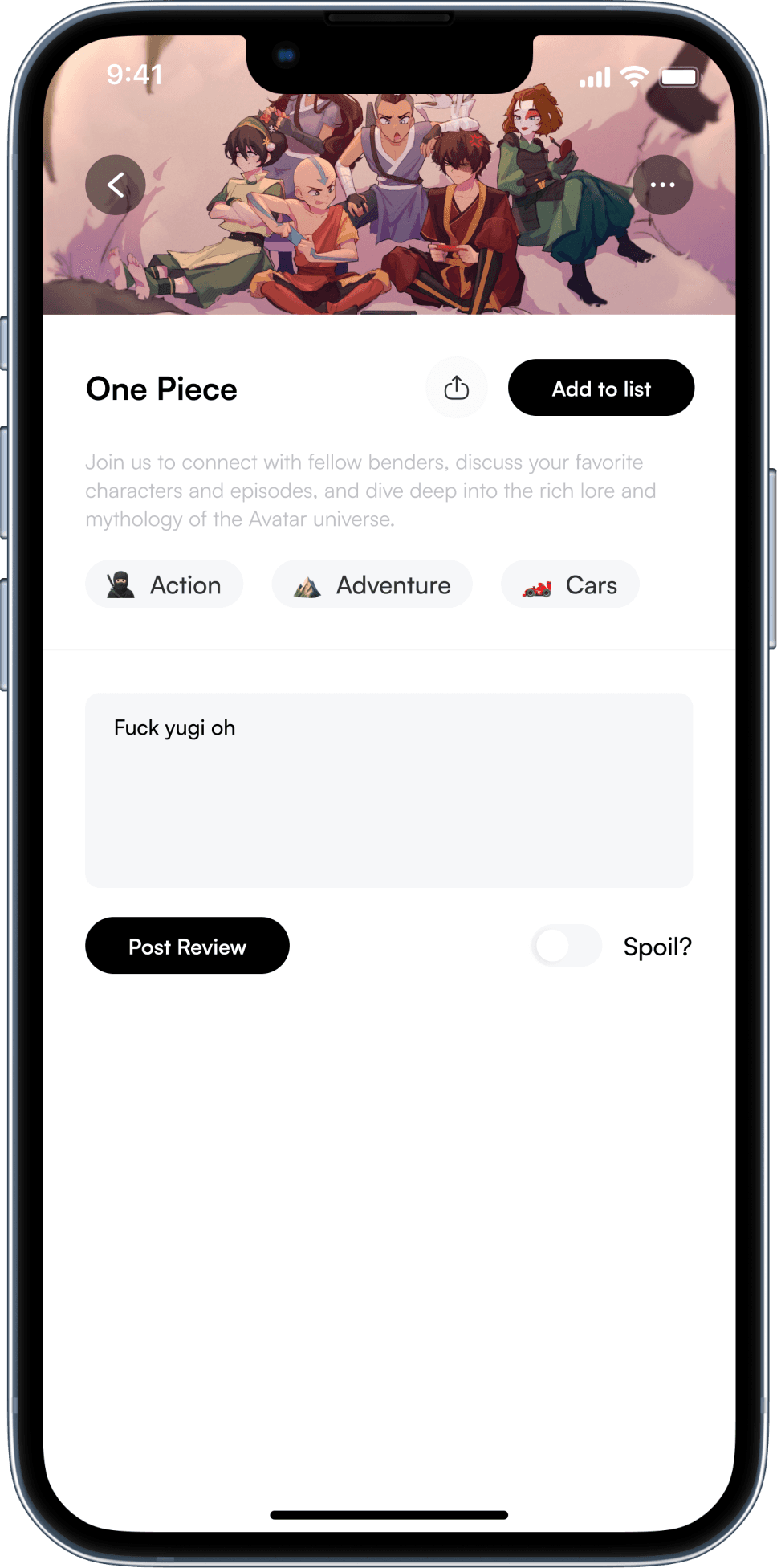
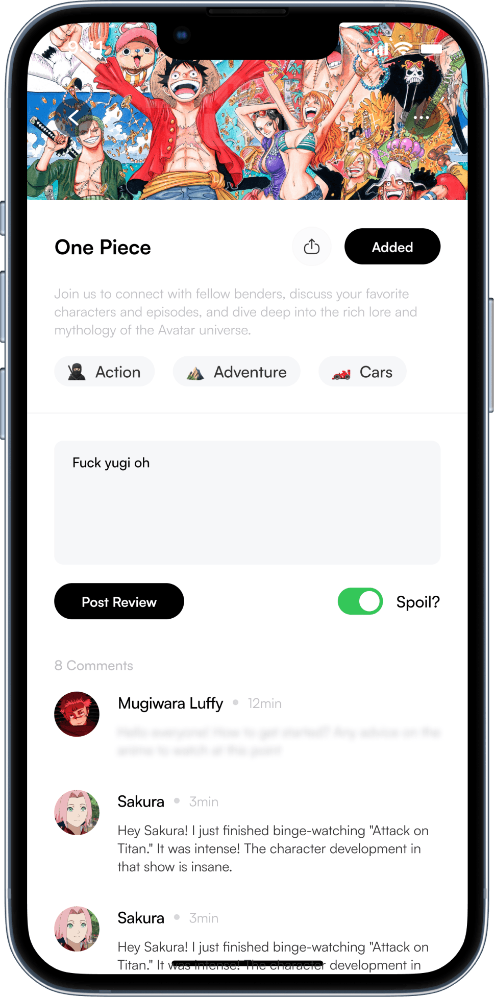
I designed the app specifically to cater to the anime community by providing a dedicated space for 'how' questions. This features several innovative design elements that ensure questions are seen, answered, and archived for future reference (Using the post feature as an example).
Answering "What"
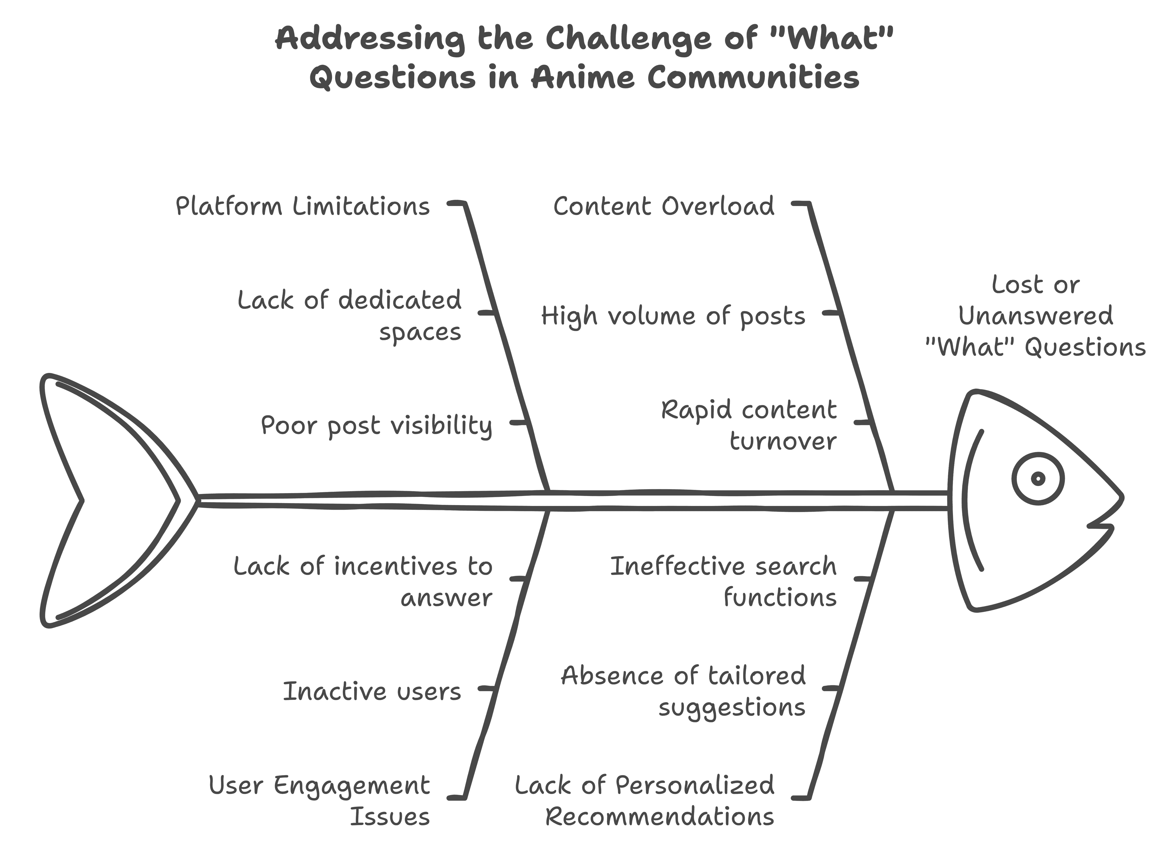
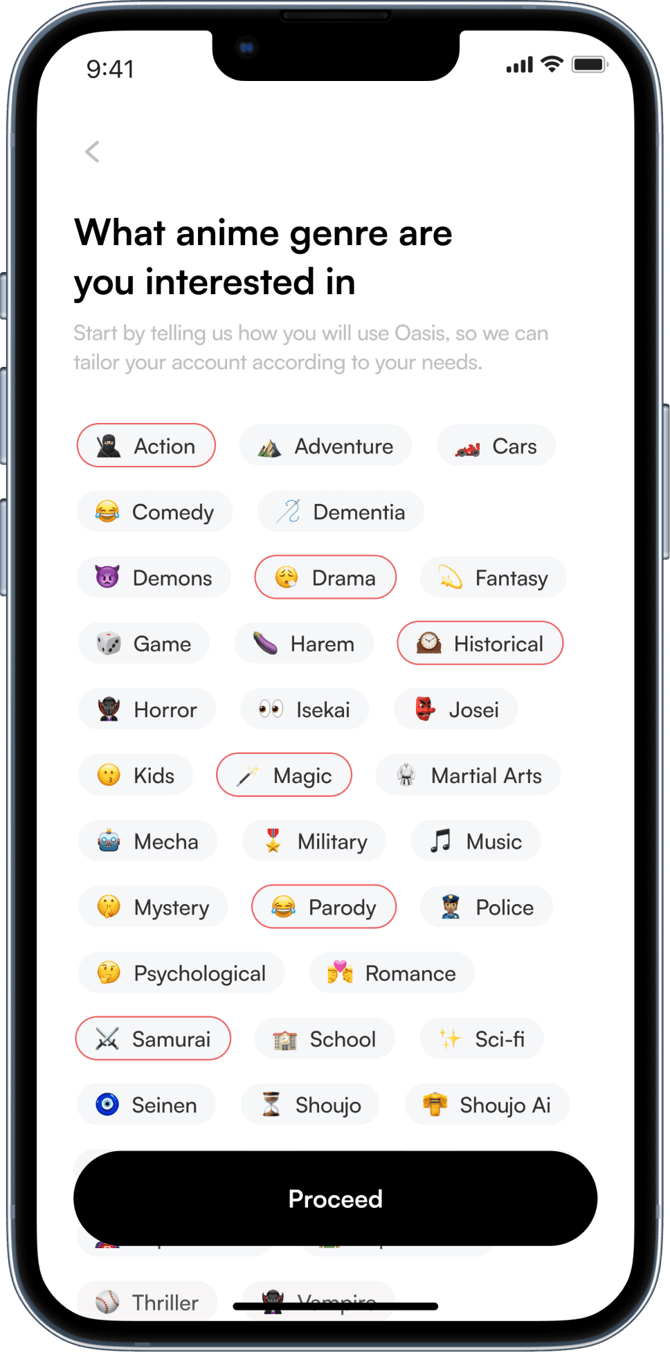
"What" questions indicate interest and curiosity in new topics. Questions like "What anime are people watching?" or "What anime can I start with?"
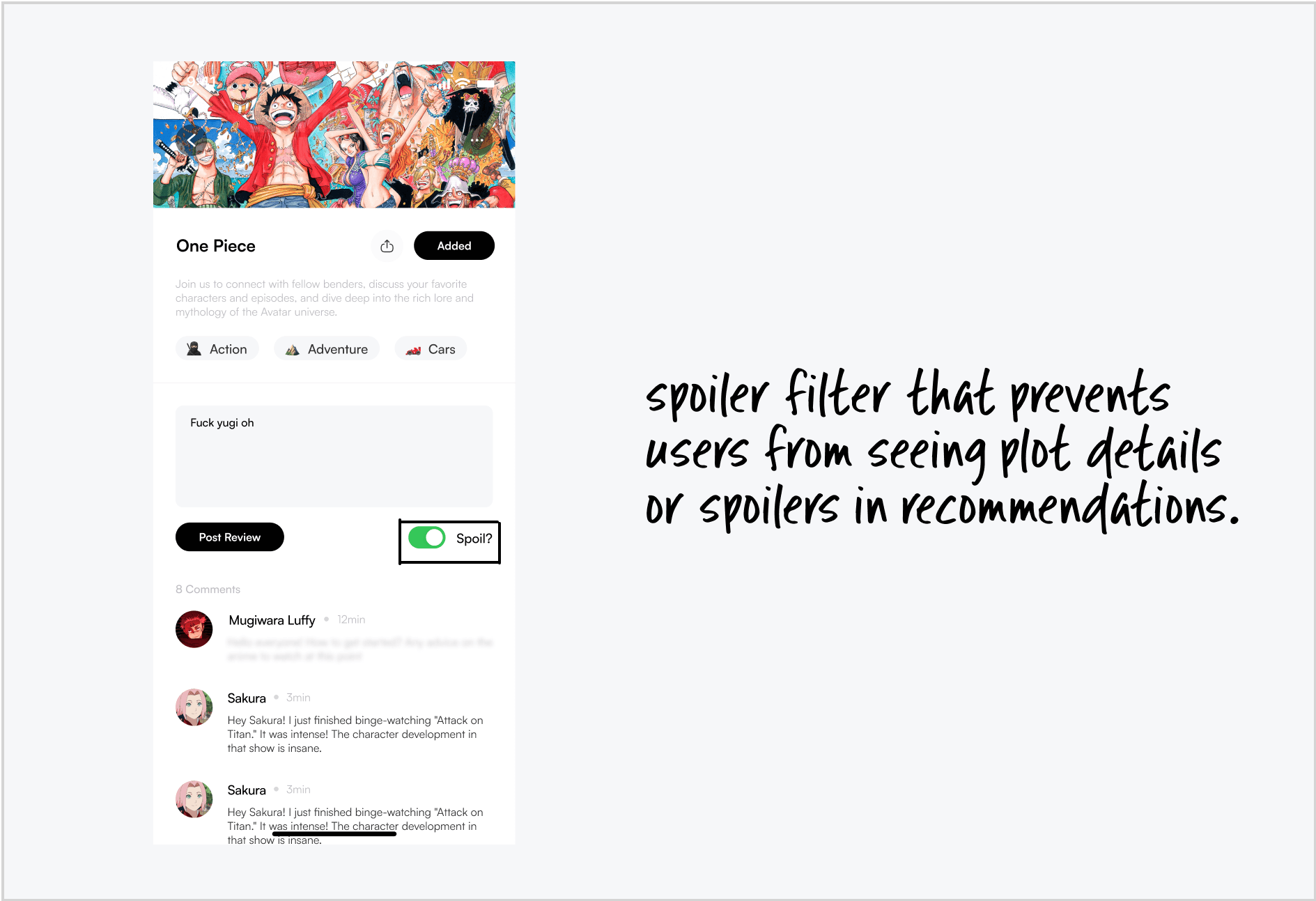
On many platforms, these questions get lost or go unanswered, making it hard for users to find personalized recommendations and explore anime effectively.
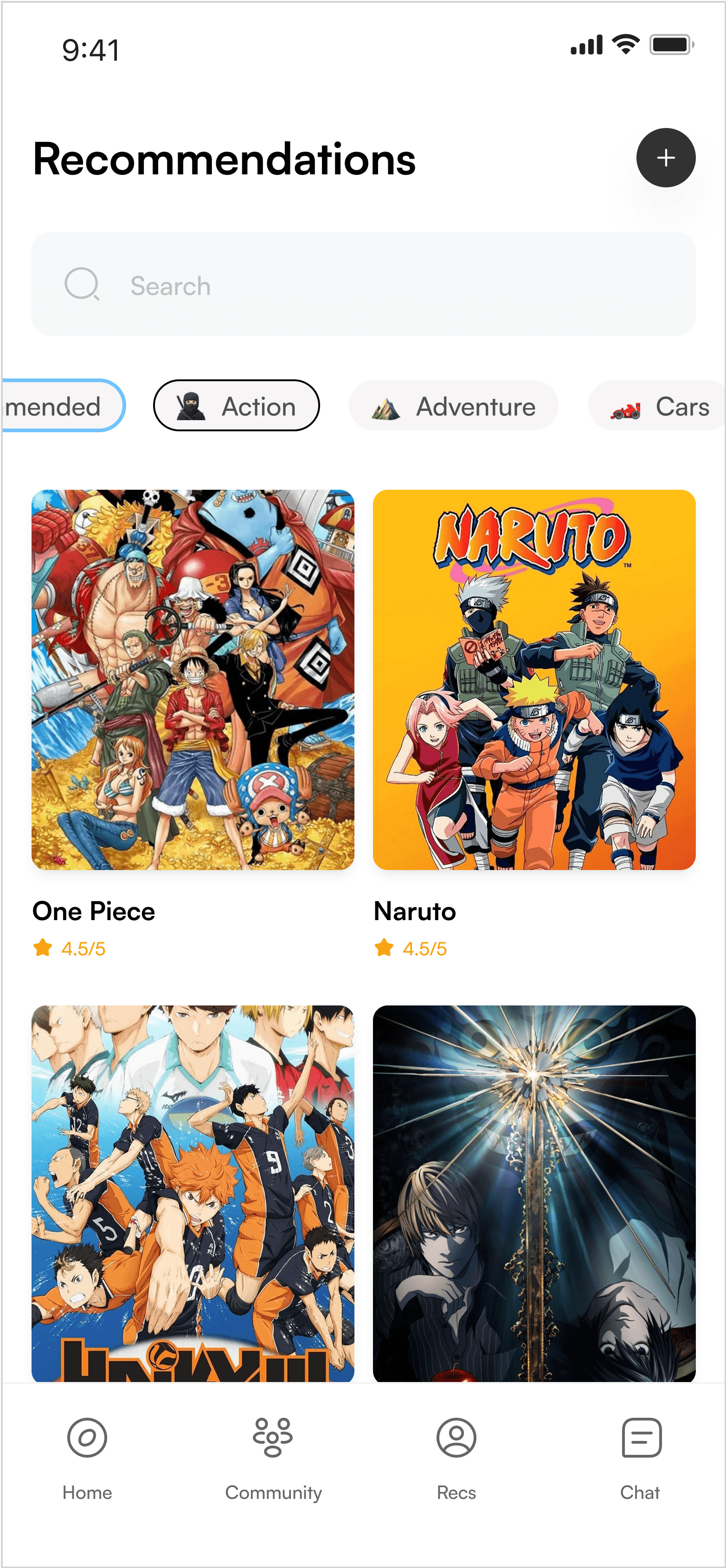
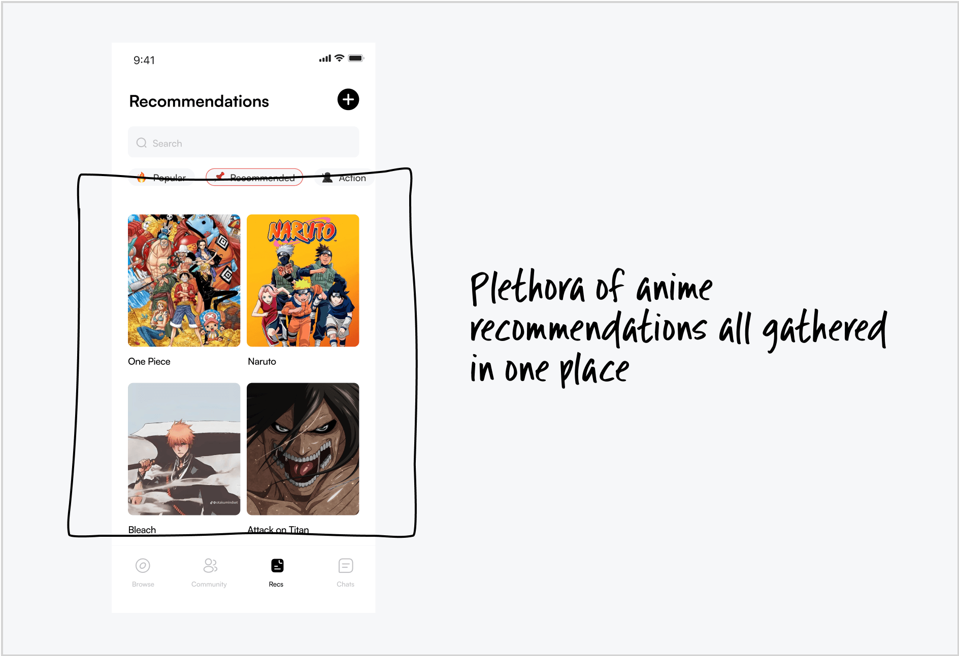
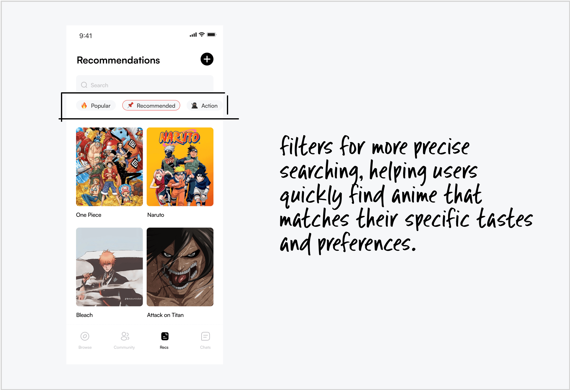
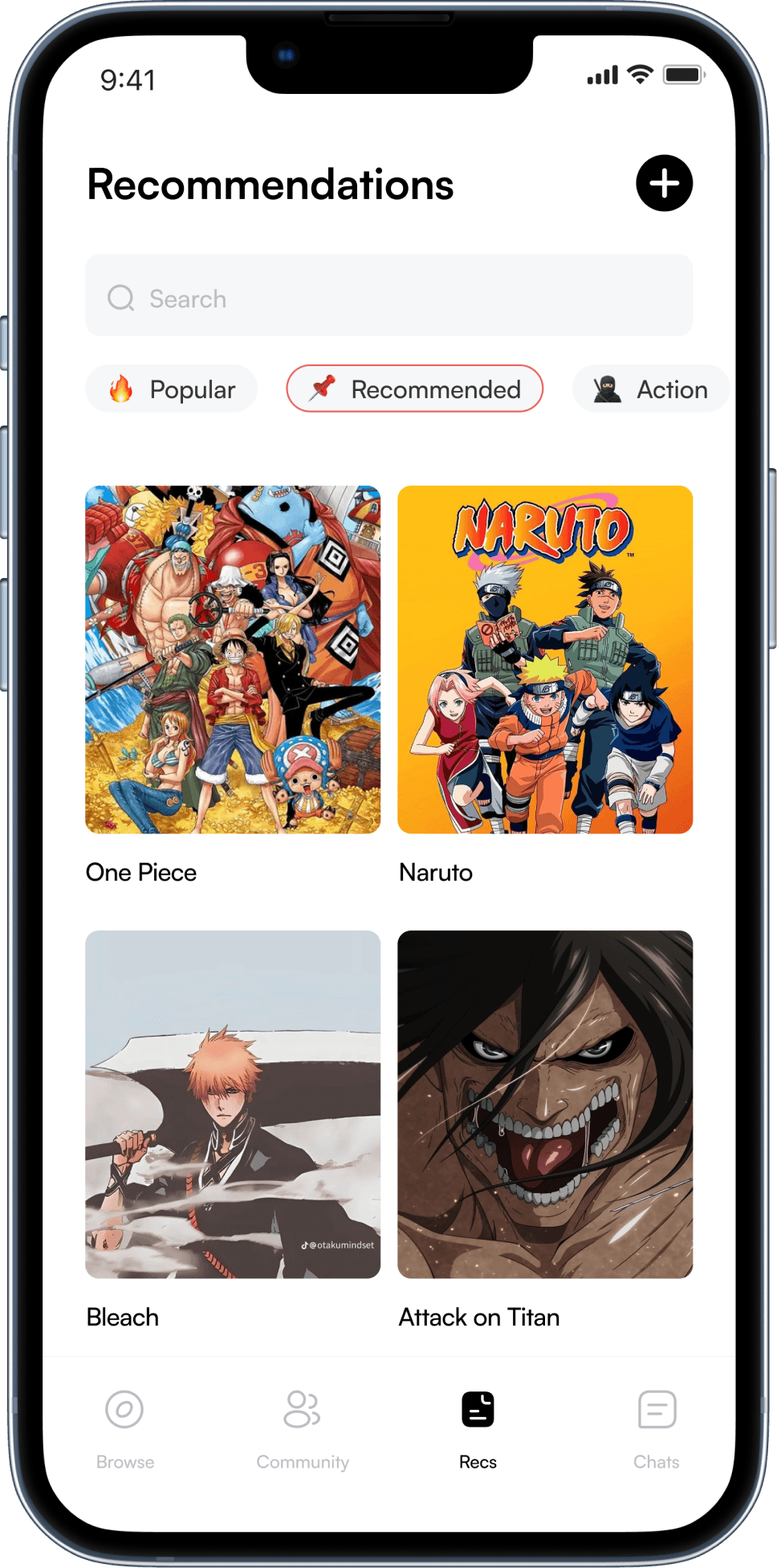
Using the recommendation panel as an example, it addresses these interest-based questions by offering tailored anime suggestions, helping users discover new shows and enhancing their experience.
Answering "Where"
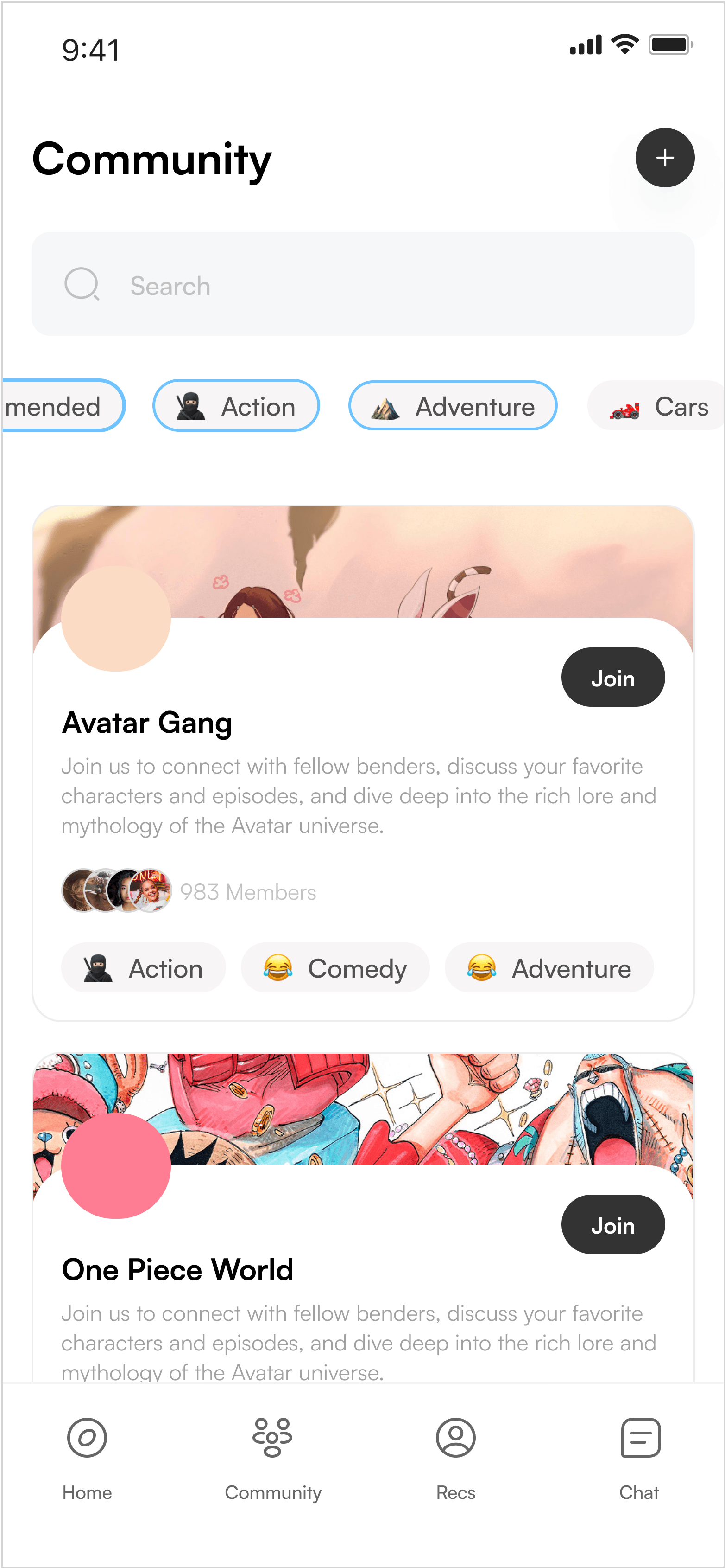
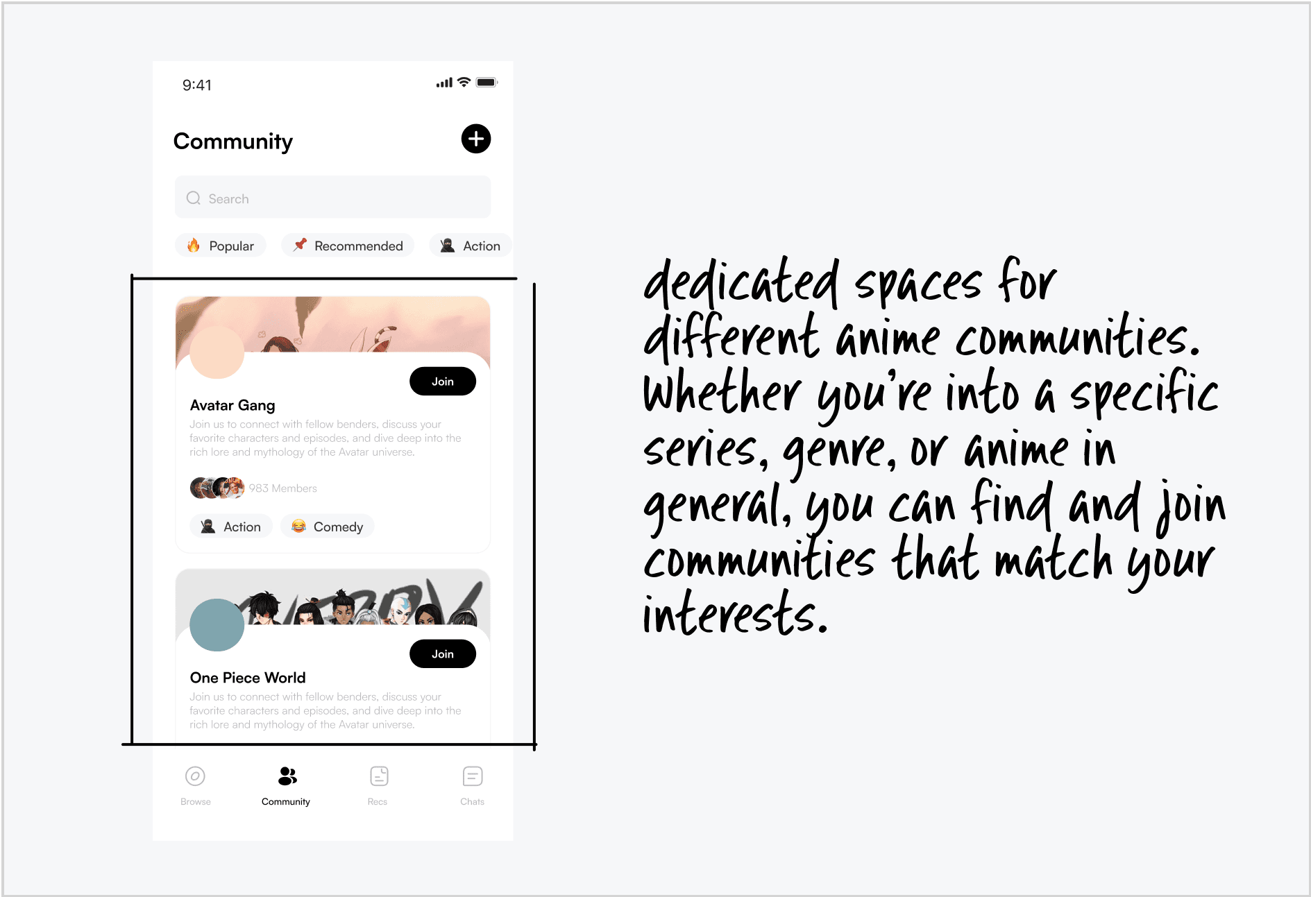
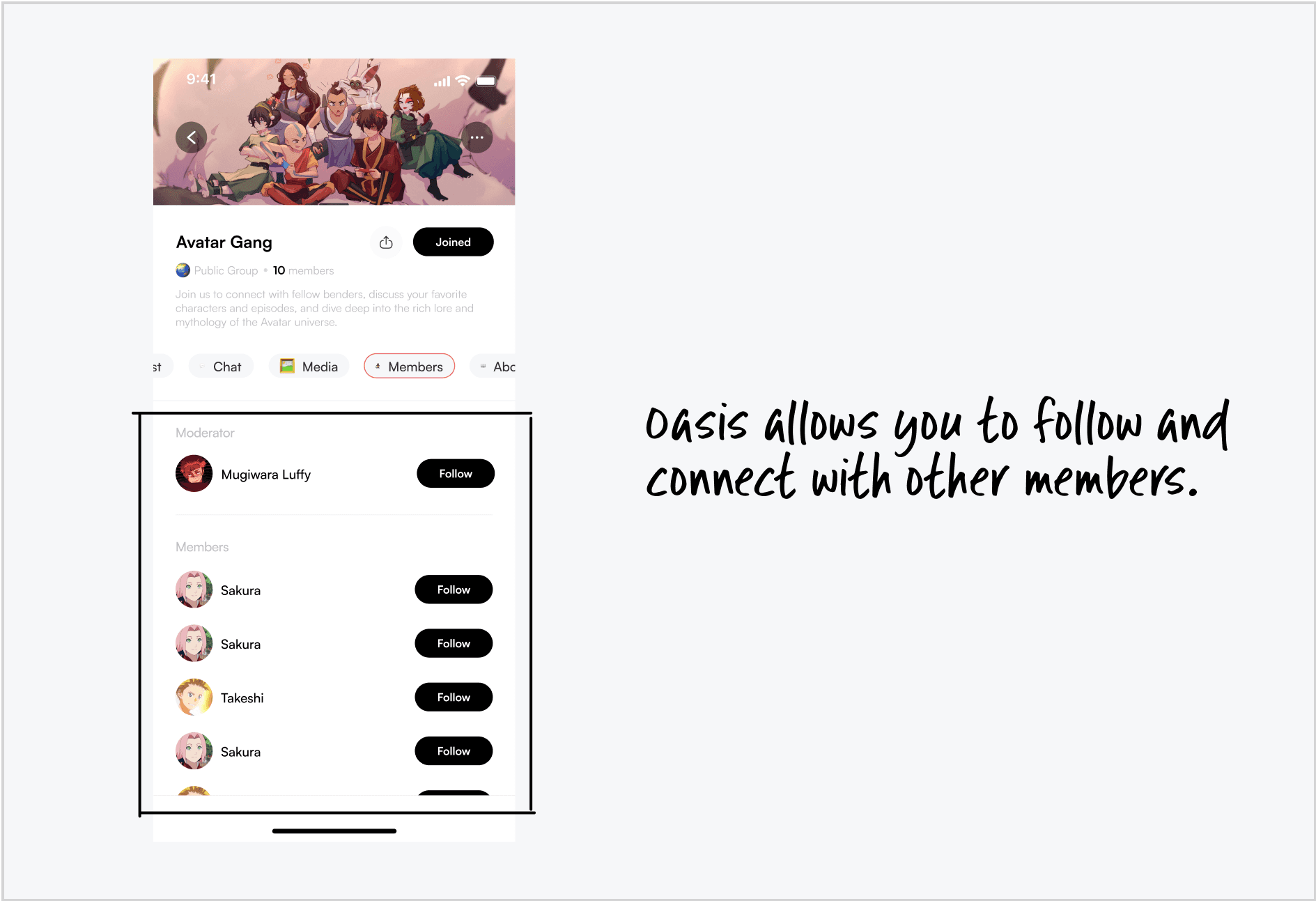
Questions like "Where can I find a community of anime enthusiasts?" reflect a desire to connect with a specific group. However, many platforms are too broad and don’t cater to these niche interests.
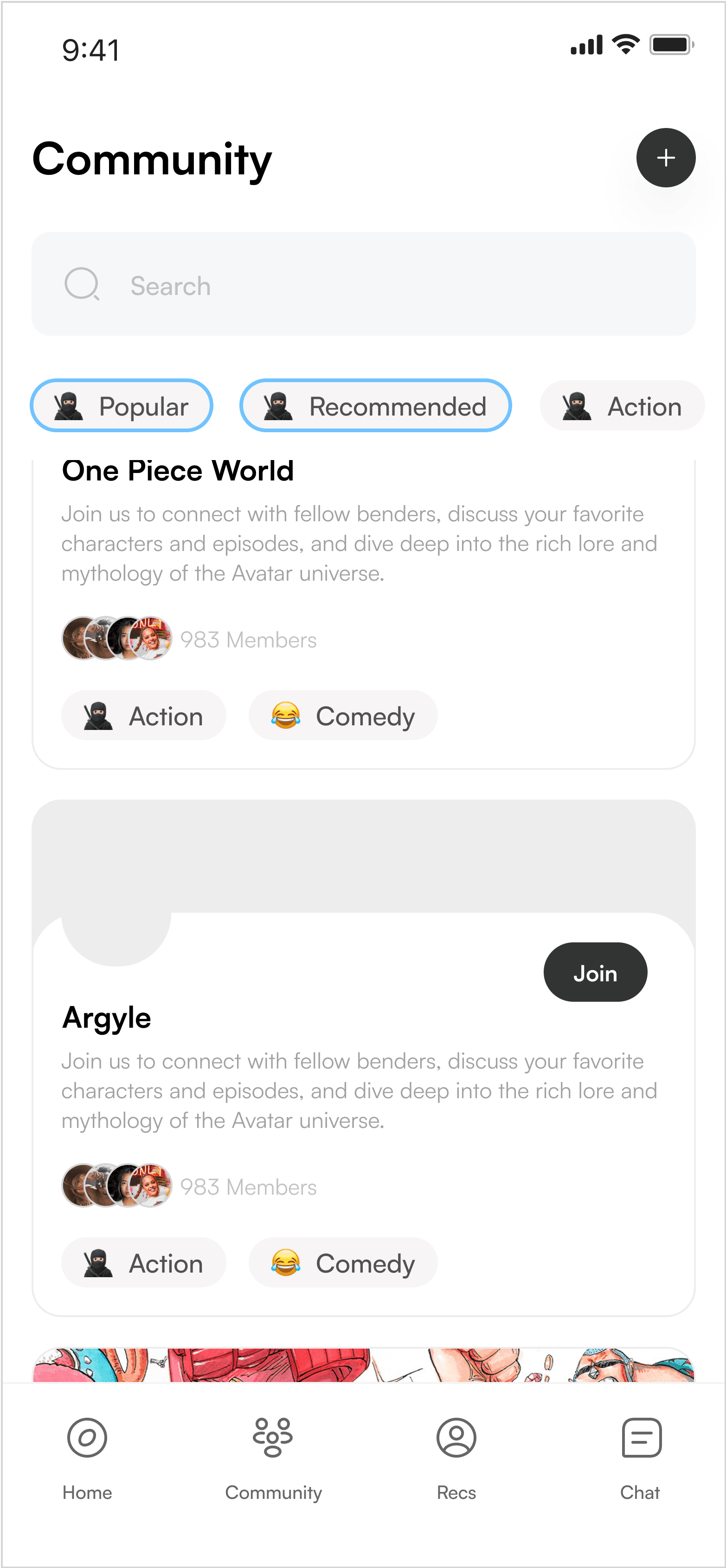
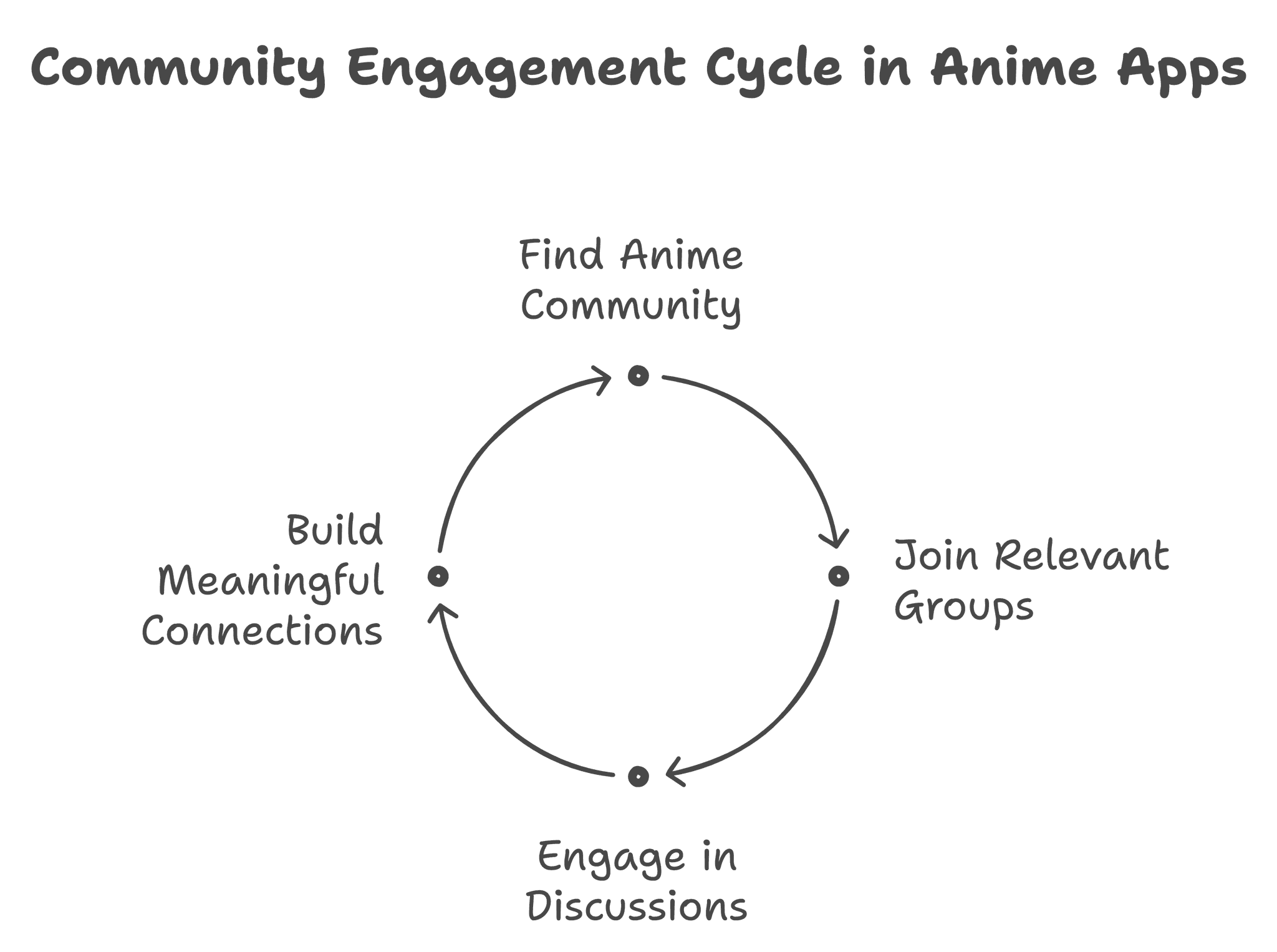
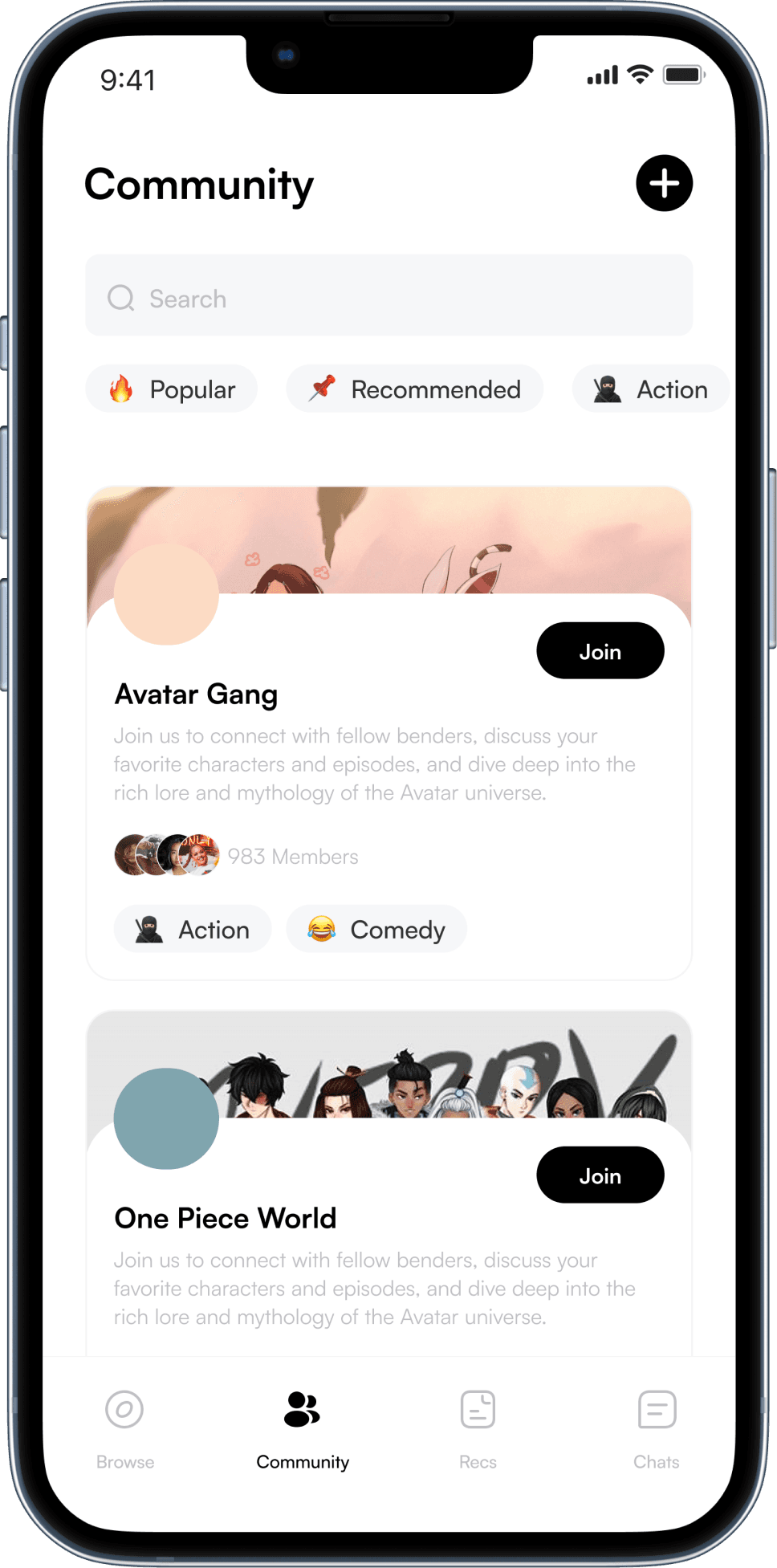
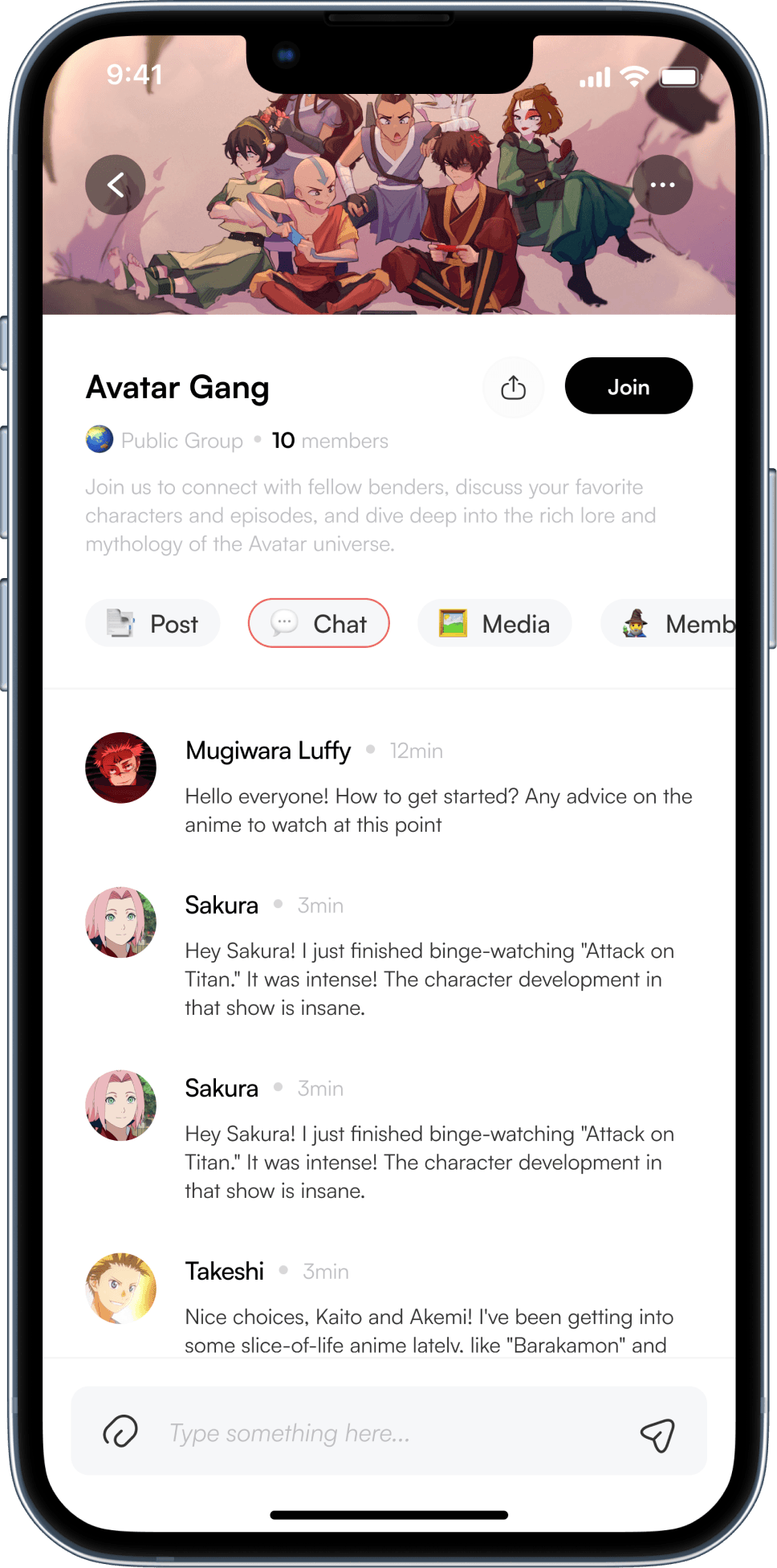
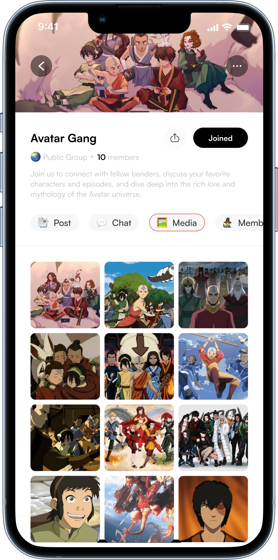
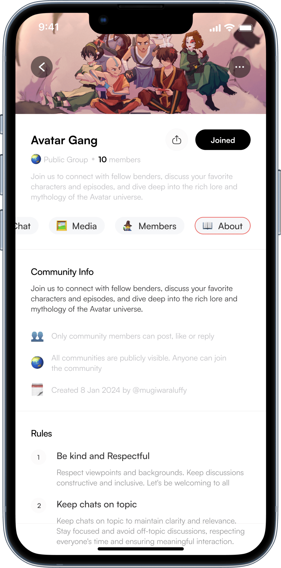
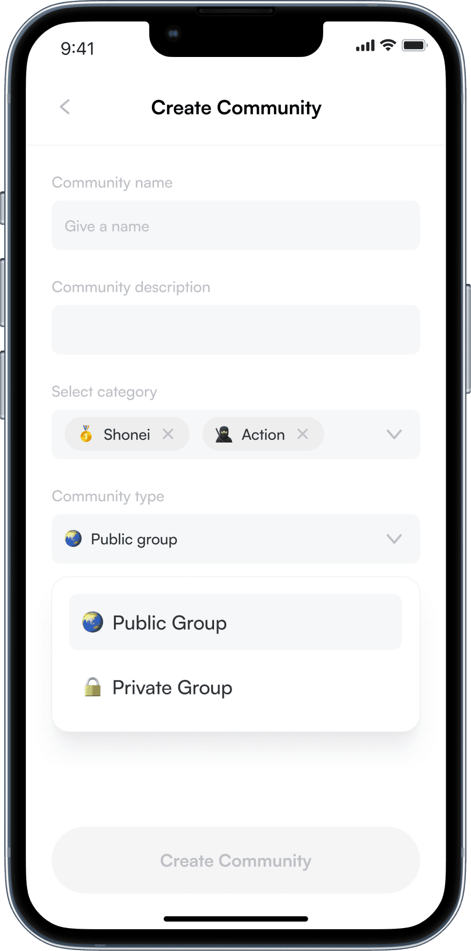
The Community Panel on an all-anime app like Oasis helps users find and connect with like-minded anime fans. It creates a niche environment where users can join relevant groups, engage in discussions, and build meaningful connections.
Visuals
The fine things
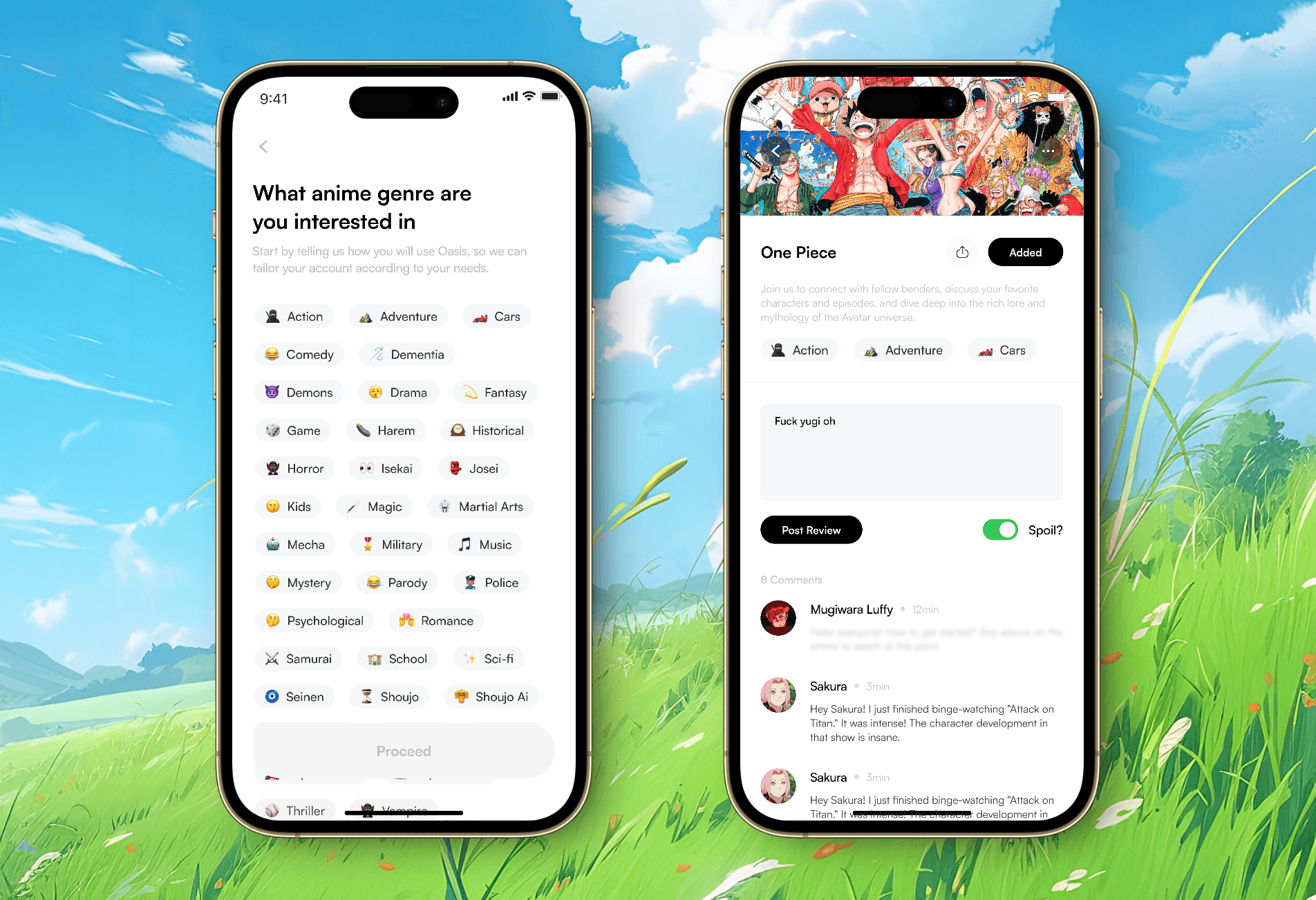
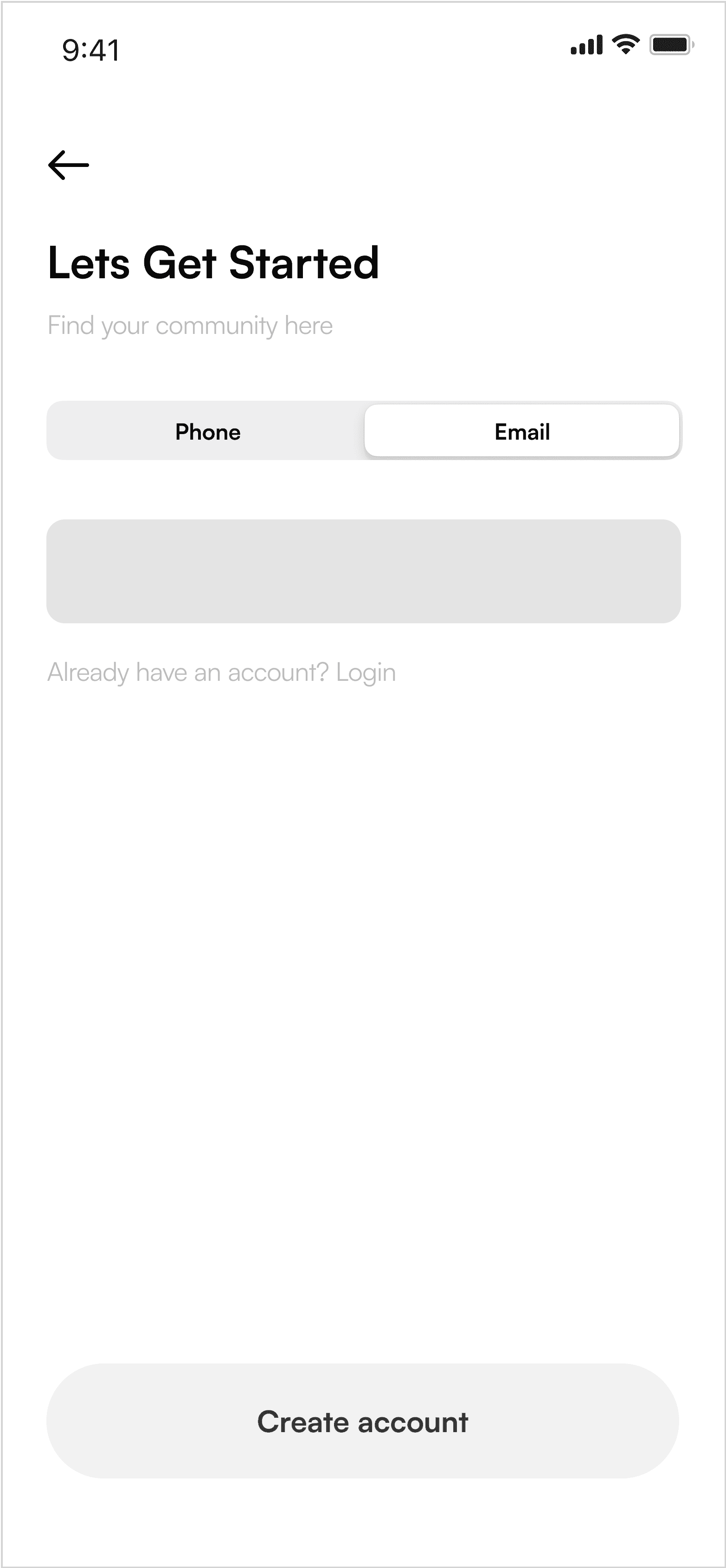
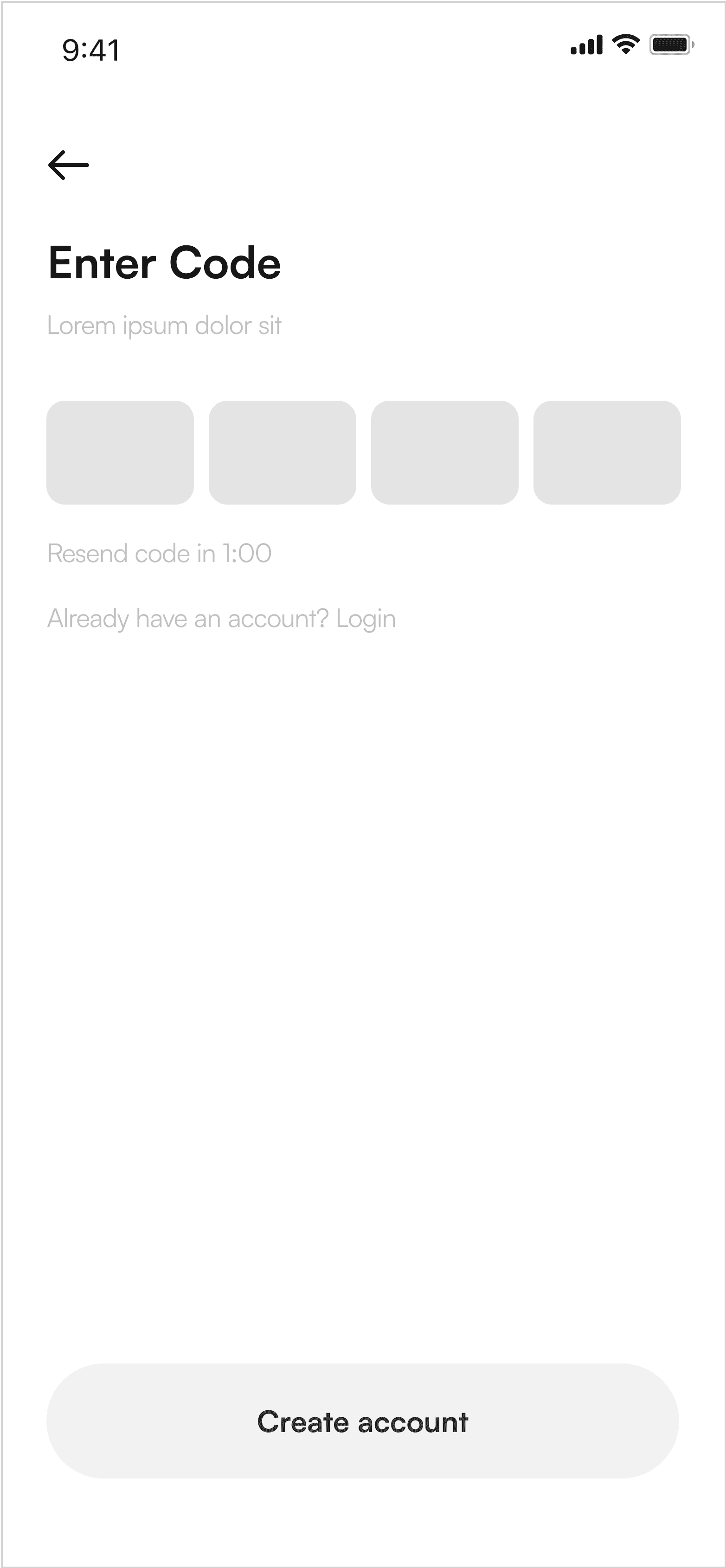
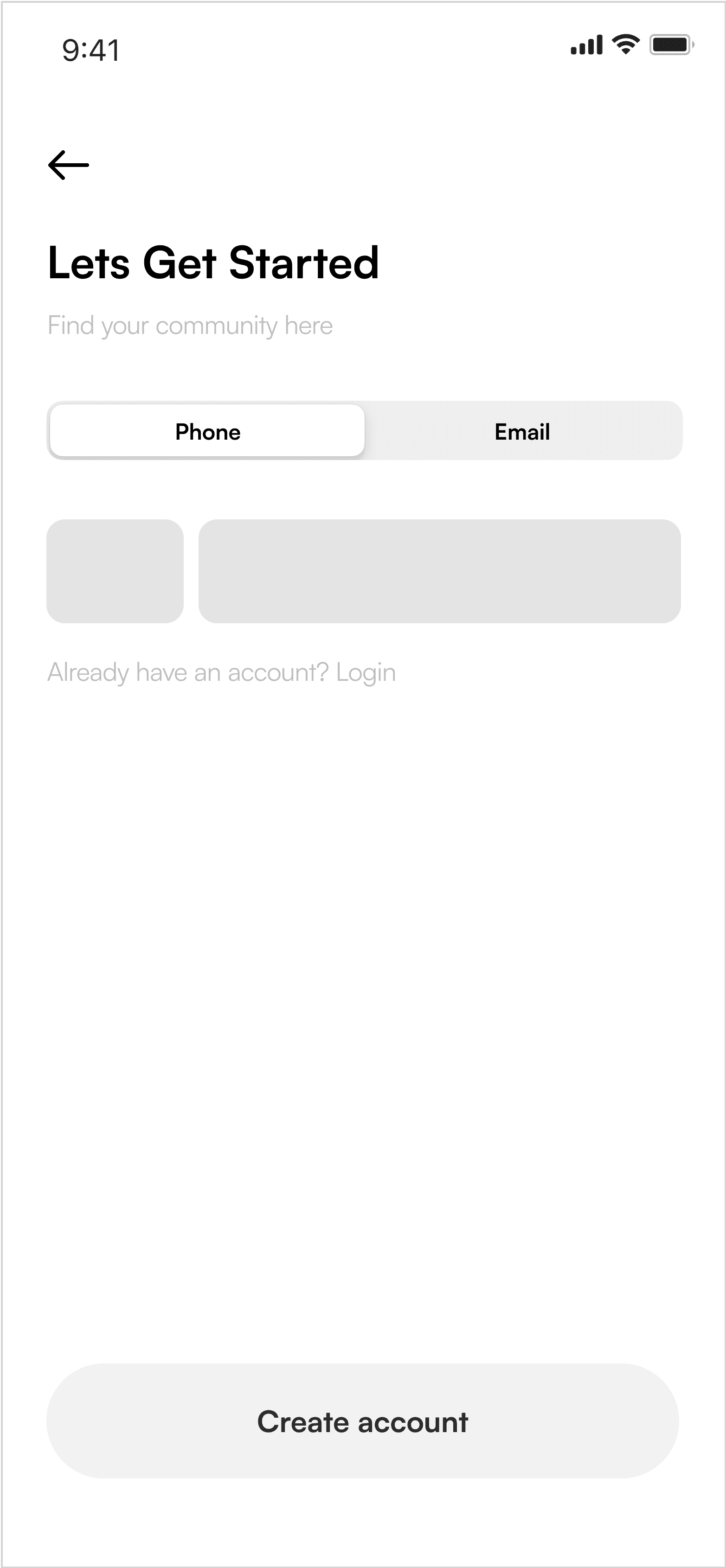
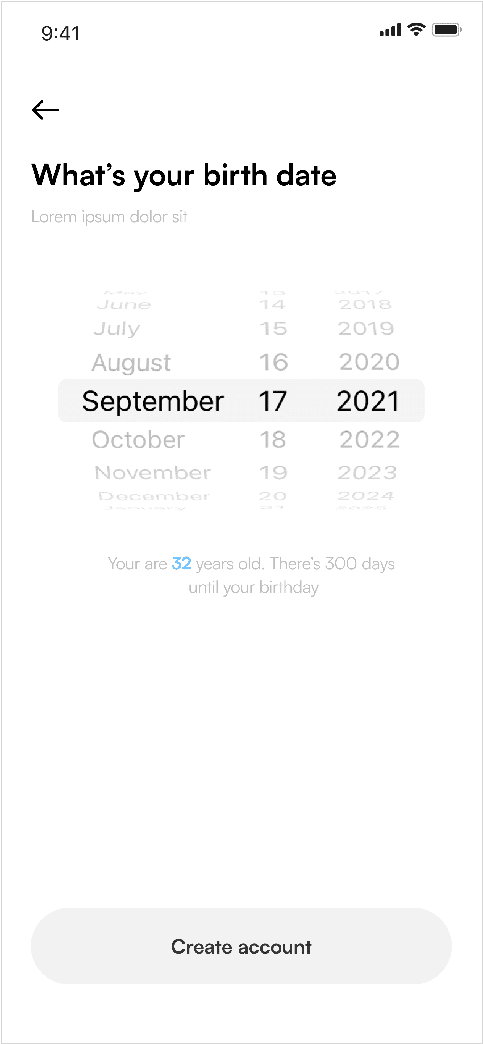
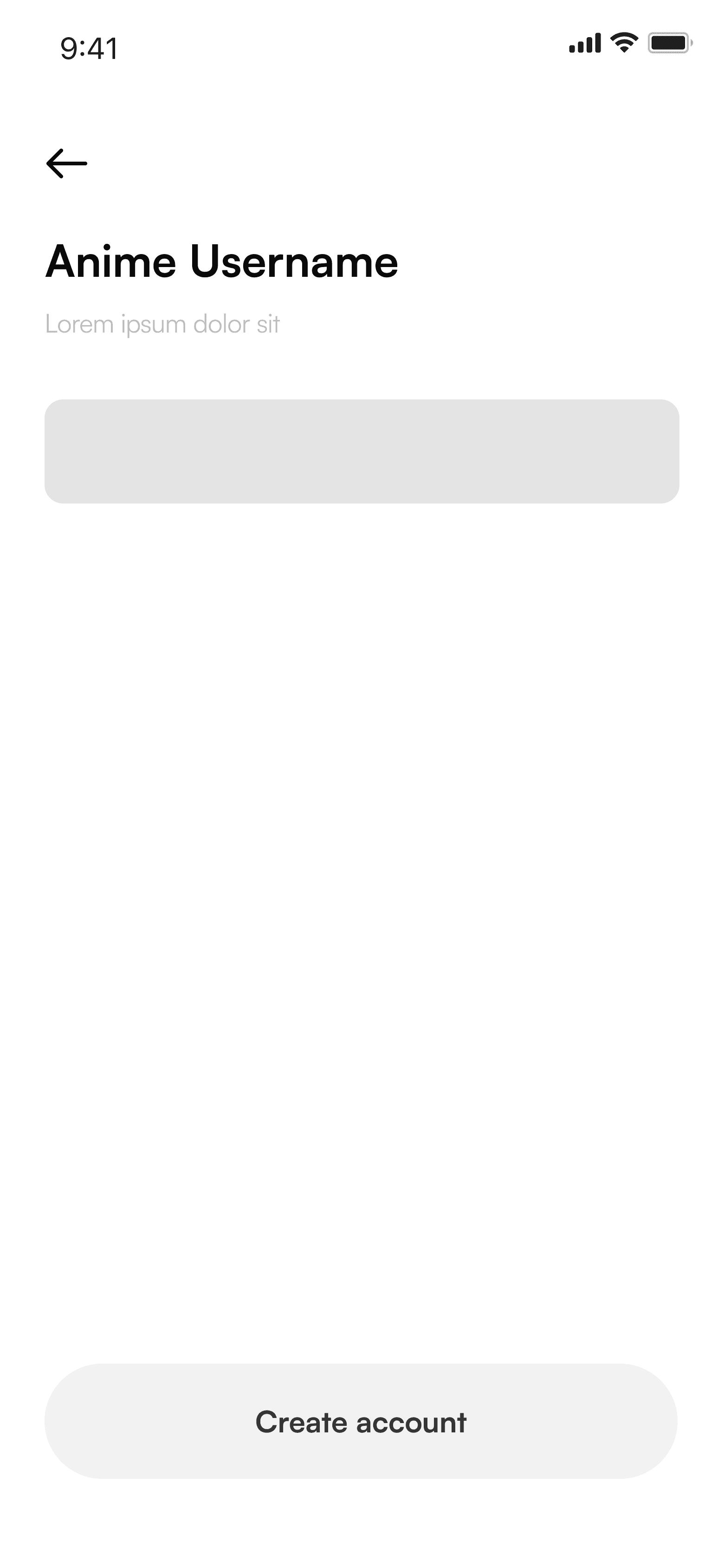
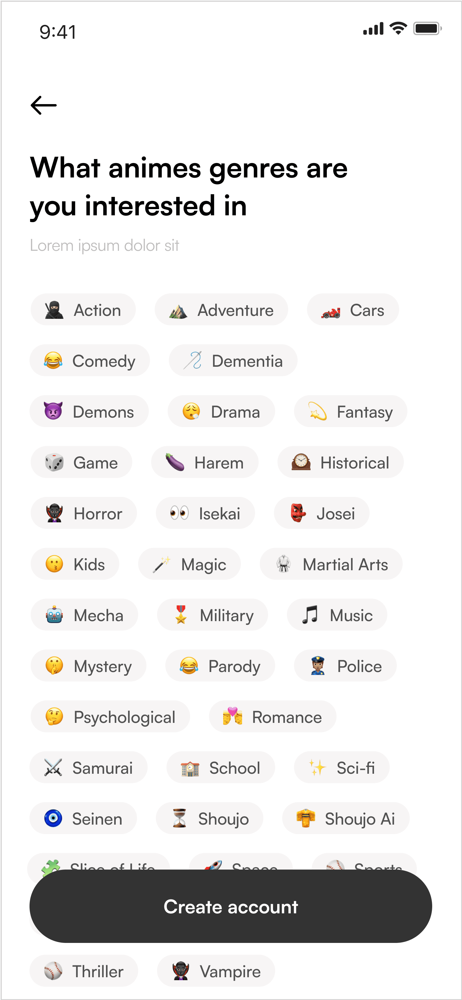
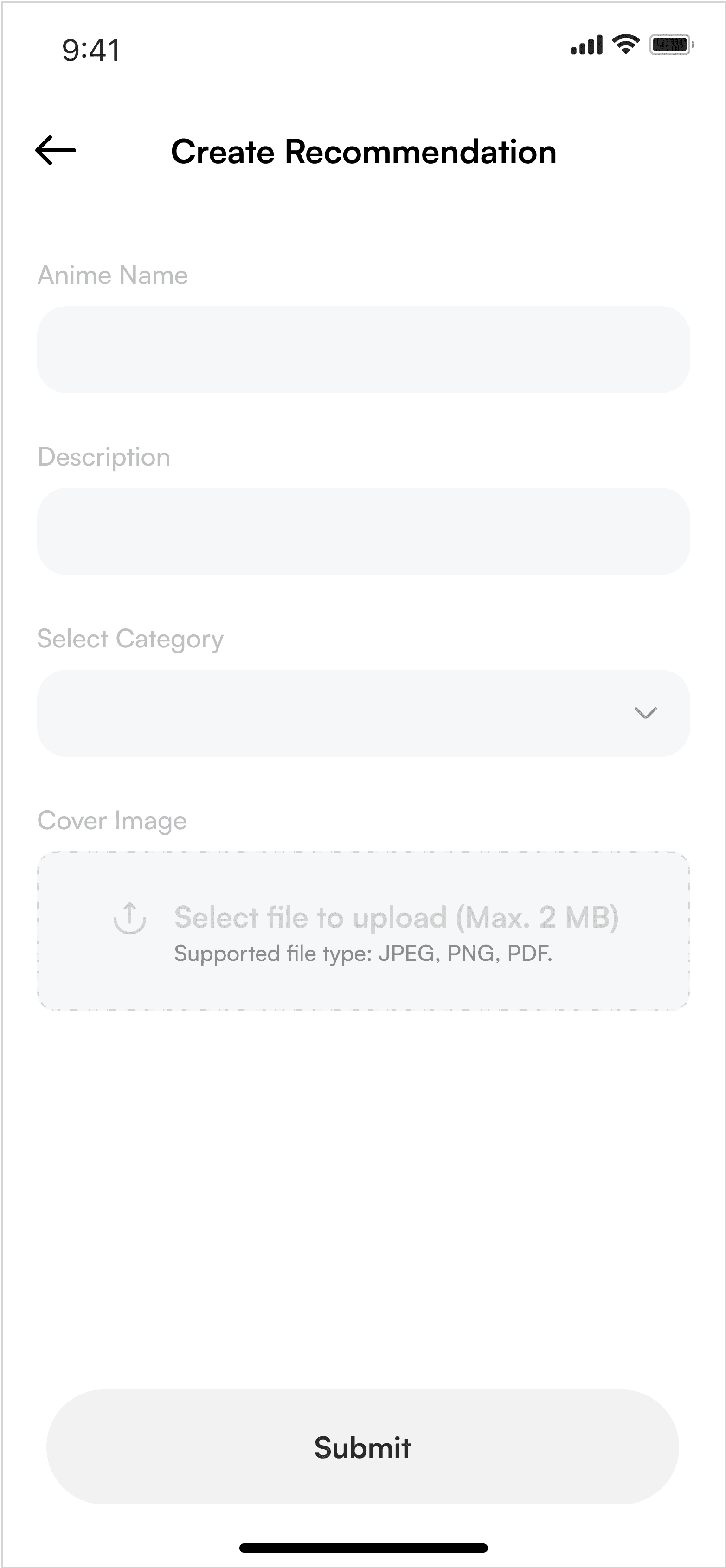
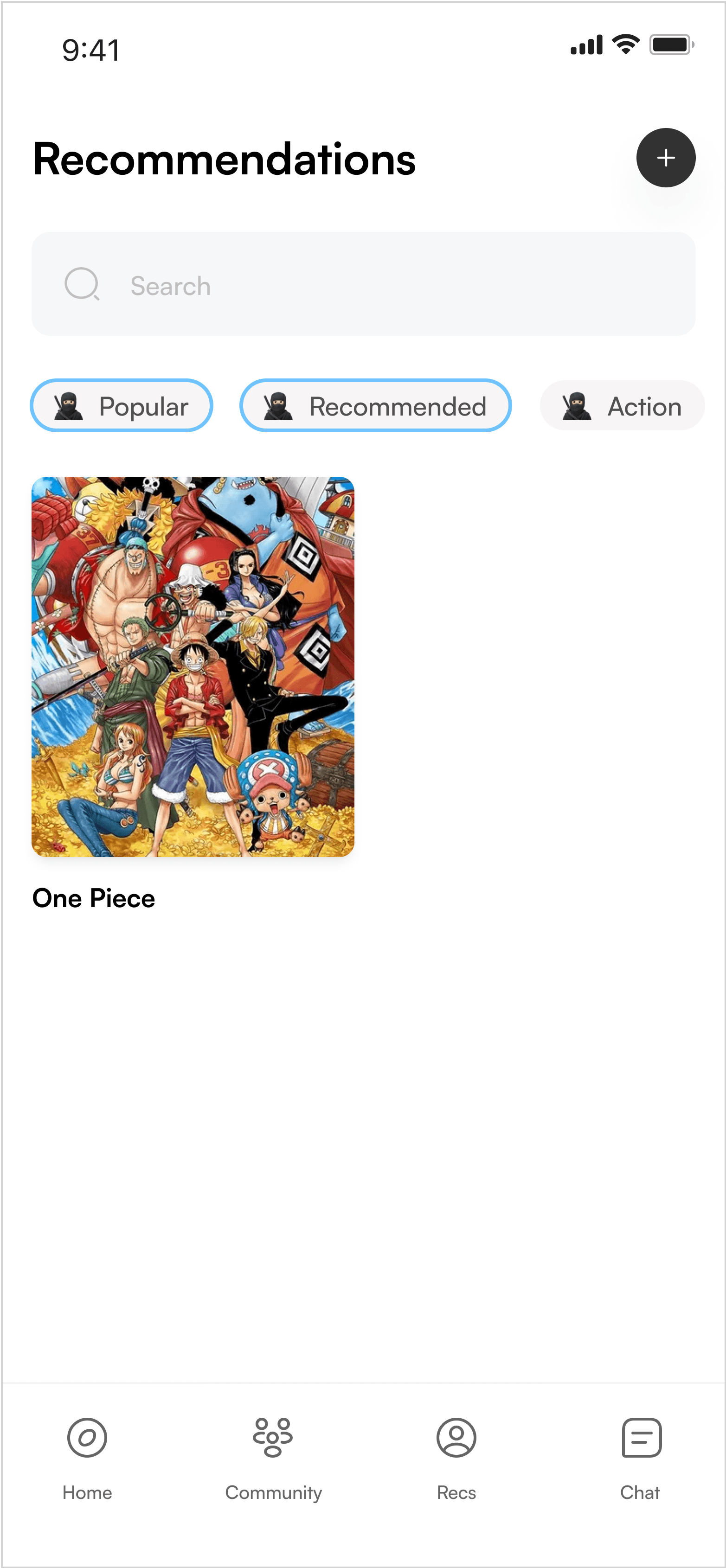
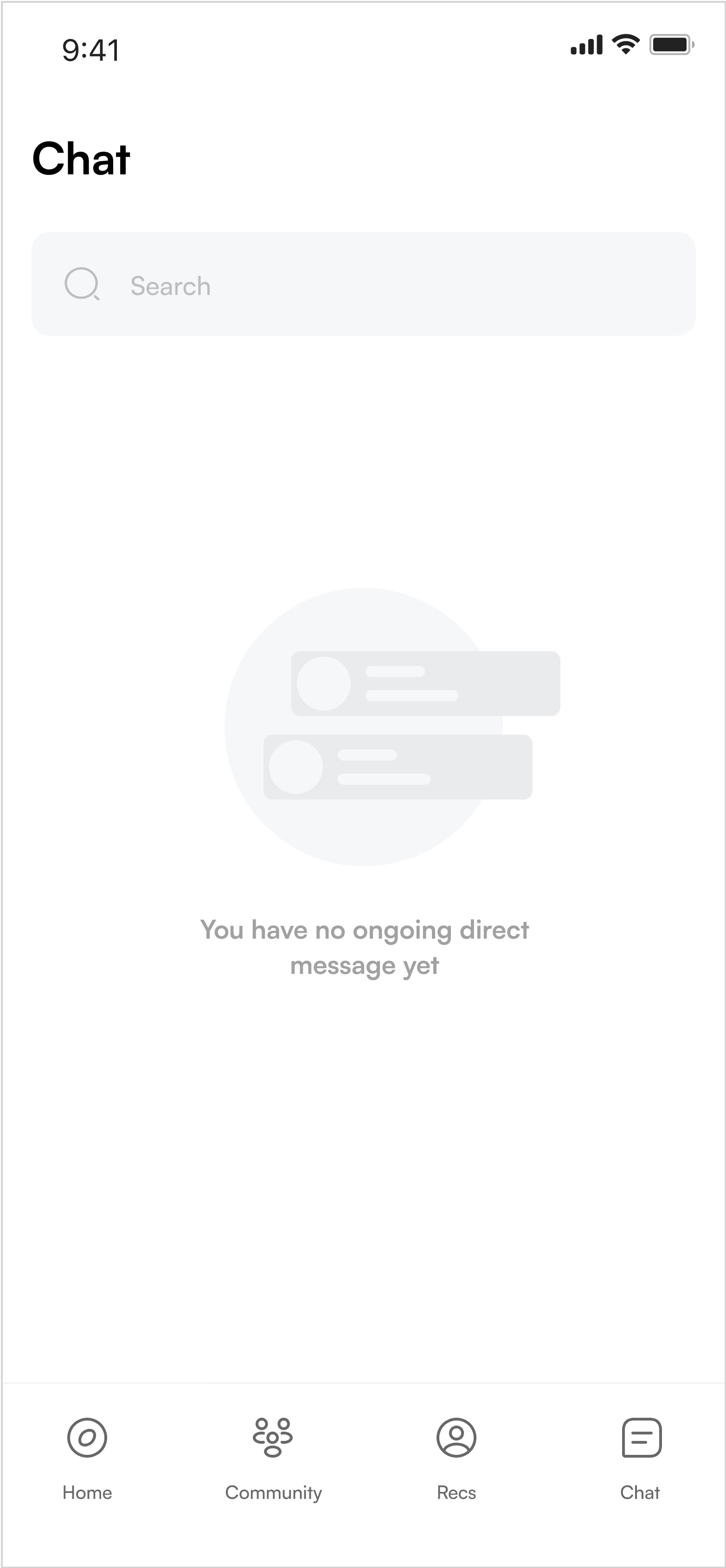
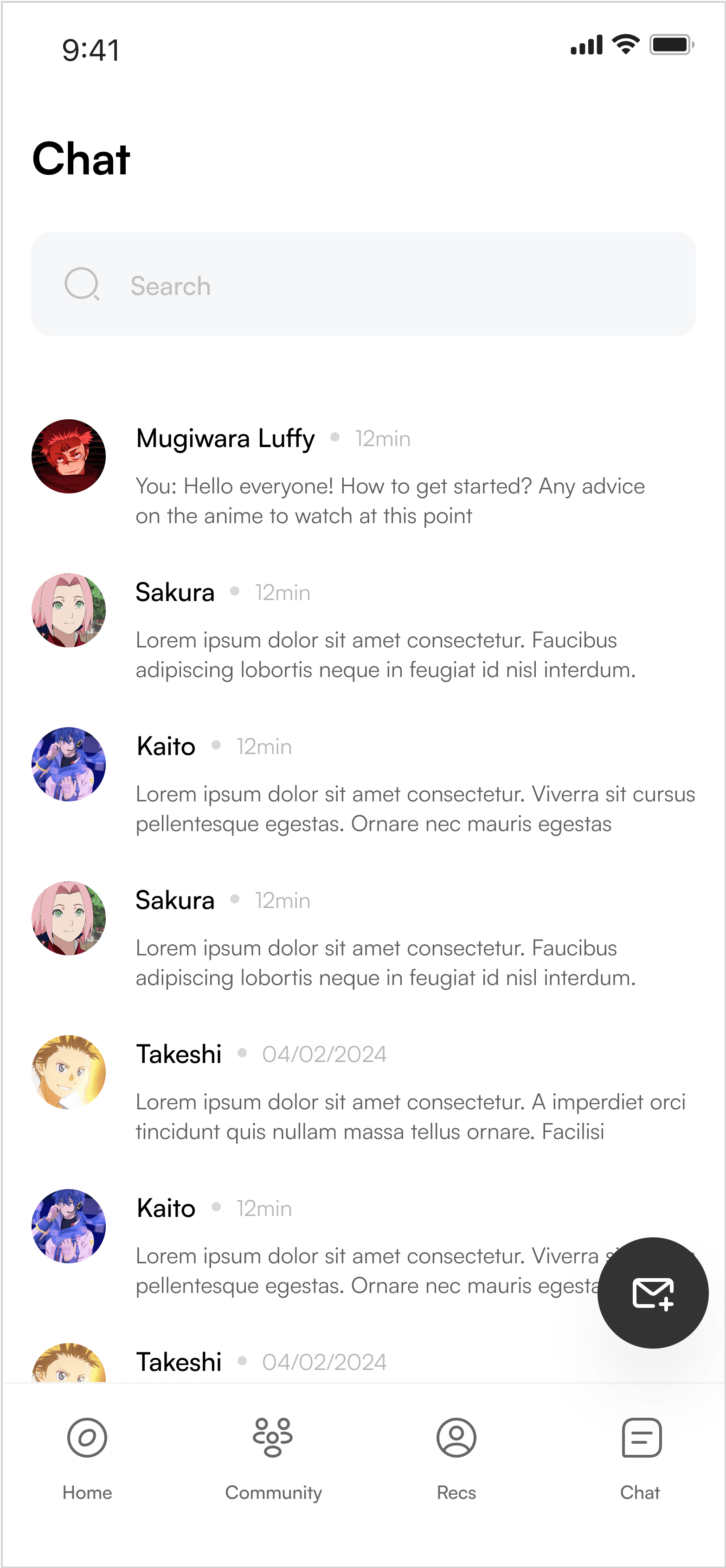
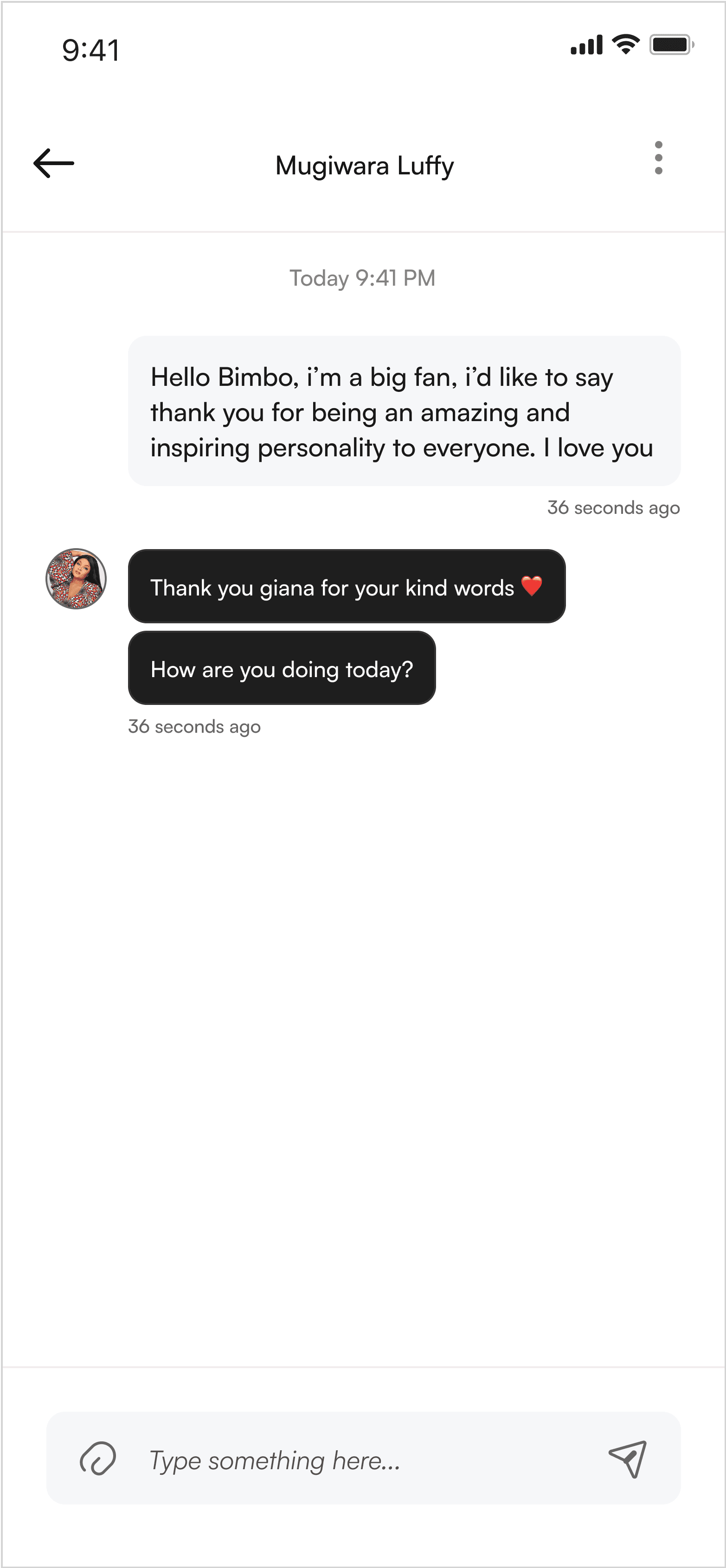
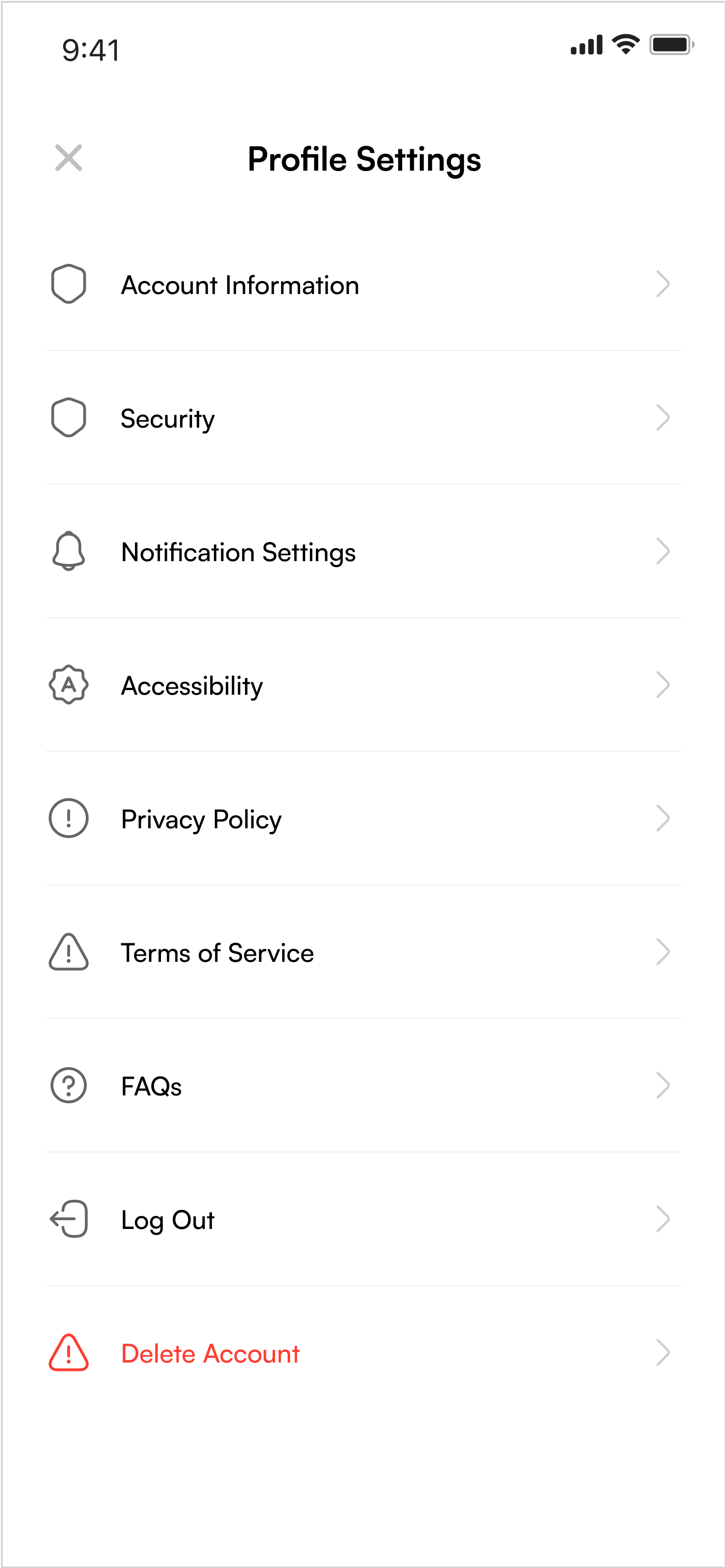
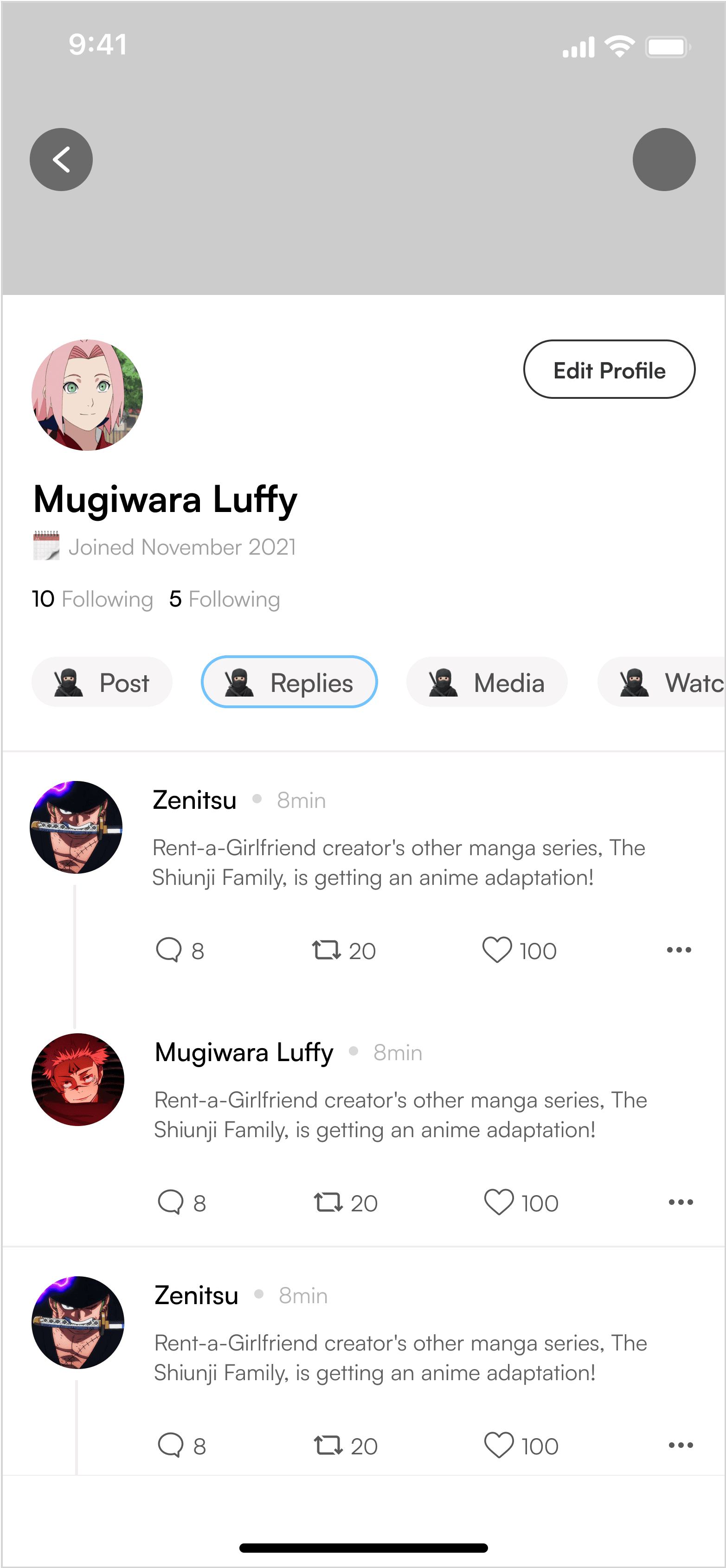
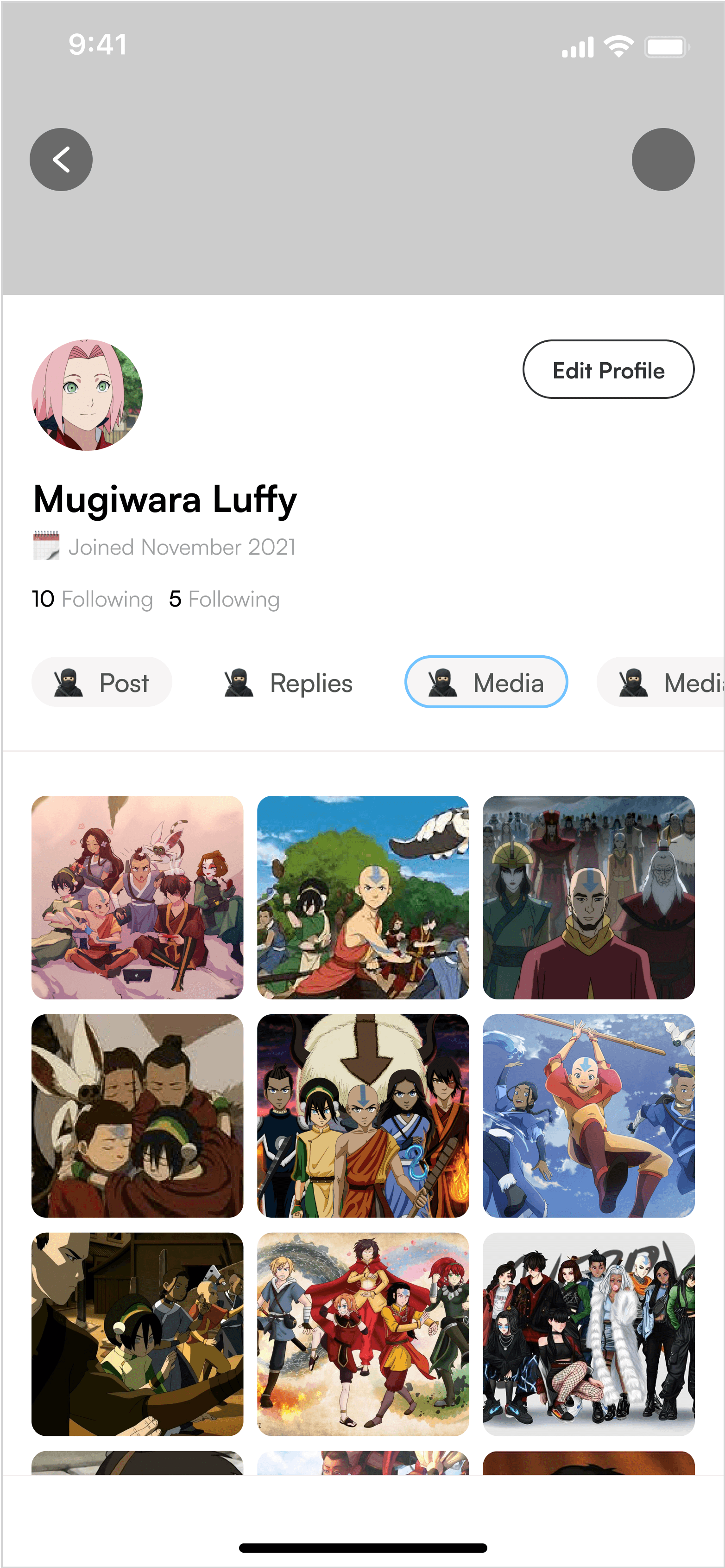
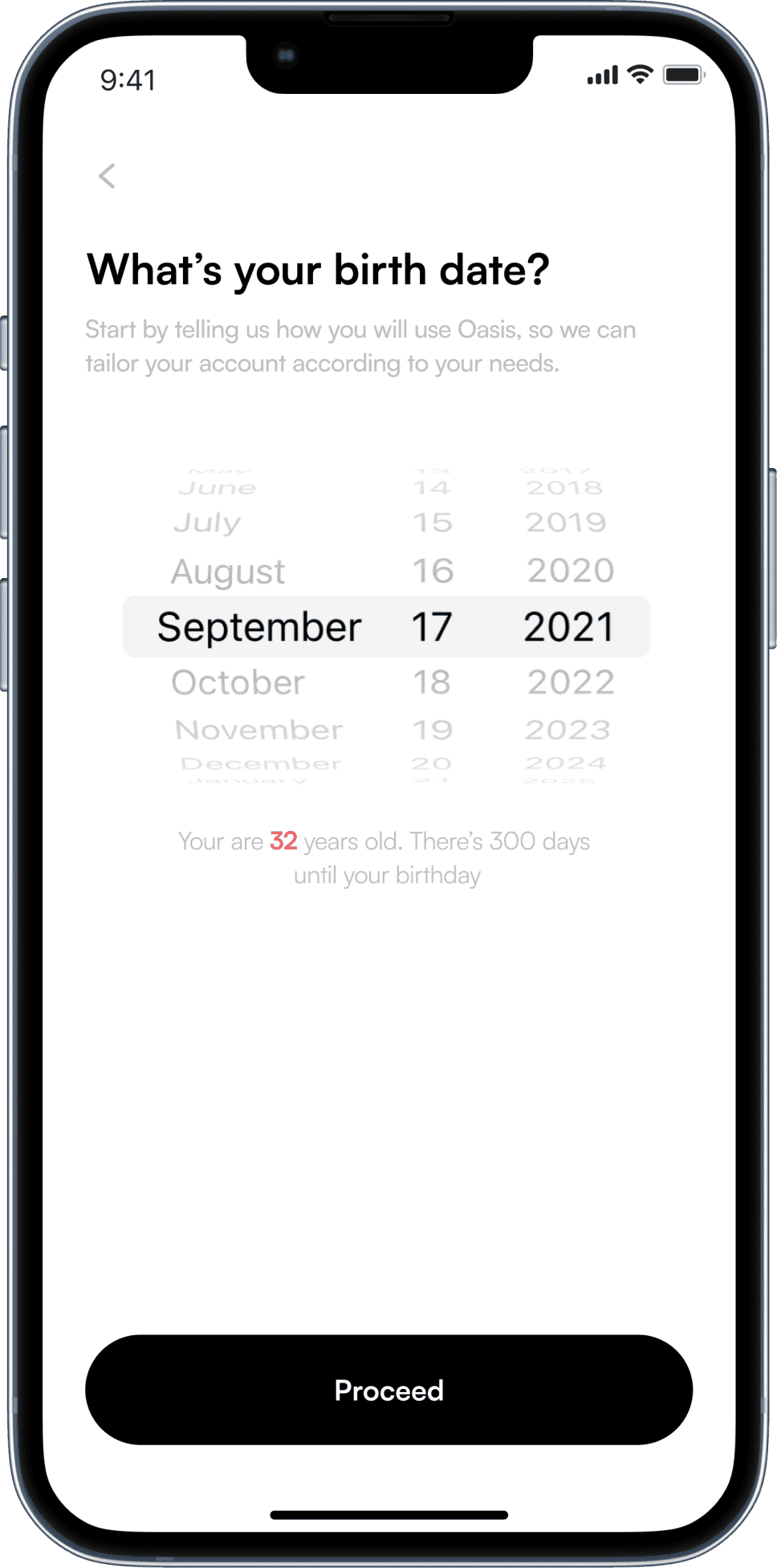
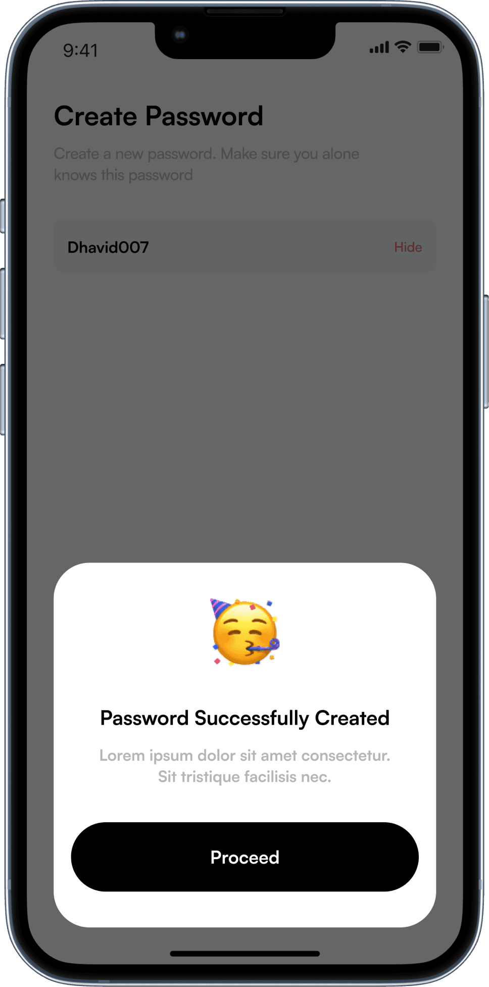
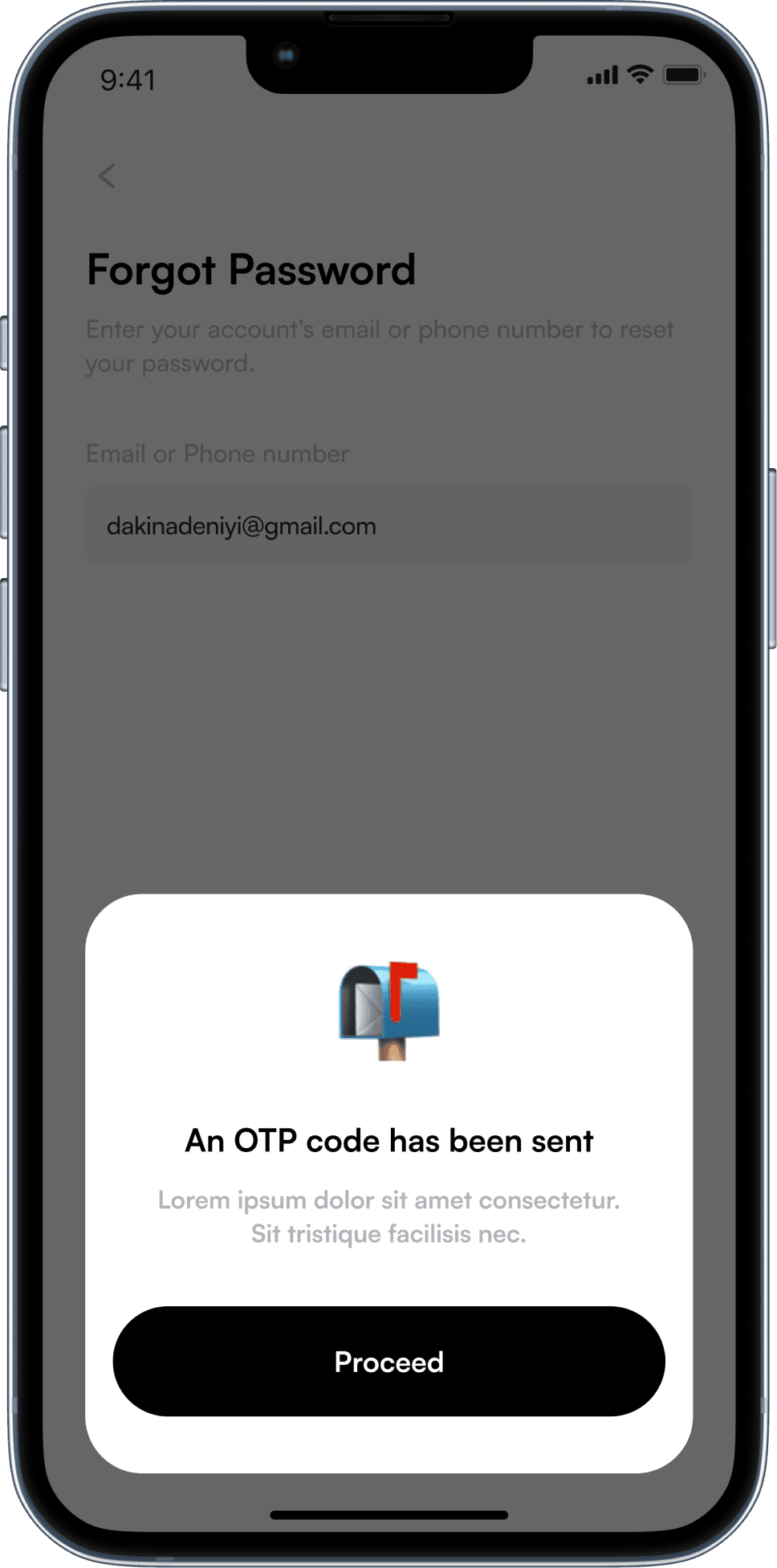
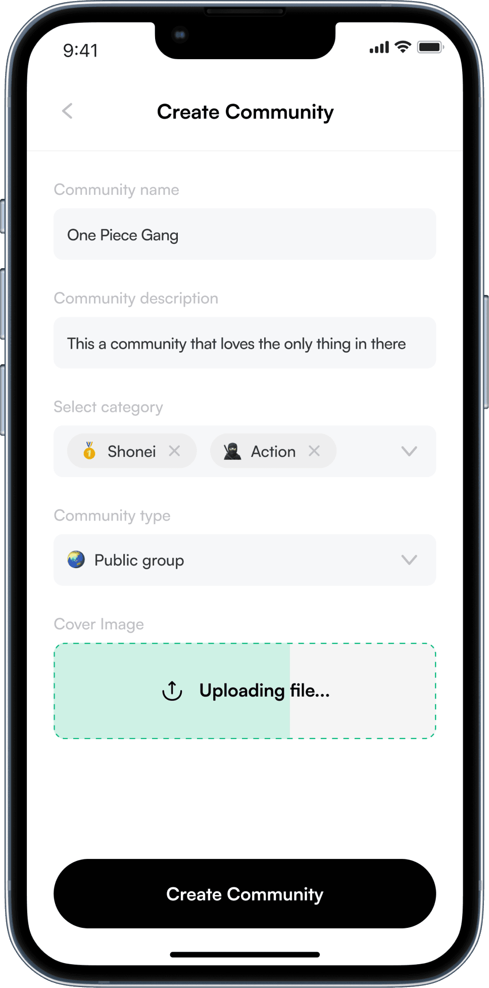
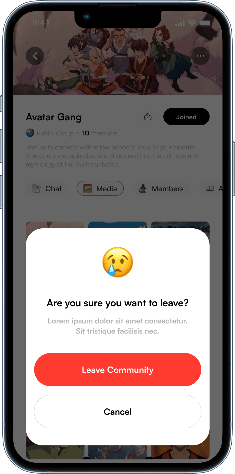
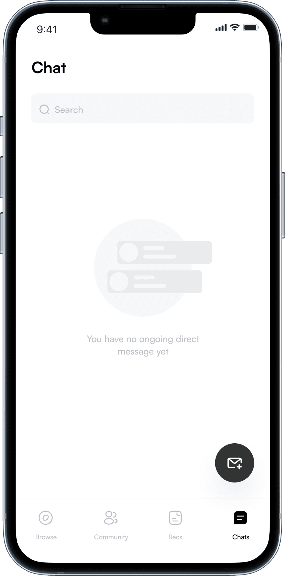
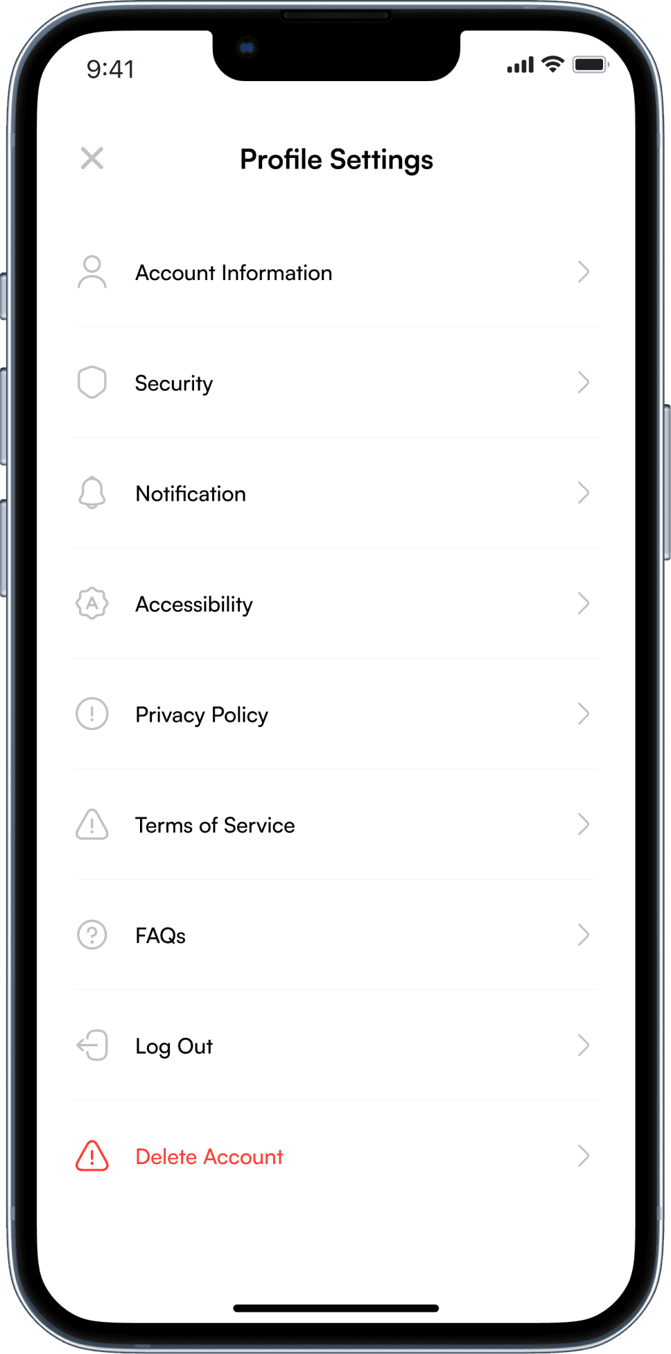
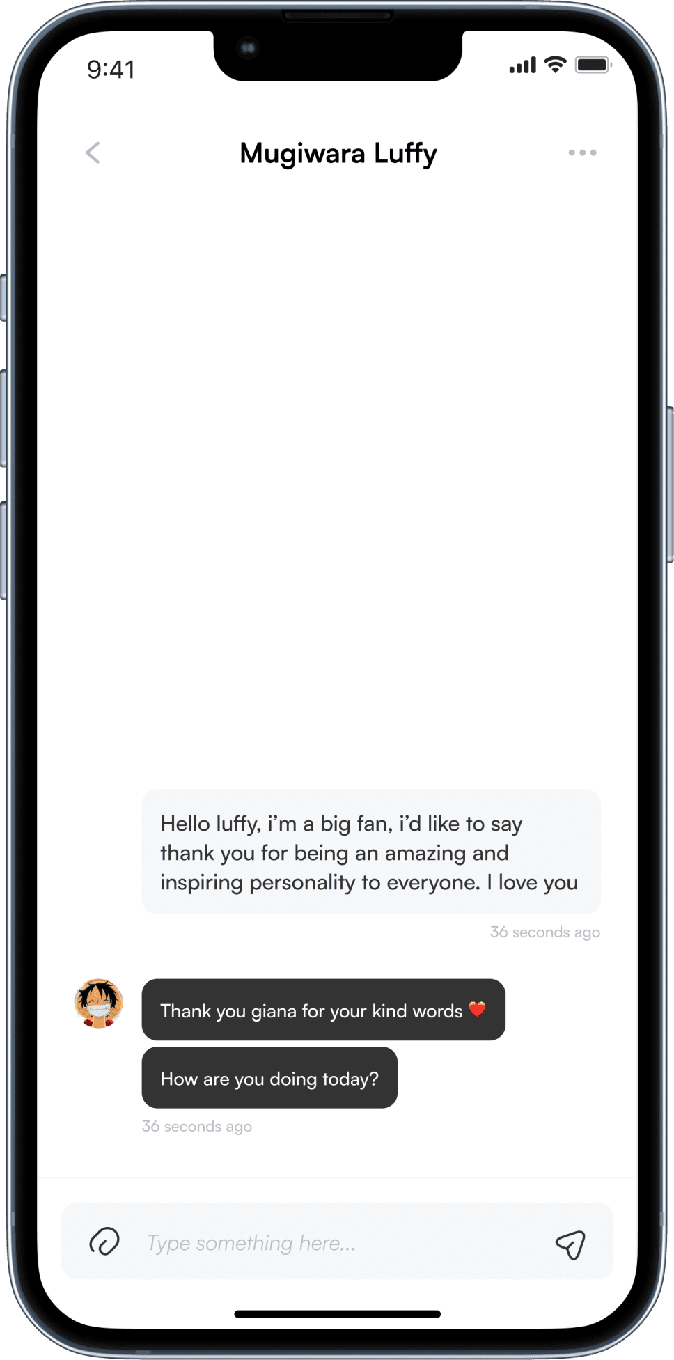
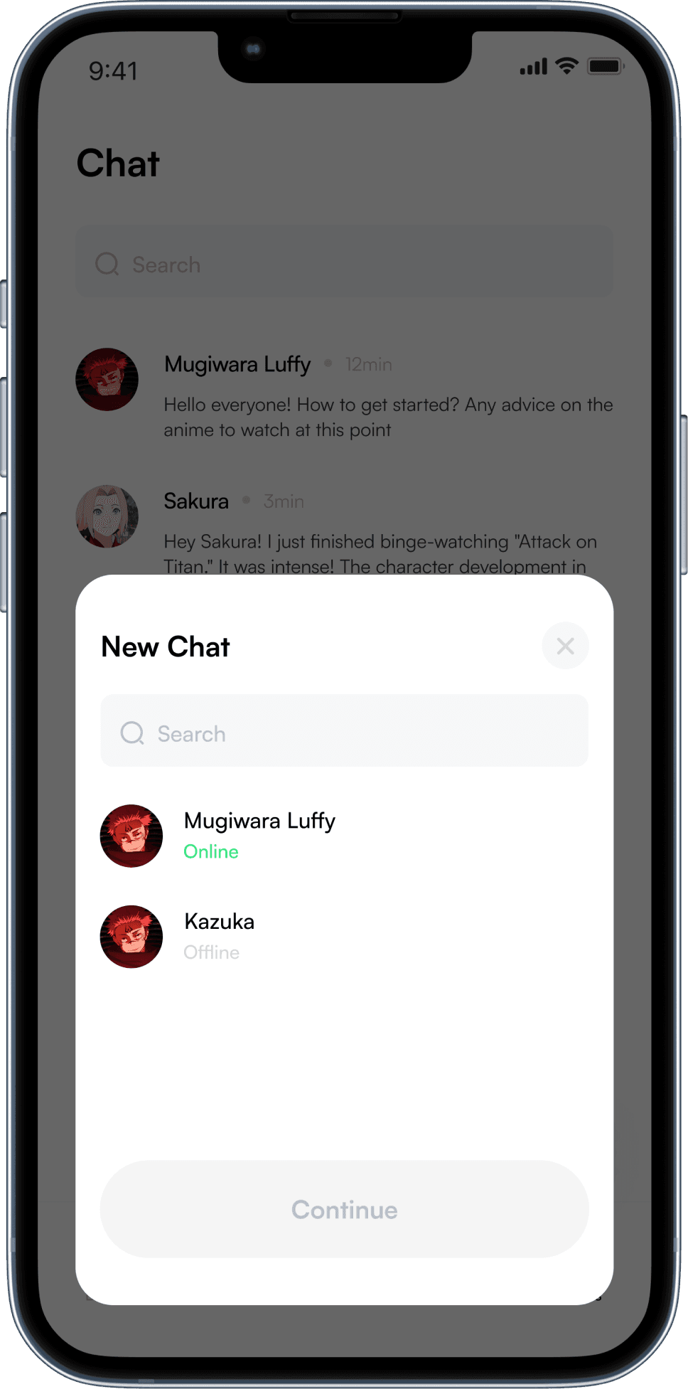
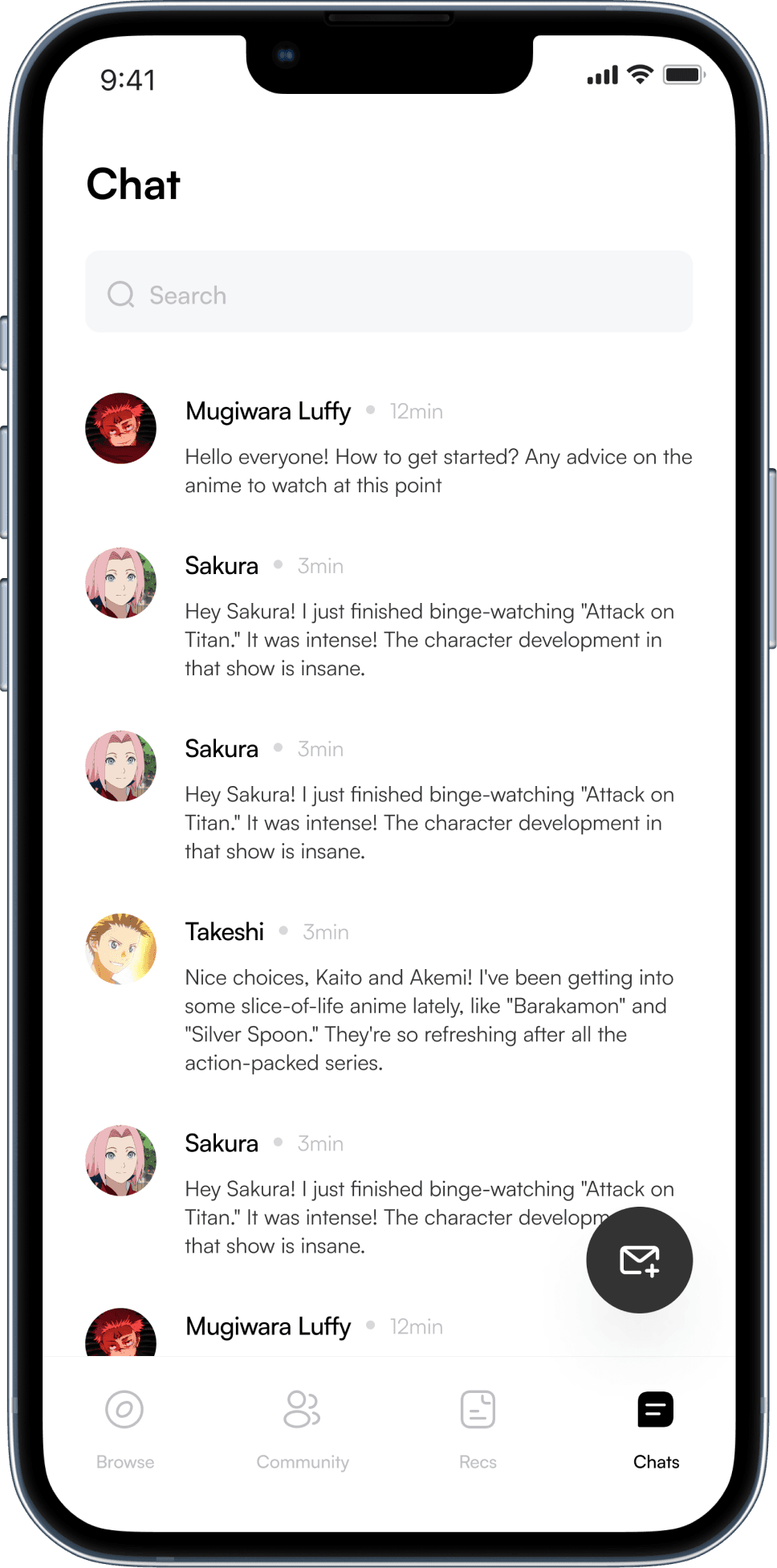
This visual showcase highlights nearly every screen of the Oasis app, meticulously crafted to provide a comprehensive overview of its design and functionality.
Project Takeways
Viewing constraints from different perspectives helped brew new approaches to tackle other constraints.
Cross-functional partners should be involved from the start to ensure holistic project progress, effectively addressing both content strategy and technical feasibility early on.
Simplicity meant reducing complexity rather than quantity. If an extra step improved intuitive usability and reduced errors, the added manual effort was justified.
Ambiguity can be a blessing. Not having a clear direction pushed me to get creative and explore big ideas, leading to fun and unexpected solutions.
